Designing with Sensitivity:
Rethinking Historical Tour Experiences
Improving the Battlefield tours email experience to increase clarity, trust, and engagement within a high-consideration booking journey.
My Role
Designer
Tools
Figma, Adobe Photoshop, FigJam
The Brand
Leger Holidays - Battlefield Tours
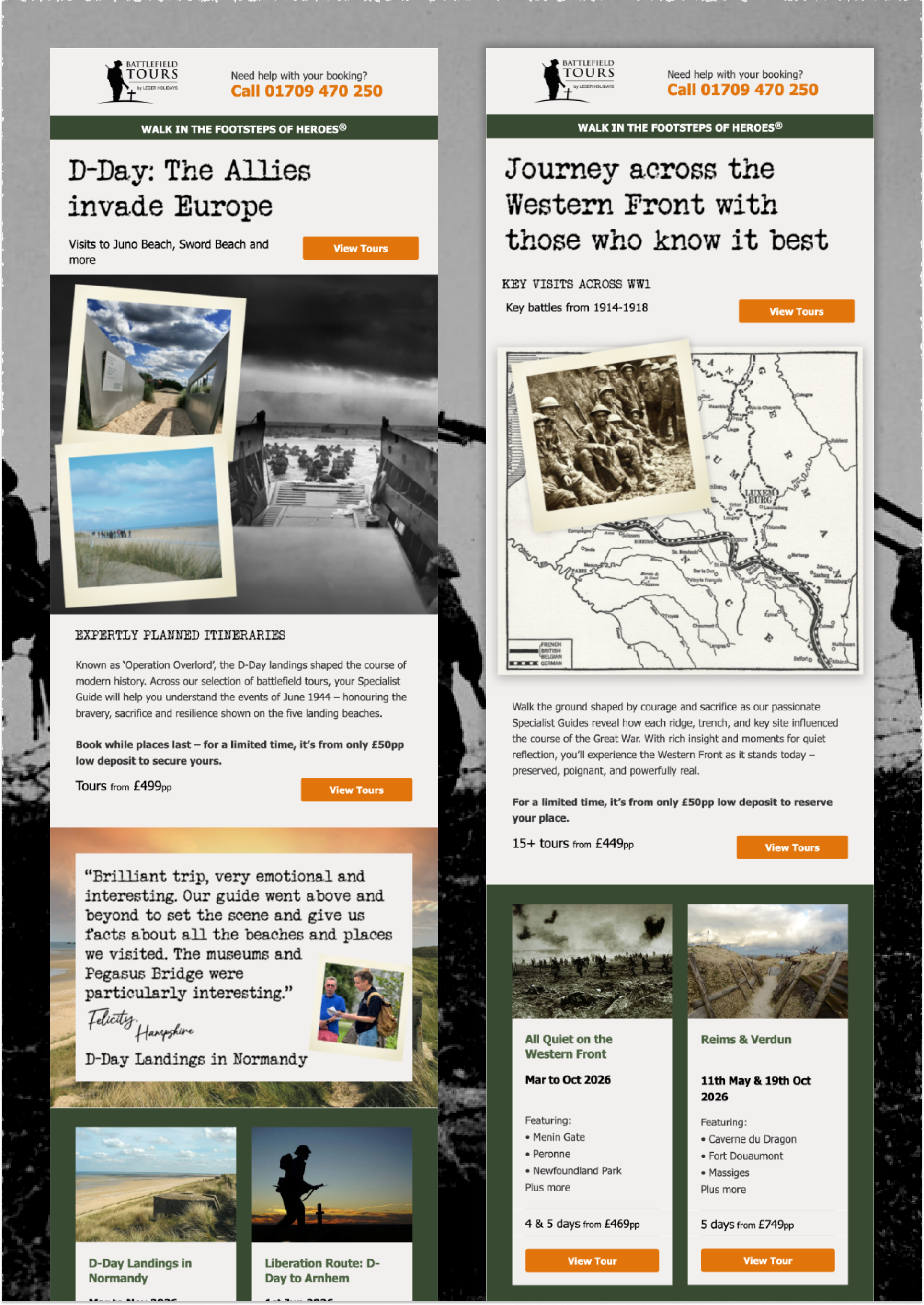
Redesign the Battlefield tours email to serve two fundamentally different user needs: action-oriented users looking to book or interact quickly, and information-focused users scanning for key details like dates, locations, and accommodation. Needed to improve clarity, trust, and emotional engagement while working within email constraints and maintaining alignment with brand and historical tone.
The Challenge
Structured the email around an improved hierarchy, prioritising key information and CTAs above the fold to support quick scanning and reduce cognitive overload. Simplified content and layout to improve clarity, standardised typography and spacing for readability, and introduced prominent testimonials and trust signals. Visuals were aligned with the emotional and historical nature of the tours. Designed for one campaign but built with reusable patterns for future emails.
The Approach
Users could quickly understand, compare, and confidently engage with tour offers. Engagement improved dramatically: +56.9% YoY click-through rate, +45.8% WoW engagement uplift, and a campaign turnaround from –9% YoY decline to +27% growth, with stakeholders praising clarity, trustworthiness, and emotional resonance of the redesign.
The Impact
THE PROBLEM
THE PROBLEM
Cognitive Overload in High-Consideration Journeys
The problem
The Battlefield email needed to communicate detailed itineraries, historical context, and key travel information within a limited space. However, poor hierarchy, inconsistent layout, and low readability made it difficult for users to quickly understand the offer. Key details were not surfaced early, and limited trust signals reduced confidence, creating friction and drop-off after initial engagement.
RESEARCH
RESEARCH
Users scan quickly but struggle to identify what matters
Understanding the Problem
To better understand how users engage with the email and identify key pain points, the research focused on three areas: user behaviour, performance data, and content structure. This involved analysing engagement patterns, reviewing the existing email experience, and assessing how information was structured and presented, supported by collaboration with internal teams and knowledge of the target audience.
User Understanding
Combined behavioural insights with knowledge of the target audience to understand how users scan, interpret, and prioritise information within email.
Performance Analysis
Reviewed engagement data to understand drop-off points, click behaviour, and how users interacted with email content.
Clarity & Structure
Evaluated hierarchy, scanability, readability, and how effectively key information and CTAs were prioritised.
Users scan quickly and rely on immediate clarity to decide engagement
Understanding the users
To better understand user behaviour and identify key friction points, I analysed performance data, reviewed the existing email experience, and assessed how information was structured and presented. This was supported by collaboration with internal teams, existing knowledge of the target audience, and observed engagement patterns, highlighting the need for clear, accessible information to support decision-making.
Key takeaways
Decisions are high-consideration, requiring trust and reassurance
Key details must be easy to find and understand at a glance
Both practical and emotional value influence decision-making
Users need quick clarity to evaluate complex tour options
Key information is not being reached before users disengage
Performance Analysis
Performance analysis focused on engagement metrics and click behaviour to identify where users were dropping off and how they interacted with the email, revealing that key information was not being reached or engaged with effectively.
Key takeaways
Users disengage before reaching key information
Click behaviour shows interest, but lack of clarity limits action
Important content is not positioned early enough
The current layout does not support how users process information
Evaluating structure & clarity
A structured audit of the email assessed hierarchy, layout, and readability, identifying inconsistencies in how content was presented and highlighting areas where poor structure reduced scanability and clarity.
Key takeaways
Weak hierarchy makes content difficult to scan
Key information is buried within dense layouts
Lack of visual separation reduces clarity between content sections
Readability issues increase cognitive effort
DEFINE
DEFINE
Helping users understand before they decide
Defining the goals
Based on the research and key takeaways, the focus was to improve clarity, reduce friction, and support confident decision-making within the email experience.
1.
Information Architecture
We prioritised identifying the key information users need and presenting it in a clear, intuitive structure.
2.
Improve confidence
Combined behavioural insights with knowledge of the target audience to understand how users scan, interpret, and prioritise information within email.
3.
Strengthen emotional engagement
Combined behavioural insights with knowledge of the target audience to understand how users scan, interpret, and prioritise information within email.
4.
Support efficient decision-making
Enable users to quickly assess relevance and take action
When information exists, but isn’t understood
The problem statement
Users need to quickly understand and evaluate complex Battlefield tour offerings in order to make a confident, high-consideration decision. However, the current email experience lacks clear hierarchy, surfaces key information too late, and provides limited trust and emotional context. This creates cognitive overload, reduces clarity, and makes it difficult for users to assess relevance and confidently take action.
DESIGN
DESIGN
Guided by the research and key takeaways, the design focused on improving clarity, supporting efficient decision-making, and building confidence within the email experience.
This was approached through four key areas, each addressing a specific user need and friction point.
Clear problem statements directed us into a focused solution
The redesign
1
Information Hierachy
Problem
Key information such as dates, price, key locations, and accommodation was not prioritised, making it difficult for users to quickly understand tours.
How might we
How might we structure content to surface key information early and support quick scanning?
Solution
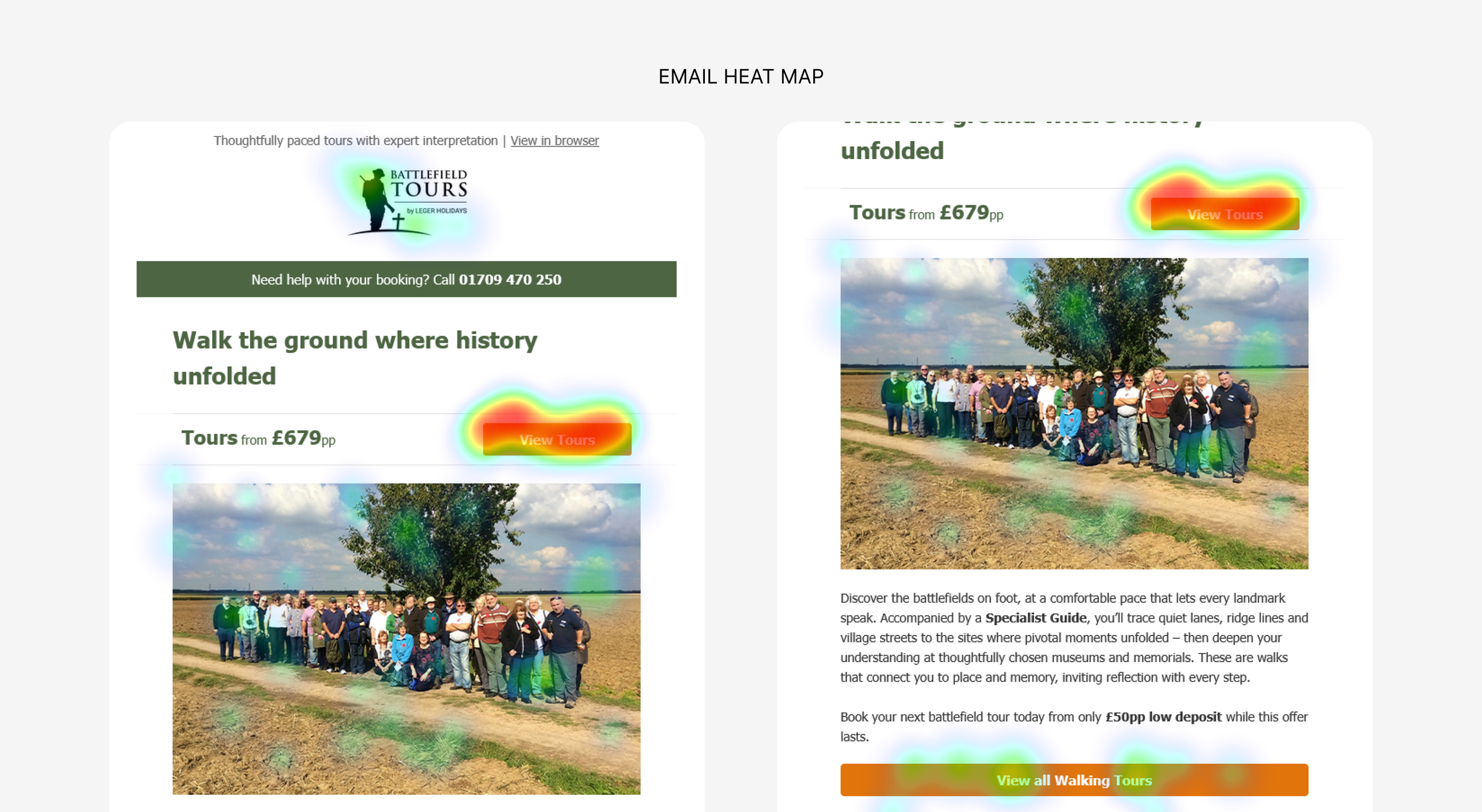
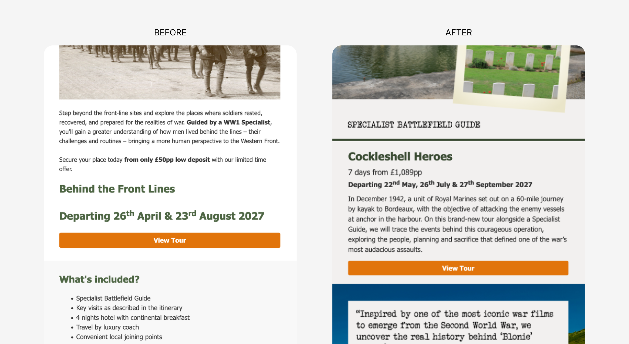
Introduced a clear top-down hierarchy, prioritising key details and CTAs above the fold, with improved grouping and visual separation between sections.
Rationale
Users rely on quick scanning to assess relevance. Improving hierarchy and visual separation reduces cognitive load & allows key information to be understood immediately.
2
Strengthening Trust & Reassurance
Problem
Limited visibility of testimonials and trust signals reduced confidence in a high-consideration purchase.
How might we
How might we build trust earlier in the email to support confident decision-making?
Solution
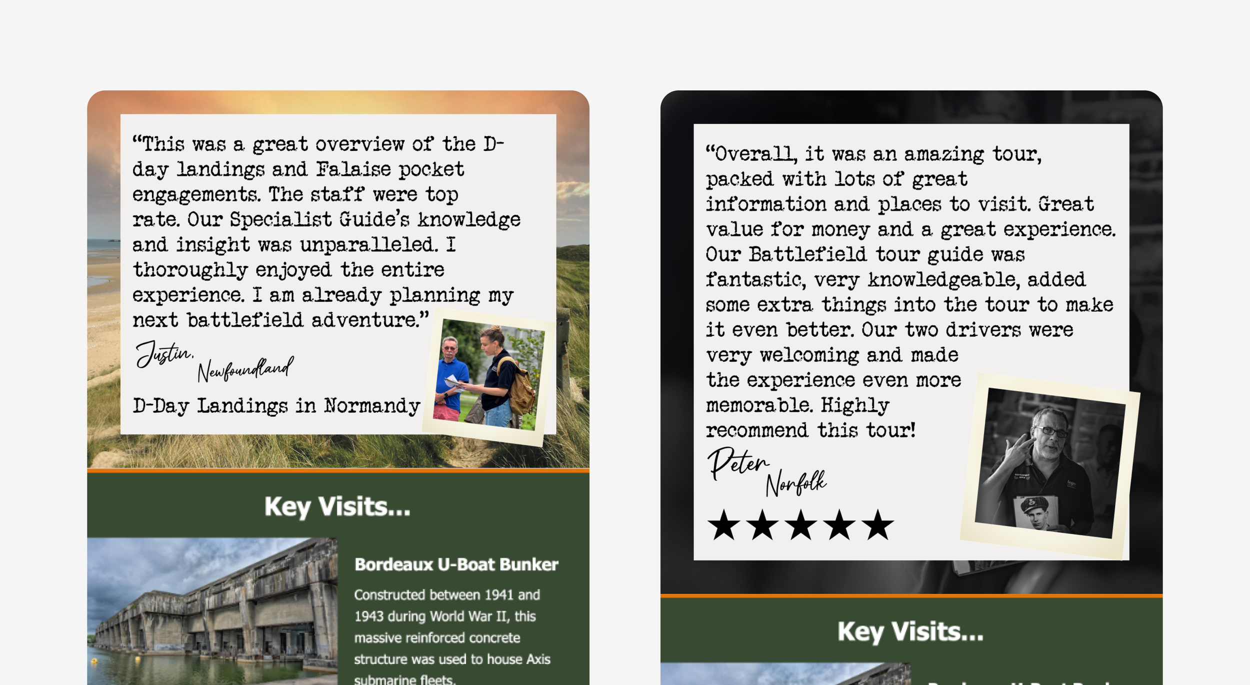
Added prominent testimonials, reassurance messaging, and trust markers throughout the email.
Rationale
Users require reassurance before engaging further. Surfacing trust signals earlier helps reduce uncertainty and increases confidence.
3
Increasing Emotional Engagement
Problem
The visual design did not reflect the emotional and historical significance of the tours.
How might we
How might we better communicate the meaning and value of the experience?
Solution
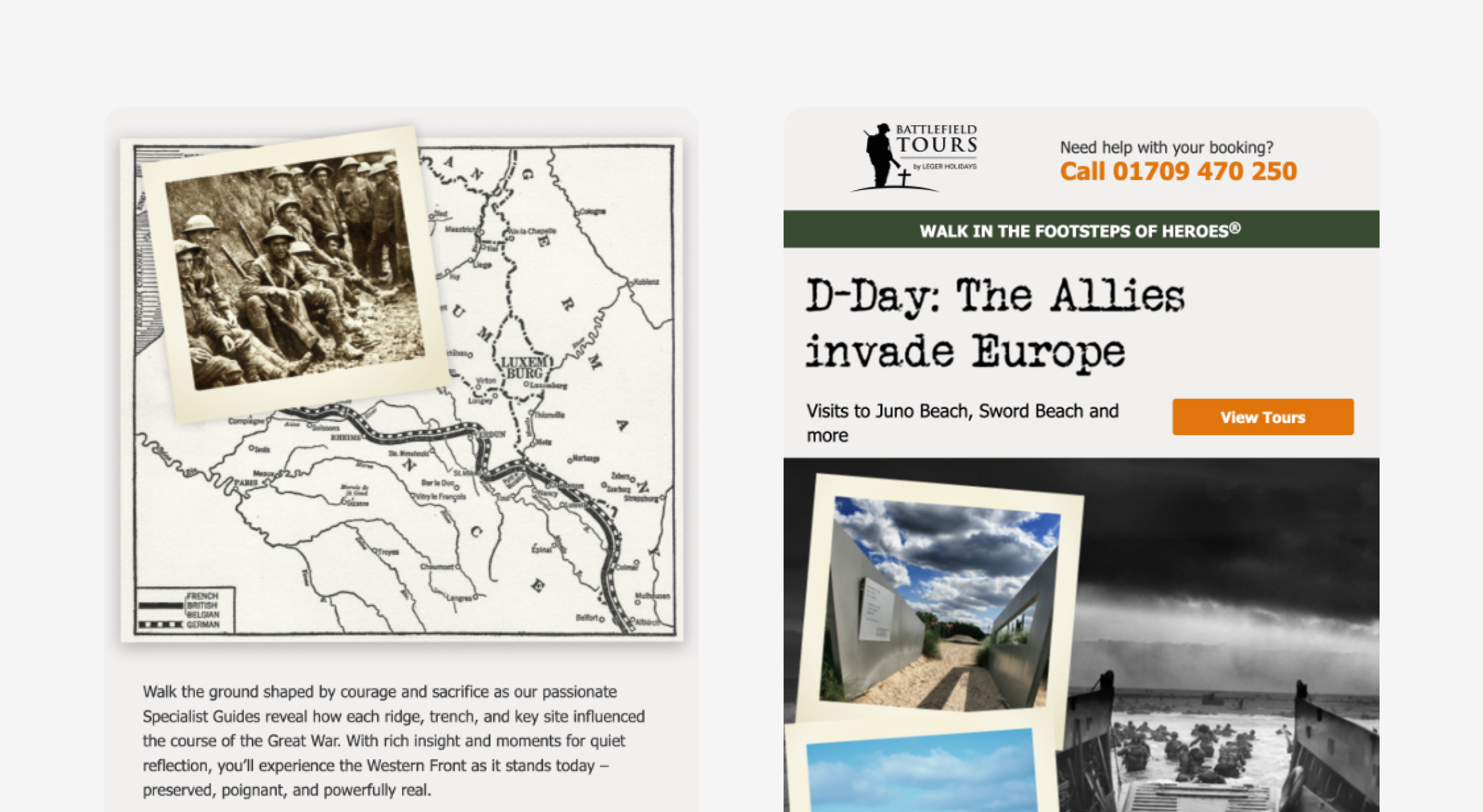
Aligned imagery and visual tone with the reflective and historical nature of the tours. This included typewriter font and old polaroid image elements.
Rationale
Emotional connection plays a key role in engagement. Aligning visuals with the experience helps users connect more deeply and perceive greater value.
4
Supporting Efficient Decision-Making
Problem
Users were required to interpret large amounts of information before understanding whether a tour was relevant, slowing down decision-making and increasing drop-off.
How might we
How might we help users quickly assess relevance and decide whether to engage further?
Solution
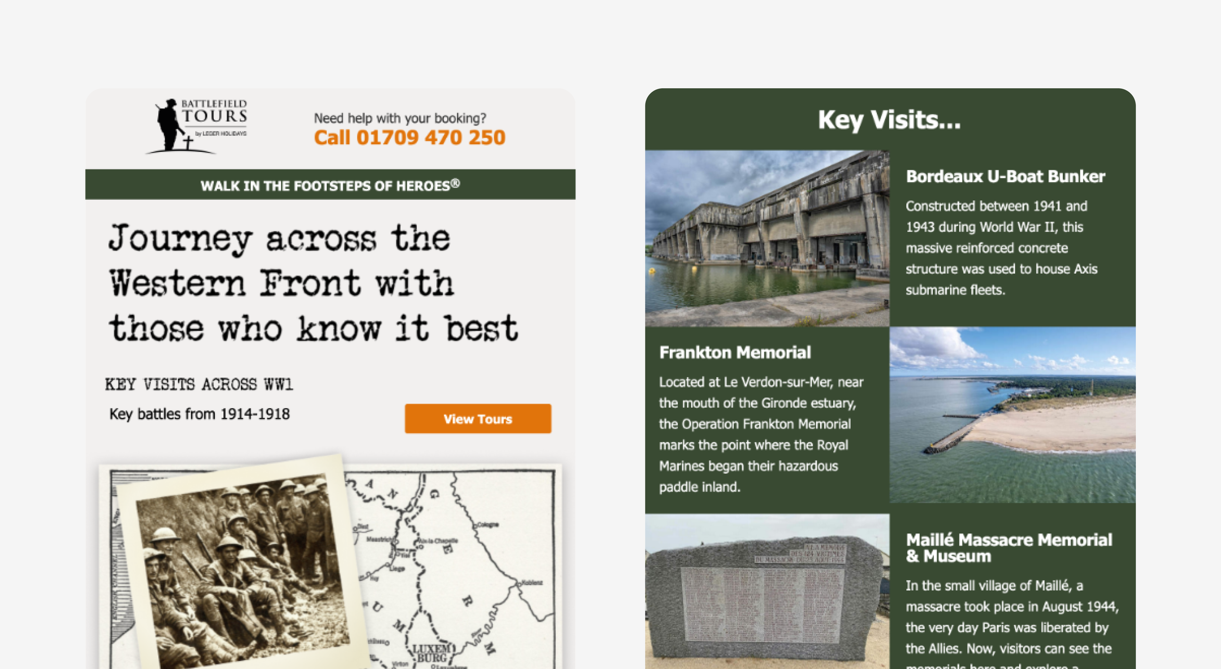
Structured content to highlight key decision-making information early, including key visits, and clear calls to action.
Rationale
Users need to quickly determine whether a tour is relevant before committing time to deeper exploration. Supporting fast, informed decisions reduces friction and improves engagement.
OUTCOME
OUTCOME
Enabling Clearer, More Confident Decisions
The takeaways and results
Clearer structure and stronger trust signals led to increased engagement and improved overall performance.
Battlefield tours saw a business uplift from -9% YoY to a +27% growth.
Engagement improved as CTR improved by 56.9% YoY and +45% WoW.