Mini-Breaks Campaign Identity
The Mini-Breaks project was developed as part of a wider strategy to boost customer acquisition for Shearings Holidays. While the core brand continued to perform well with existing customers, acquisition activity wasn’t delivering the growth needed—particularly among new and younger travellers. To address this, Shearings identified an opportunity to introduce a completely new product range designed specifically to attract first-time customers: Mini-Breaks.
I was tasked with creating the full campaign concept for this new range. The objective was to clearly communicate its key USPs from the outset: a streamlined pickup system with a maximum of seven local points to reduce travel time, budget-friendly 3-day breaks ideal for new travellers, and a curated selection of theatre and event options including shows like Tina Turner and ABBA.
Role
Designer
Tools
Adobe Photoshop, Adobe Illustrator, Adobe InDesign, Figma
DISCOVER
DISCOVER
Research
To launch Mini-Breaks successfully, I first conducted research to understand the target audience, competitive landscape, and opportunities for new customer acquisition. While Shearings’ core brand performed well with existing customers, acquisition growth had plateaued, highlighting the need for a fresh, compelling product aimed at first-time travellers.
I analysed trends in short-break travel, audience expectations, and competitor campaigns to identify what would make Mini-Breaks stand out. From this, I mapped out the key USPs of the new product:
Short, budget-friendly 3-day breaks ideal for first-time or time-conscious travellers
Simplified pickup system with a maximum of seven closely-located points to reduce travel time
Popular theatre and event experiences, including shows like Tina Turner and ABBA
Understanding these USPs helped shape the creative direction. By highlighting the benefits clearly and concisely, I could ensure the campaign would communicate why Mini-Breaks are unique, appealing, and easy to book, while informing design decisions for layout, hierarchy, and visual messaging across digital and offline channels.
DEVELOP
DEVELOP
Solution
I played a key role in shaping the creative concept, visual identity, and campaign assets for Mini-Breaks, collaborating closely with the marketing team to ensure alignment with business objectives.
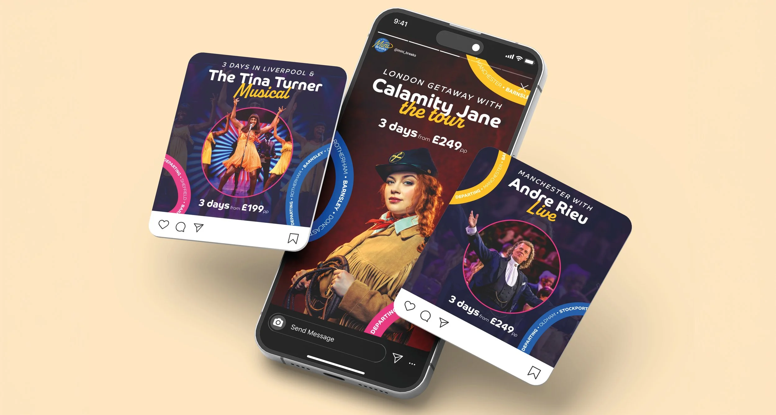
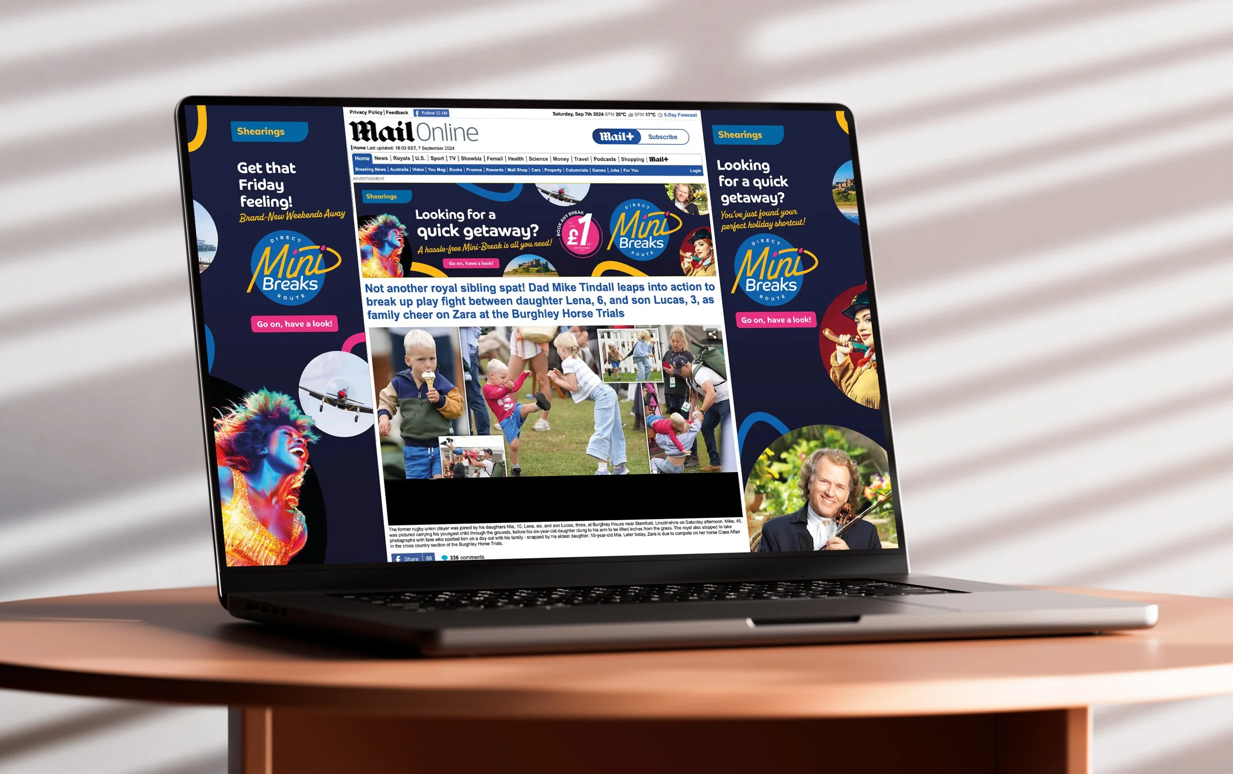
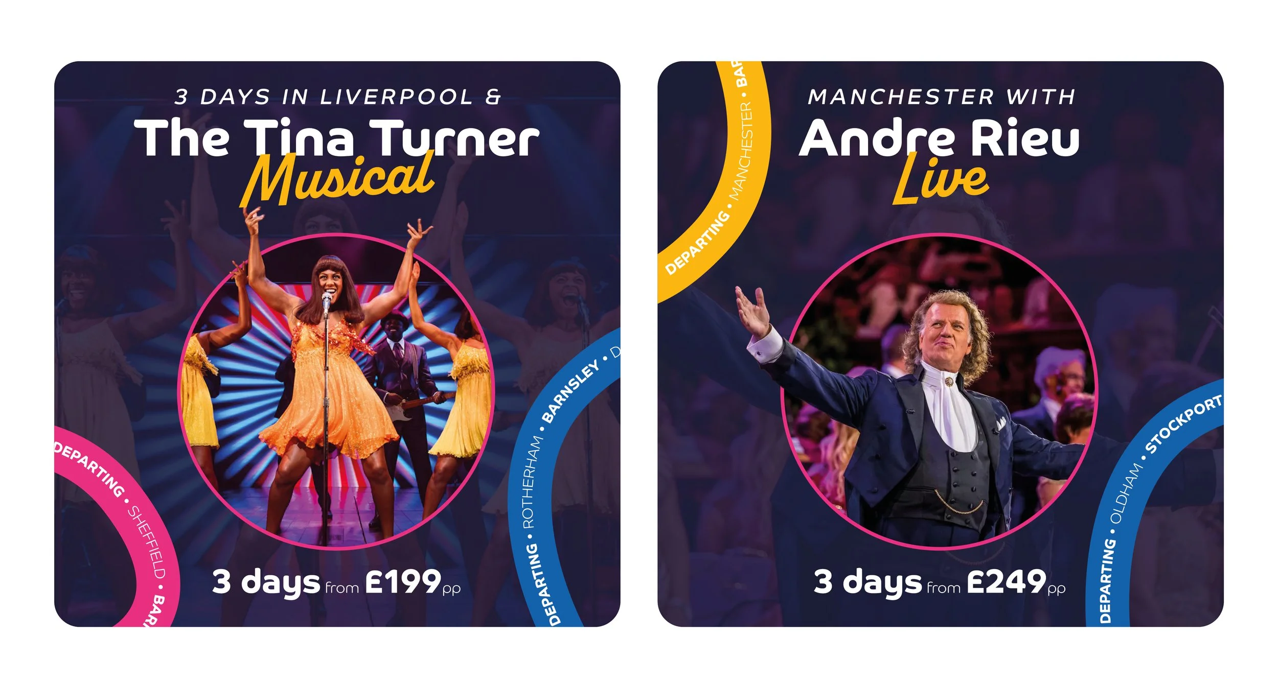
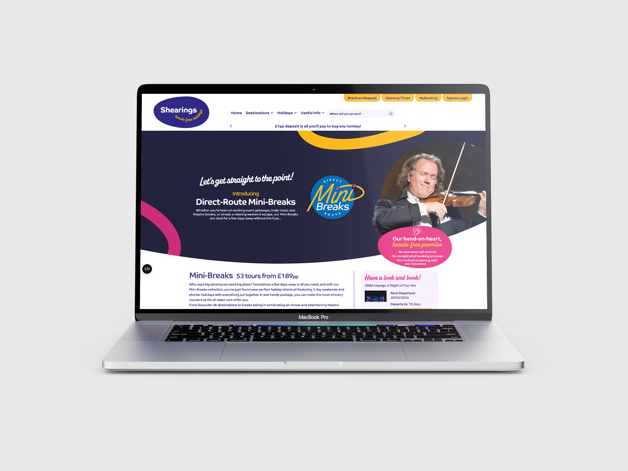
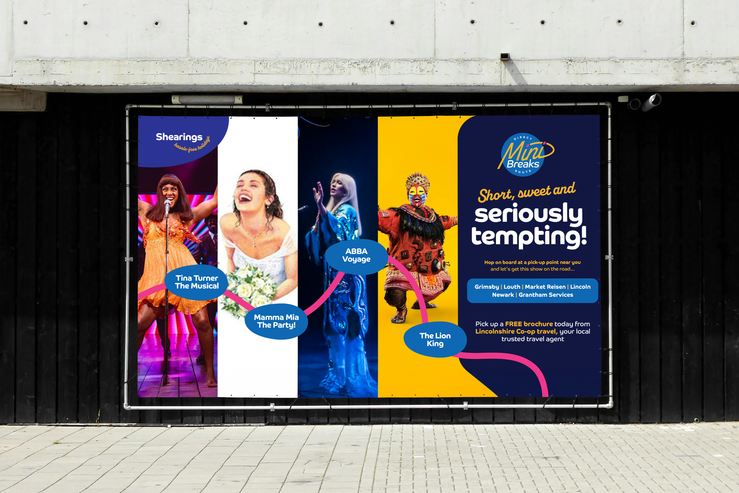
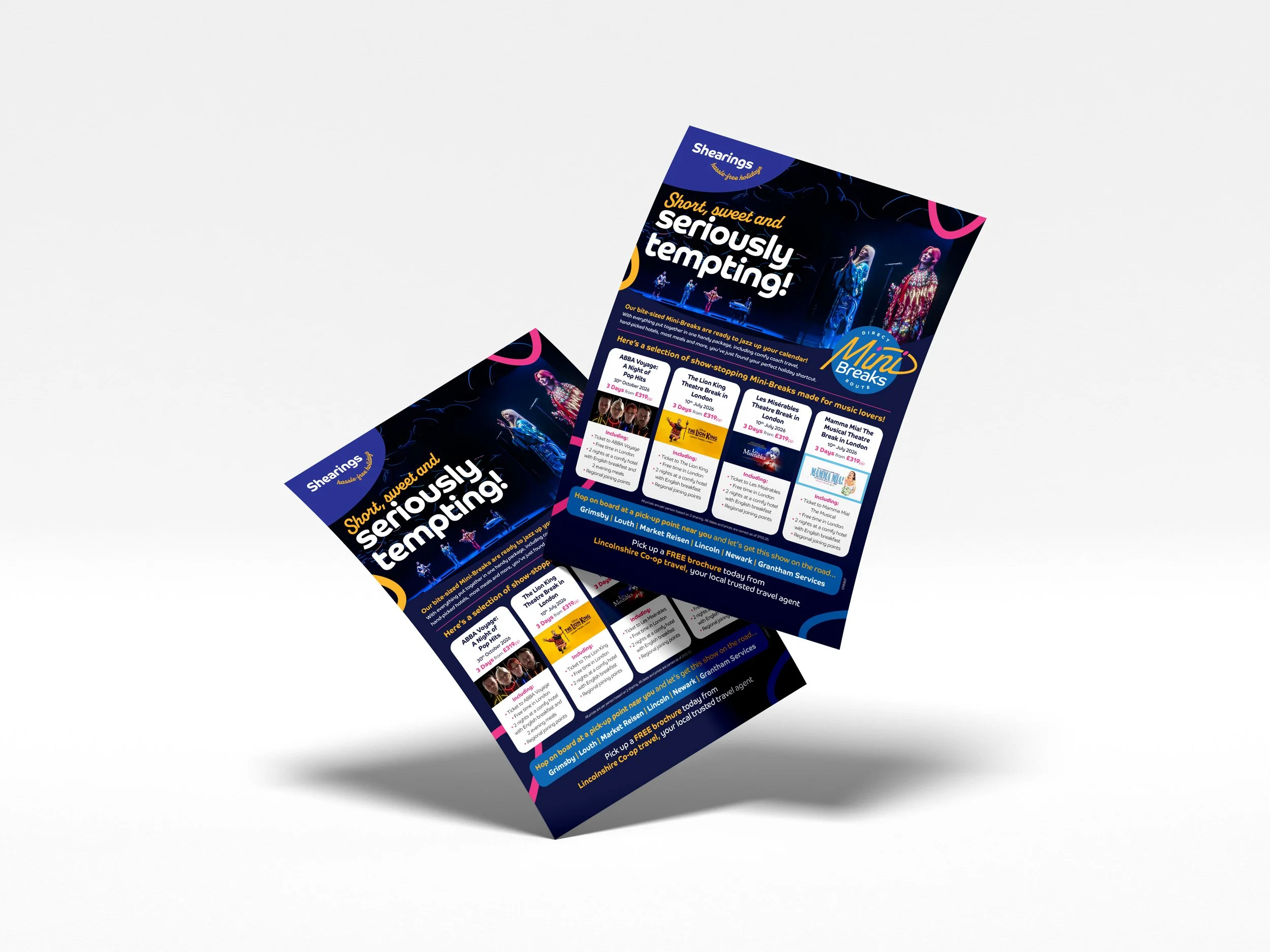
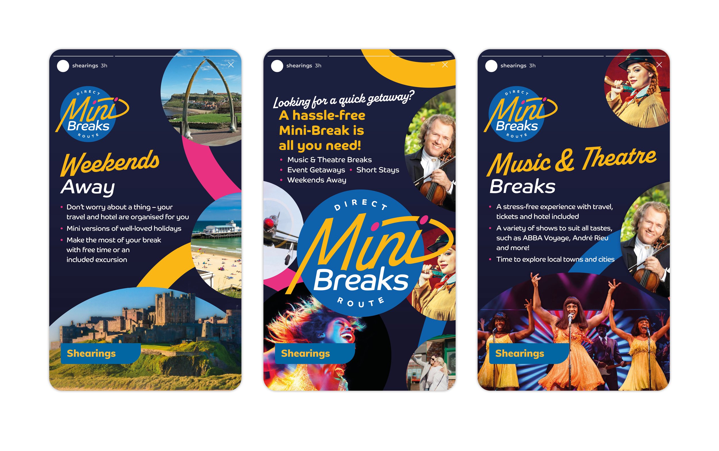
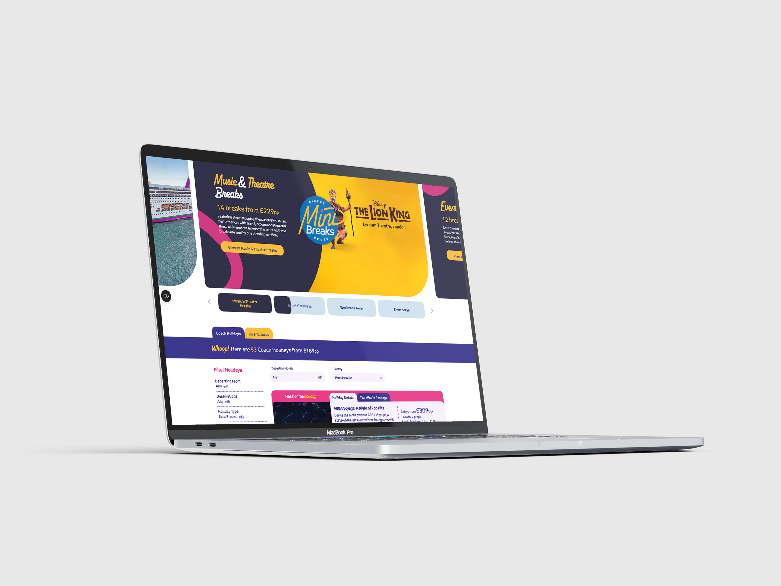
The logo concept, “Break Out”, is visually represented by a dynamic line breaking out of a circle, symbolising Mini-Breaks as a fresh, streamlined alternative to traditional coach tours. This breakout line is consistently applied throughout campaign visuals, reinforcing the idea of direct, convenient travel.
A playful script font paired with two dots subtly references the direct pickup route, while cut-out silhouettes within shapes formed by the breakout line add visual interest and engagement, particularly in upper-funnel paid social and search campaigns. Vibrant imagery of popular theatre and event experiences—such as Tina Turner and ABBA—further attracts attention and communicates the key USPs.
The direct-route pickup line is also reinforced via colourful, geo-targeted elements in ad corners, listing local pickup locations to subtly highlight convenience for the audience without distracting from the main messaging. This combination of bold design and UX-informed layout ensures the campaign is both visually striking and easy for new customers to understand.

Performance
and impact
The Mini-Breaks package has significantly boosted customer engagement and bookings, with 70% of mini-break bookers now being new customers, demonstrating strong appeal to first-time buyers.
Performance continues to grow year on year, with 85% growth versus 2024 and 180.9% versus 2023, highlighting the success of the updated offering and its effectiveness in attracting and converting new customers — with the potential to guide them into more profitable tours over time.