Battlefield Tours
A Multi-Touchpoint Battlefield Tour Redesign
Battlefield tours are a high-consideration travel product, combining historical depth with emotional sensitivity.
As revenue declined and performance weakened, friction across key touchpoints became evident. I led a redesign across areas such as email, paid social and brochure assets to improve visual hierarchy, reassurance and cross-channel consistency, supporting clearer progression toward conversion.
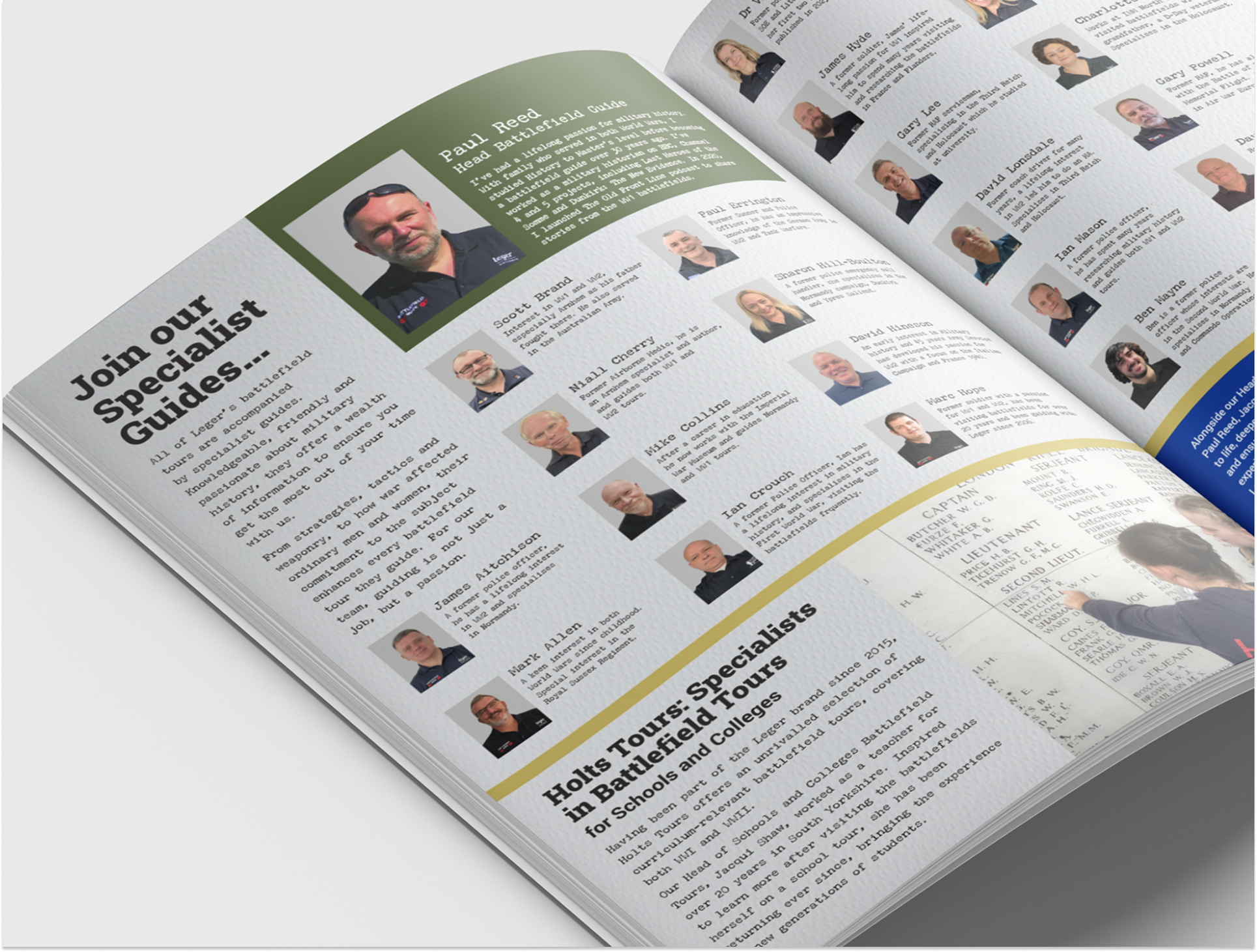
Roles
• Analysed customer behaviour across channels
• Redesigned email journeys for improved UX
• Designed paid social creative to align with parts of the funnel
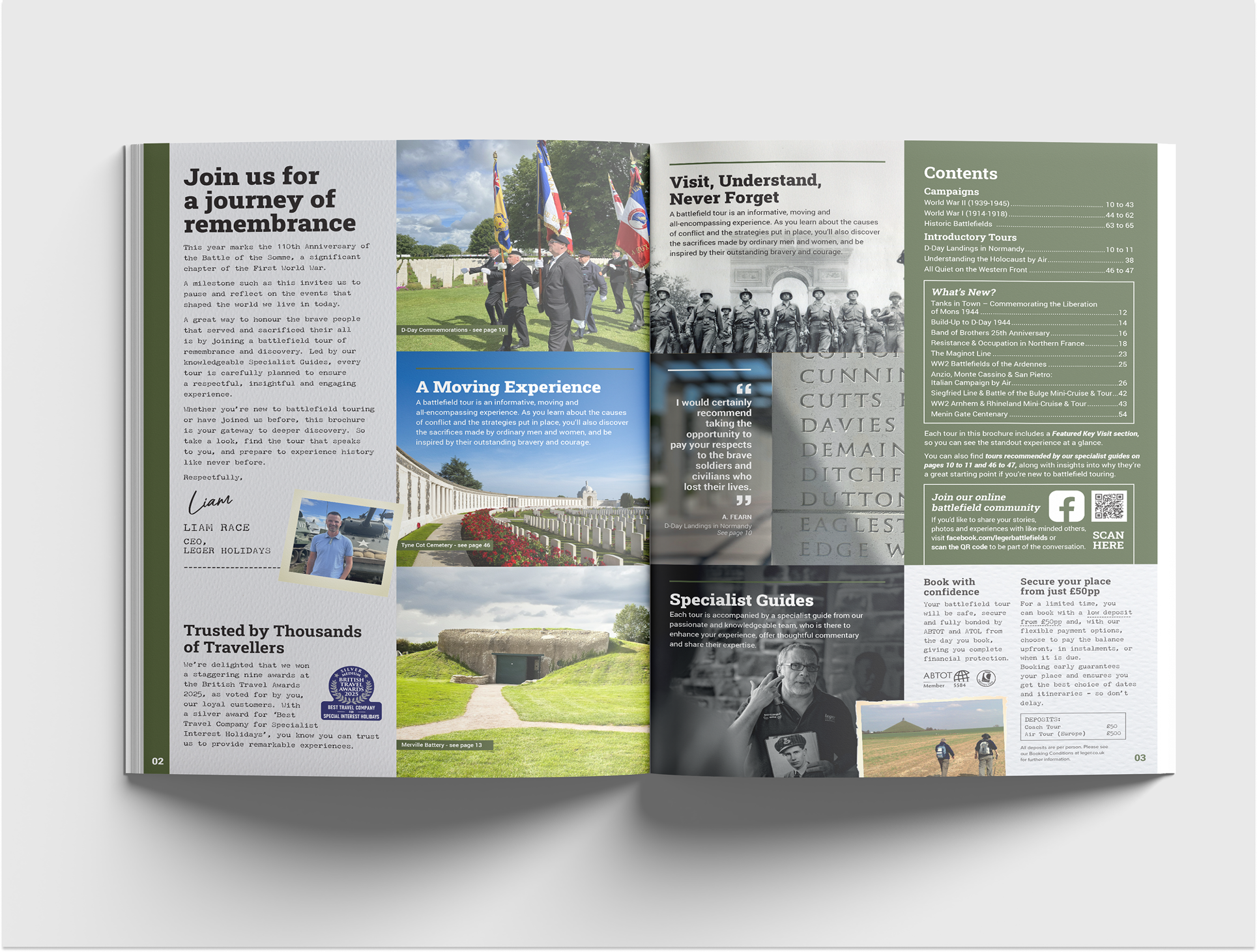
• Created a brand-new brochure experience
Tools
Figma Design
Figma Buzz
Adobe Photoshop
Adobe InDesign
FigJam
AT A GLANCE
AT A GLANCE
-
![META Advert]()
META Advert
-
![Email UI]()
Email UI
-
![Brochure]()
Brochure
-
![Brochure]()
Brochure
Project at
a glance
Battlefield tour engagement was declining, with underperforming digital touchpoints and an inconsistent experience across the customer journey. I redesigned the email experience, improved paid social assets using thumb-stopping best practices, and introduced a new brochure design to create a clearer and more engaging journey when exploring the tours.
A more considered content approach and a simpler, clearer presentation of information helped highlight key battlefield visits and improve scanability. Together, these changes helped customers more easily understand the value of each tour and move more confidently towards booking, reversing performance from –26% year-on-year to +27% year-on-year growth across the experience.
PROBLEM
PROBLEM
The problem
Battlefields is currently showing a 26% decline in turnover year-on-year, highlighting a need to understand the factors affecting performance. Despite last year’s strong results, current trends suggest challenges in maintaining customer engagement and revenue growth, which prompted a deeper analysis of the brand’s positioning, user experience, and market response.
-26% YoY
Turnover has dipped 26% compared to last year, spotlighting a clear challenge for the brand.
DISCOVER
DISCOVER
We began by understanding who Battlefield tour customers are. They are a high-consideration audience interested in history, reflection, and meaningful travel experiences, ranging from first-time visitors to enthusiasts with deep knowledge of battlefields and memorials.
Key findings:
Want to know which sites and memorials are included, with clear focus on key visits, cemeteries, and historical landmarks
Value knowledgeable guides who can provide context, stories, and expert insight
Often follow their own personal or family history as part of the reason for visiting
Need reassurance around trust, organisation, and support while travelling
Seek immersive yet authentic imagery that reflects the historical and emotional nature of the tours
Appreciate clarity on guided experiences, expert talks, and tour structure
Average age of 59
Who are the Battlefield
customers?
Journey & Touchpoint Consistency
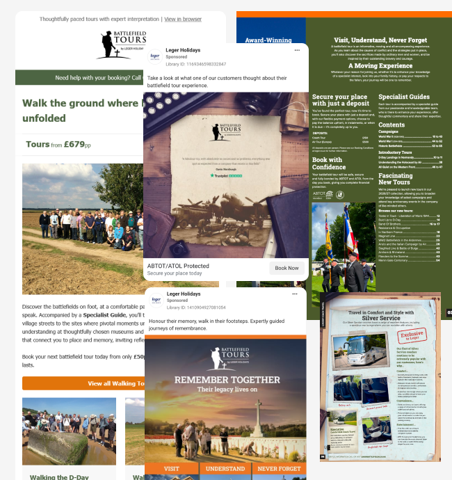
Many touchpoints, social, email, website, and brochures – were not visually aligned, creating a disjointed experience. Addressing this inconsistency became a focus to strengthen trust and create a cohesive journey.
To understand the current experience, we conducted an audit of the existing email along with usability testing and surveys. The audit highlighted usability issues, content gaps, and opportunities to improve trust, clarity, and engagement.
Key findings:
Hierarchy & Scanability: Important content and calls to action were not prominent, making it difficult for users to quickly identify key destinations and actions.
Visual Design: Inconsistent styling and layout made the email feel disjointed and reduced overall cohesion with other touchpoints.
Trust & Reassurance: Customer testimonials and social proof were missing or buried, offering little reassurance for high-consideration trips.
Content Clarity: Key information (dates, locations, accommodation details) was not surfaced early enough, creating friction in decision-making.
Font Size & Readability: Small and inconsistent font sizes reduced readability, especially for users with lower digital confidence, impacting scanability.
Engagement & Emotional Connection: The visual style did not reflect the historical and emotional nature of battlefield tours, limiting emotional engagement.
These findings informed the redesign priorities, focusing on improving trust, clarity, readability, visual hierarchy, and emotional engagement, while aligning the email with the broader customer journey.
Existing Email Audit
DEFINE
DEFINE
“It’s important to see the key places that connect to my family’s history, that’s why I choose these tours.”
Battlefield Customer
Defining the problem
Despite offering specialist holidays, the email experience made it hard for users to quickly see value, trust the brand, and take the next step. Cluttered layouts and inconsistent design created friction, reducing engagement and progression.
Focus areas:
Strengthen trust and reassurance for a high-consideration purchase
Improve visual hierarchy to make content easier to scan
Increase prominence of key visits, cemeteries and other points of interest
Create a more engaging visual experience aligned with the historical theme
Increase accessibility and legibility
Ensure consistency across multiple touchpoints and channels
DESIGN
DESIGN
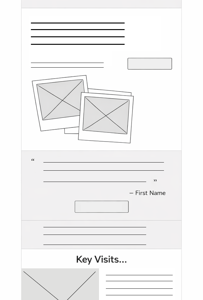
Lo-fi &
Wireframing
I began the redesign process with low-fidelity wireframes to quickly test layout, hierarchy and content prioritisation. These lo-fi prototypes allowed for rapid iteration on email structure, CTA placement and visual flow before committing to higher fidelity visuals.
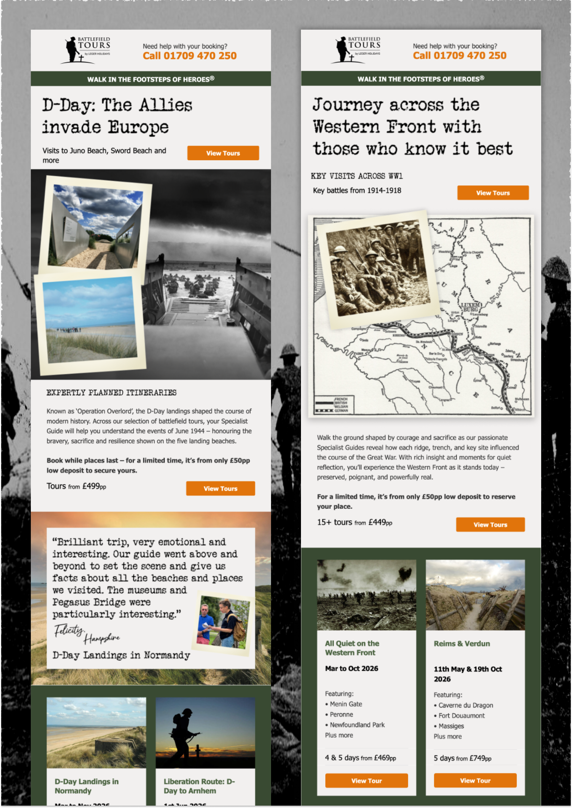
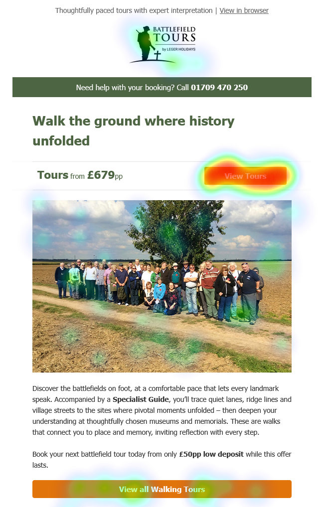
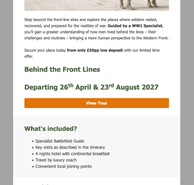
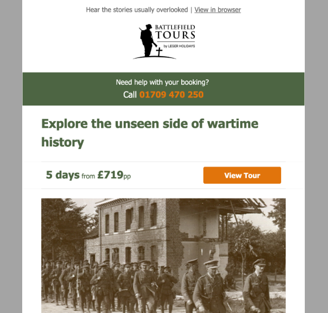
Key Improvements - Email
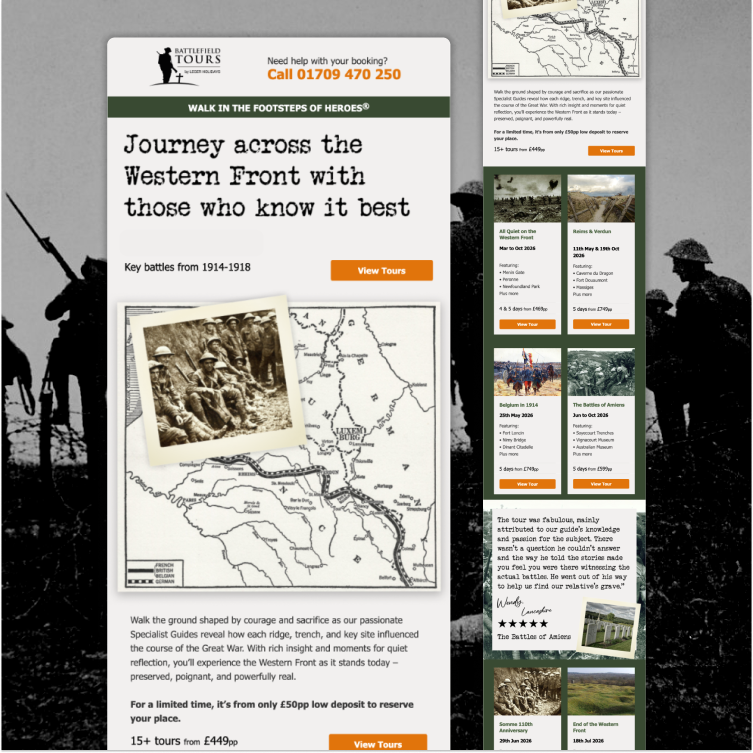
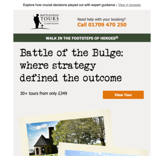
The redesign focused on improving trust, scanability and visual hierarchy. Targeted changes helped highlight key visits and memorials, strengthen reassurance, and make the email easier to navigate.
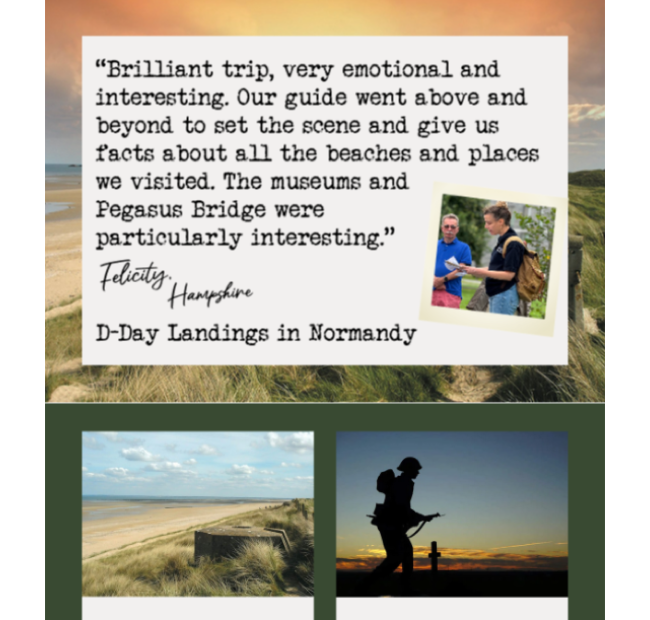
Customer Testimonials
Added customer testimonials to increase trust and reassurance for a high-consideration purchase.
Before
After
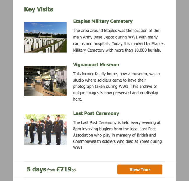
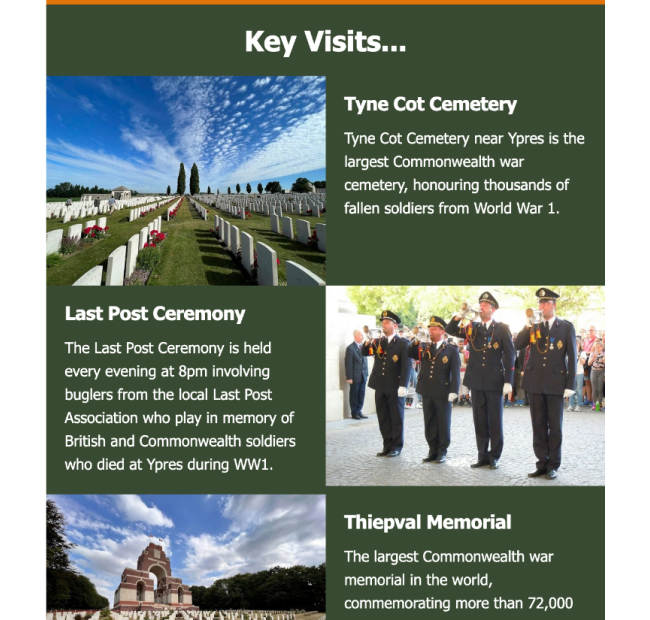
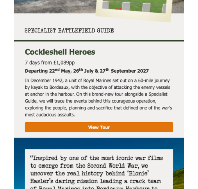
Key Visits & Memorials
Increased image prominence and spacing to make key visits, cemeteries and memorials easier to identify and compare.
Before
After
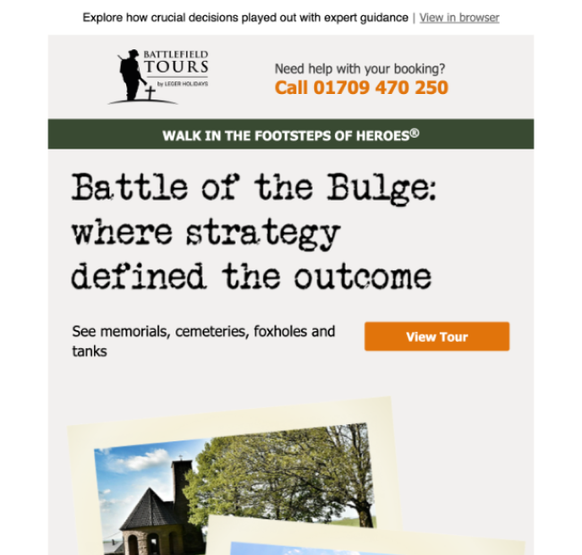
Visual Hierarchy
Refined colour and typographic hierarchy to guide attention toward key information and calls to action.
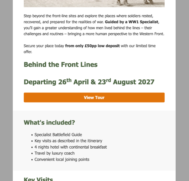
Before
After
Engaging Visual Style
Introduced typewriter visual elements to better reflect the historical nature of the tours and strengthen engagement.
Before
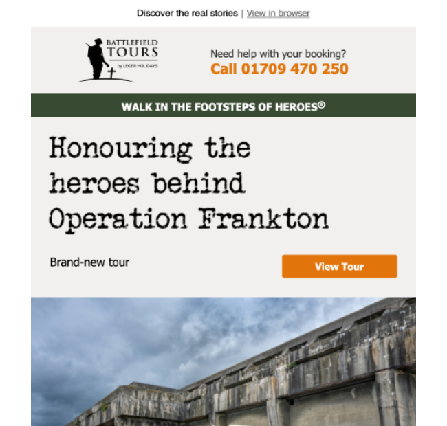
After
Testing
A/B testing showed that clearer hierarchy, larger imagery and improved readability helped users engage more easily with key visits such as memorials and cemeteries. Longer introductions and multiple polaroid-style images were less effective, so the design was simplified to focus on a single strong hero image and quicker access to key tour information
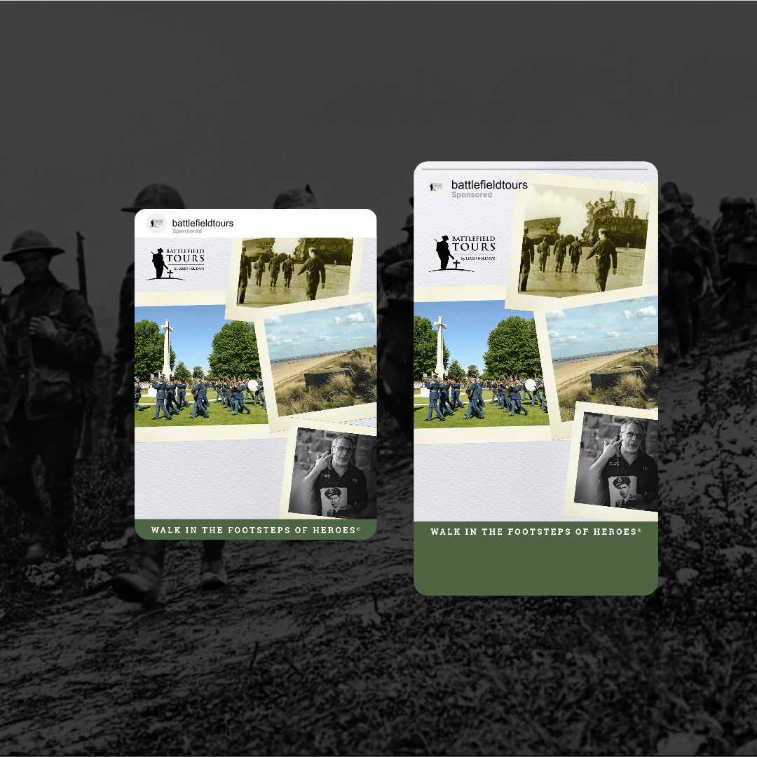
Key Improvements -
META adverts
Paid social acts as a key discovery touchpoint for Battlefield tours. I redesigned the Meta ads using thumb-stopping social best practices, improving imagery and messaging clarity while introducing subtle animation to help capture attention in the feed and better highlight key battlefield visits.

RESULT
RESULT
Performance & Impact
At the week commencing 12th January 2026, the brand was 26% down YoY. With targeted interventions and improvements, by the week commencing 9th February, turnover had rebounded to 27% up YoY, showing a rapid and measurable shift in performance.
+27% YoY
Turnover surged following targeted interventions, highlighting the impact of improvements.