First for Bridge
First for Bridge is a specialist tour operator offering hosted bridge holidays and events for players of all levels.
With low click-through and limited progression from email to site, the journey showed clear friction.
I improved the end-to-end user experience by analysing customer behaviour and redesigning the email experience for clarity, confidence and progression, then extending a consistent design system across email, web, social and print.
UX-Led Email & Creative
System Redesign
Roles
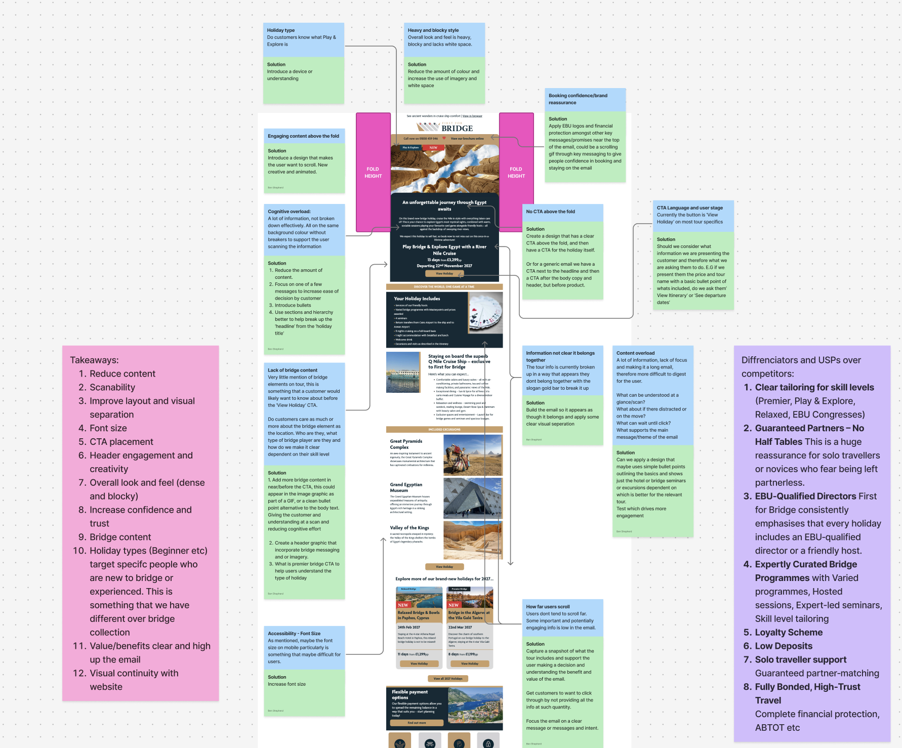
UX audit of existing email communications
Performance analysis and iteration
Email UX & UI redesign
Creation of a reusable visual system
Tools
Figma Design
Figma Buzz
Adobe Illustrator
Dot Digital
FigJam
AT A GLANCE
AT A GLANCE
Project at
a glance
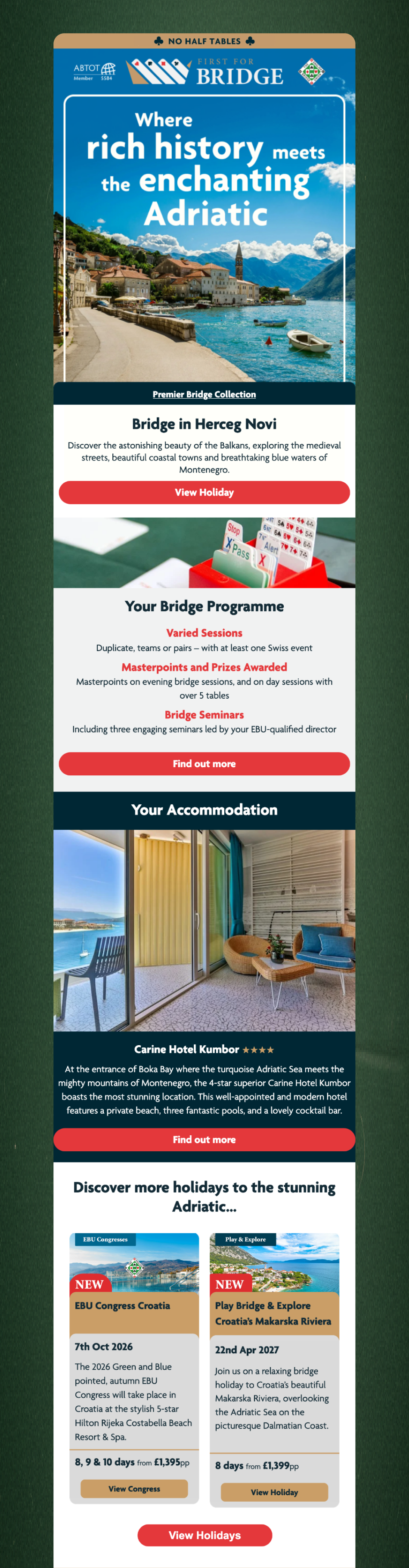
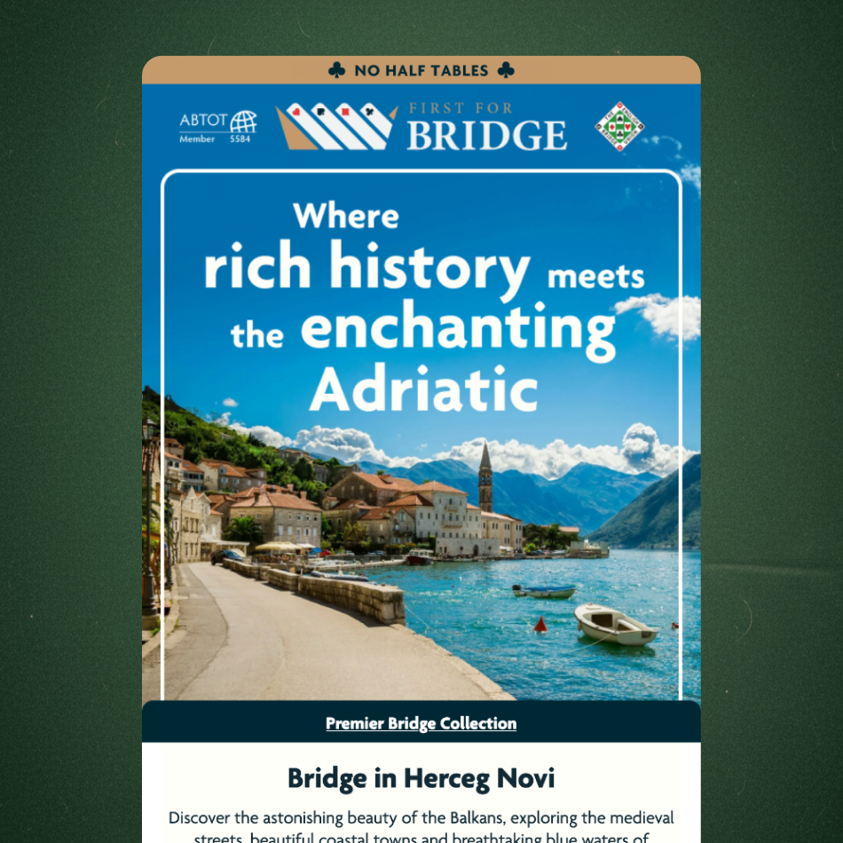
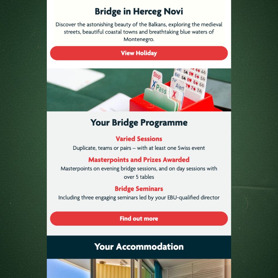
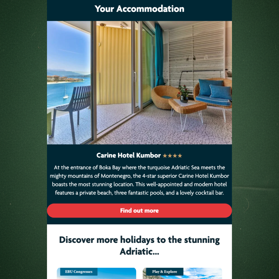
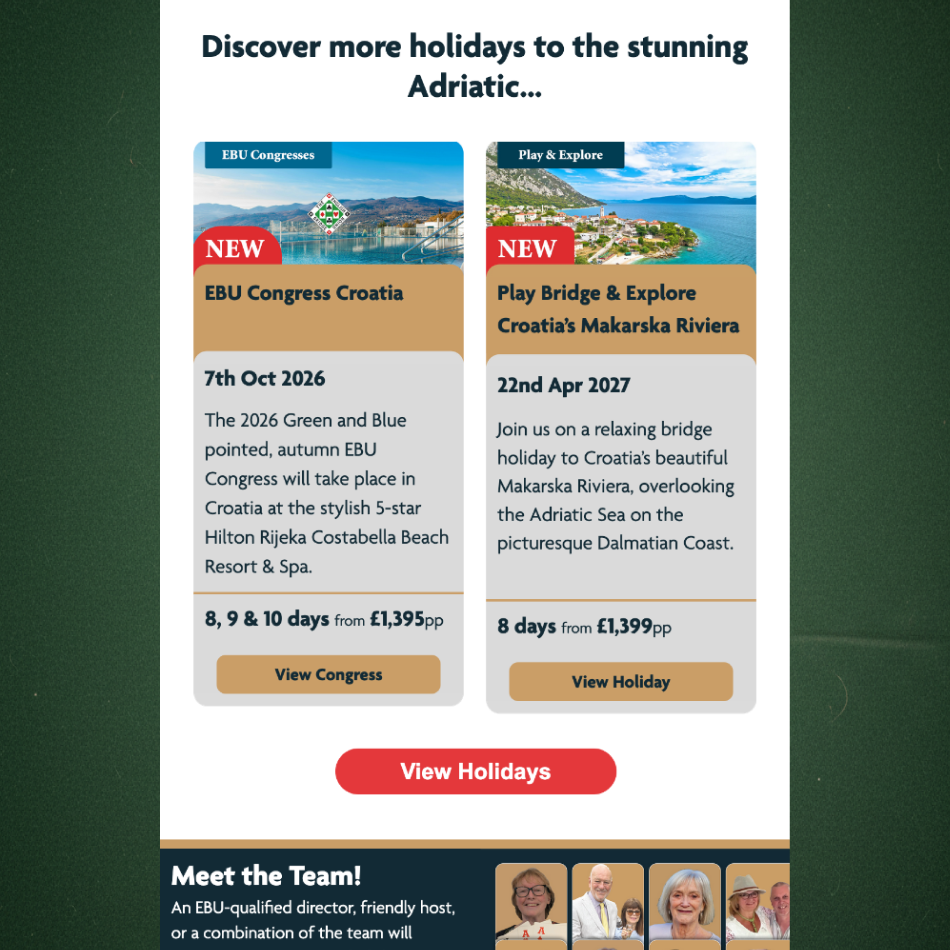
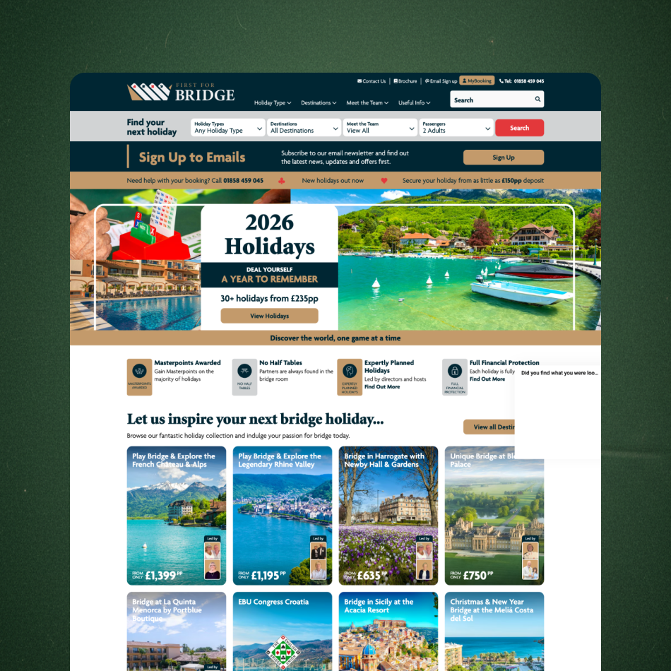
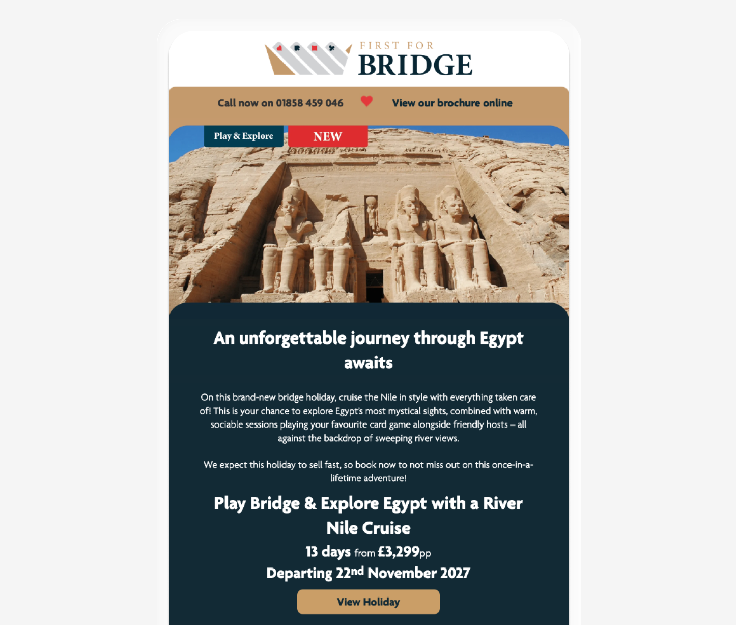
First for Bridge emails were underperforming, with low click-through and limited progression to the website, and the overall experience felt dense and inconsistent. I redesigned the email UX to reduce cognitive load, improve scanability and accessibility, and introduce a simplified creative system across email, web, social, and print.
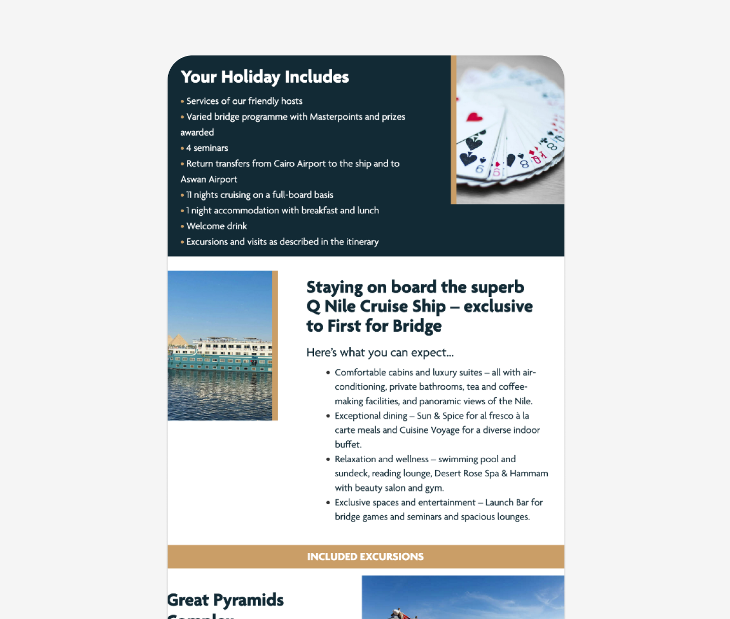
Simplifying the layout and prioritising key holiday types, bridge programmes, and benefits made it easier for users to understand each trip, build confidence in the brand, and move toward booking, improving engagement across the journey, reversing performance from -21.4% YoY to +56.9% YoY, with +45.8% WoW improvement in click-to-open rate.
Outcomes
PROBLEM
PROBLEM
The problem
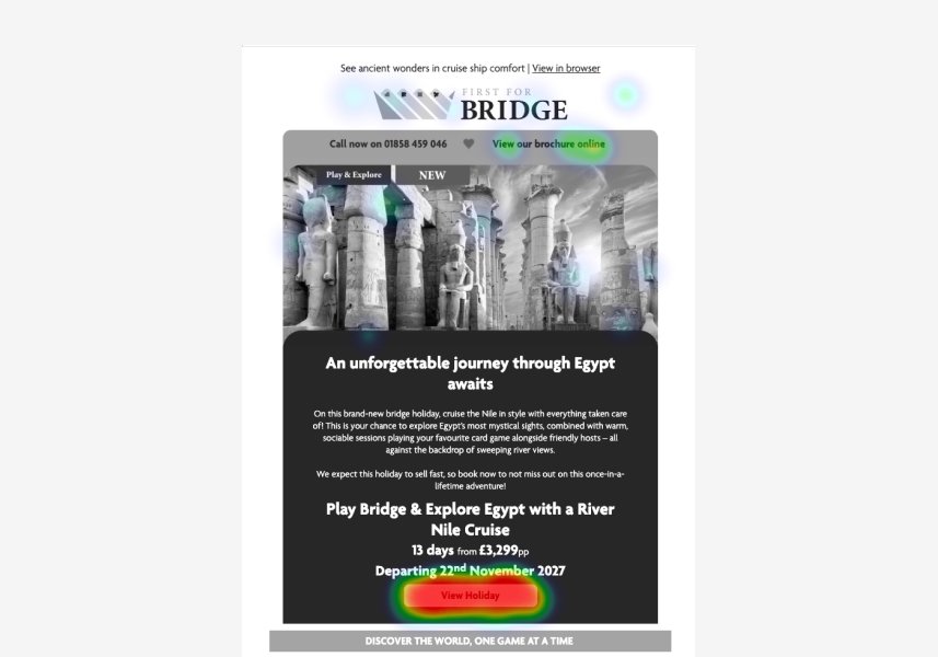
The existing email experience suffered from:
Poor visual hierarchy and dense layouts
Low scannability, especially on mobile
Inconsistent look and feel across campaigns
Unclear primary actions and competing CTAs
Limited trust and reassurance at key decision points
This created unnecessary friction for users and reduced engagement with otherwise high-intent content.
-21.4% YoY
Before the interface update, the brand was experiencing a significant decline in audience interaction, the KPI metric of Click-to-Open Rate (CTOR) had dropped by over 21% Year-over-Year.
DISCOVER
DISCOVER
Who are the First for Bridge
customers?
We began by finding out who the First for Bridge audience is.
We found it serves a predominantly older, hobby‑led audience with varying digital confidence, from beginner players discovering bridge holidays for the first time to experienced players seeking specialist tournaments and community.
Key findings:
Quickly understanding who each holiday is for (beginner, intermediate, experienced)
Clear explanation of what’s included and overall value
Reassurance around trust, organisation and support while travelling
Confidence in the quality of the hotel and accommodation
Inspiring but straightforward imagery that shows the experience
Key details (dates, locations, price/value) surfaced early
Clear visibility of what the bridge programme consists of (schedule, tournaments, teaching/expert, social play)
Audit of existing
email interface
I analysed existing emails using heatmaps, click data and journey tracking to understand how users moved from inbox to website. I also reviewed layouts, content structure and collaborated with stakeholders to surface known friction points.
Key findings:
Emails were dense and difficult to scan
Block-heavy layouts reduced hierarchy and clarity
Small font sizes impacted readability for older users
CTAs were inconsistent and easy to miss
Headers lacked engagement and context
Value and benefits appeared too low in the scroll
Weak segmentation between beginner and experienced players
Visual mismatch between email and website
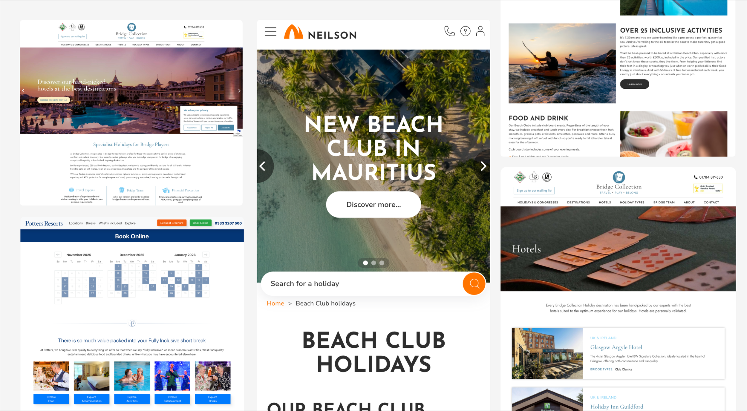
Competitor research
A review of comparable hobby and bridge holiday brands helped benchmark expectations and identify opportunities.
Key findings:
Simpler, cleaner layouts with less visual noise and fewer competing messages
Clear confidence indicators (reviews, guarantees, inclusions) surfaced early
More straightforward navigation and content structure
First for Bridge showed a stronger niche USP through its varied bridge holiday types and specialist programmes, but this value wasn’t always communicated clearly
DEFINE
DEFINE
Defining the challenge
Despite strong, specialist holiday offerings, the email experience made it difficult for users to quickly understand value, trust the brand and confidently choose their next step. Dense layouts, weak hierarchy and inconsistent design created friction between email and site, resulting in low engagement and lost progression.
Focus areas:
Reduce content and cognitive load
Improve scanability and visual separation
Strengthen hierarchy and CTA placement
Surface value propositions earlier
Increase accessibility and legibility
Introduce clearer segmentation by holiday type and skill level
Create visual continuity across touchpoints to build confidence
DESIGN
DESIGN
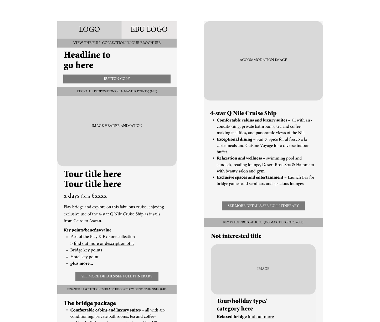
Lo-fi & Wireframing
I began the redesign process with low-fidelity wireframes to quickly test layout, hierarchy and content prioritisation. These lo-fi prototypes allowed for rapid iteration on email structure, CTA placement and visual flow before committing to higher fidelity visuals.
Testing
Through a series of A/B tests, we moved away from assumptions and let user behaviour dictate the new interface strategy. The testing phase revealed critical insights into how the audience actually navigated the content.
Key insights:
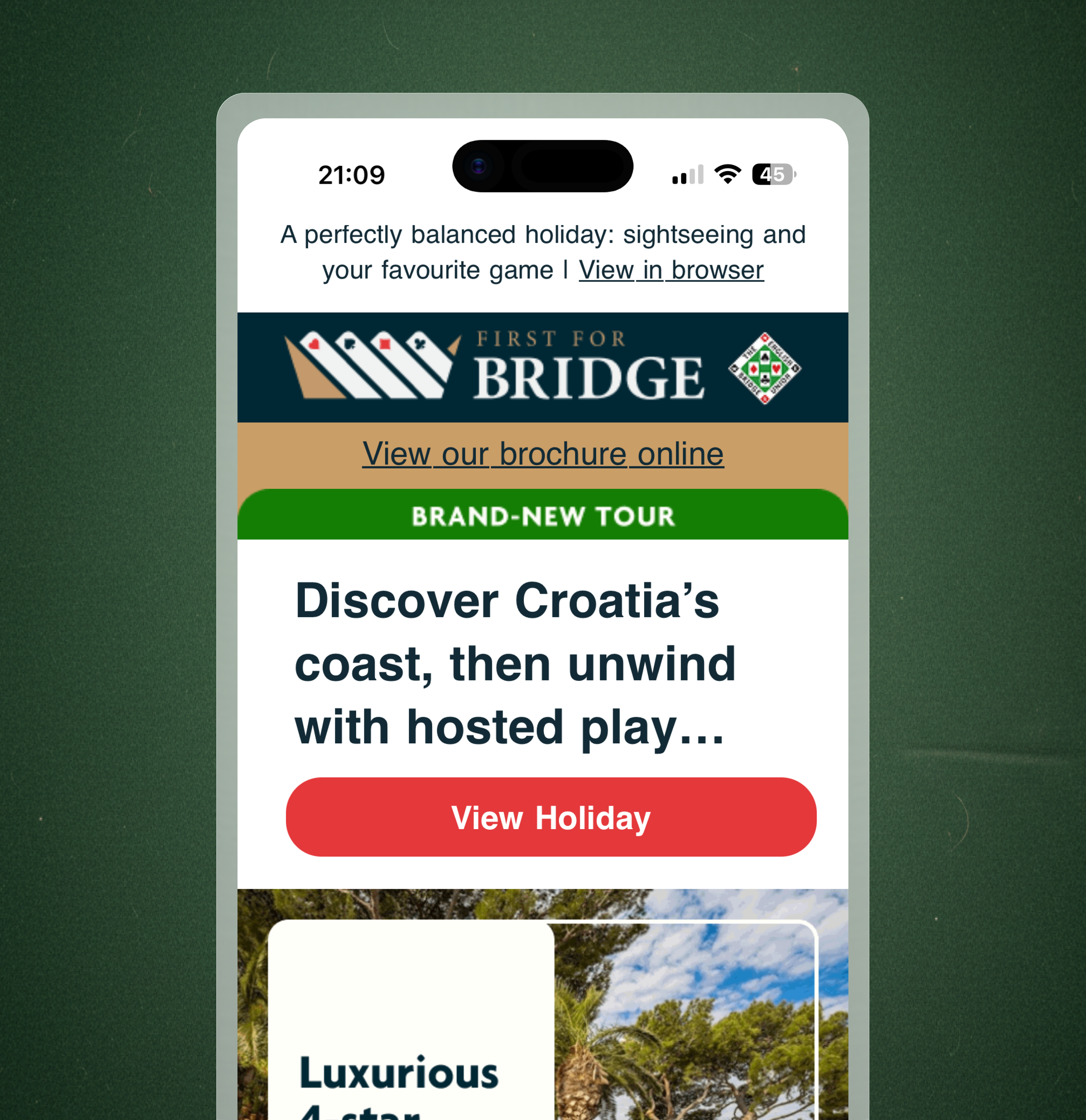
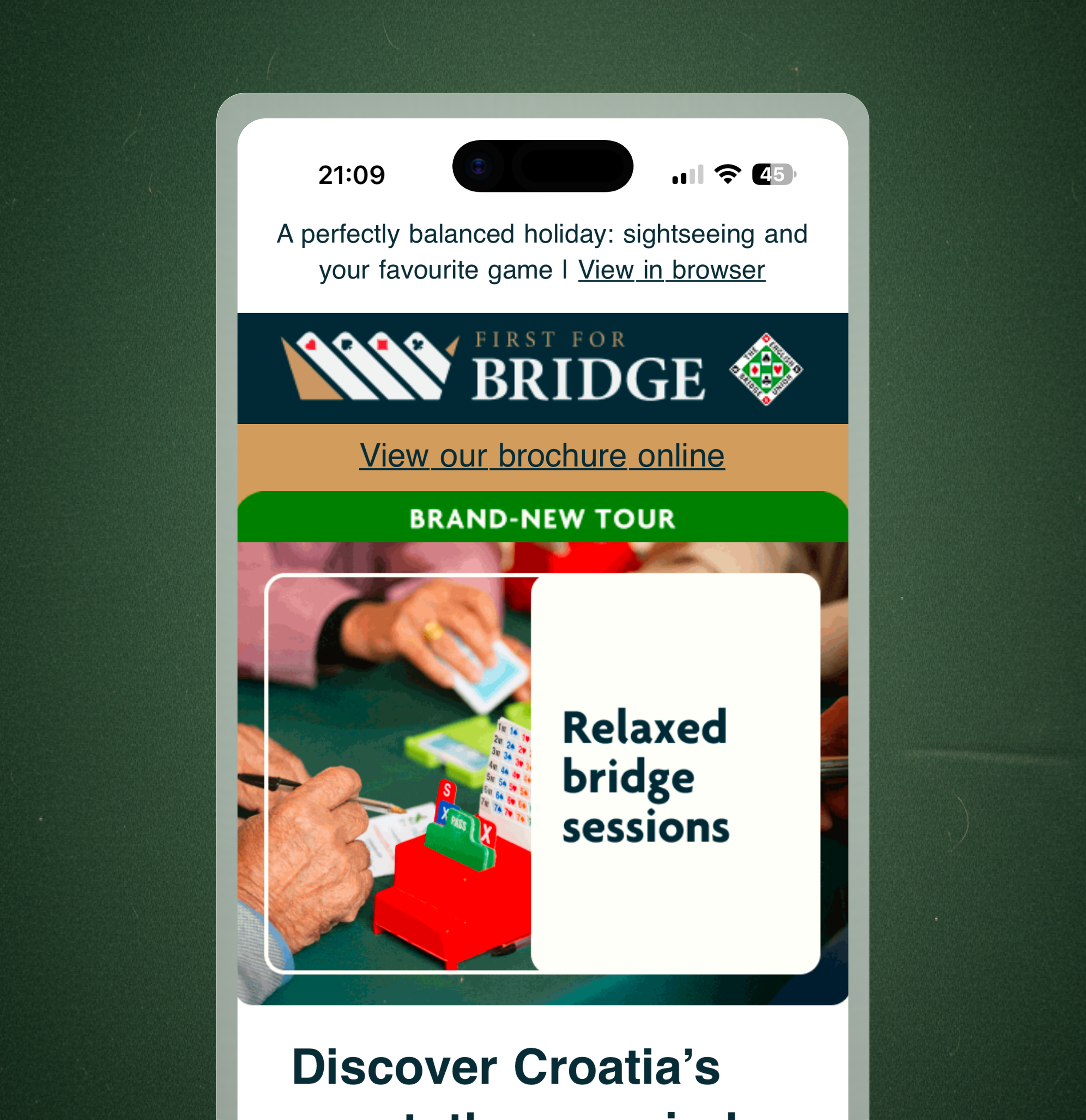
We found that a singular, engaging header image paired with concise copy drove higher engagement than long-form, descriptive text.
Tests on content density proved that reduced, "scannable" content led to higher-quality click-throughs.
RESULT
RESULT
Outcome and results
The user experience improvement and redesign moved the interface toward a simpler UI with various creative options for above the fold. Comparing the performance against both the previous year and the period immediately before the launch shows that the structural changes improved how users interact with the content.
+45.8% WoW
Click-to-Open Rate WoW: +45.8%
+56.9% YoY
Click-to-Open Rate YoY: +56.9%