Rail Holidays by Leger
A poor performing product
design solution
Rail Holidays, part of the Leger Holidays product range, was significantly underperforming. I was tasked with collaborating with the Product Team and Web Manager to lead the direction for improving revenue and engagement by redesigning the on and offline product presence.
My role involved assessing the key issues behind the product’s poor performance and identifying opportunities to strengthen the customer experience and journey when searching for a Leger rail holiday, and the overall sub-brand positioning and core messages.
Roles
• Analysed customer behaviour across channels
• Researched competitors to find gaps and identify our value proposition
• Created a brand-new brochure experience influencing other outputs
Tools
Figma Design
Adobe Photoshop
Adobe InDesign
Adobe Illustrator
DISCOVER
DISCOVER
We conducted some internal research and analysis by looking into the current package offering including the website and printed brochures. We organised meetings with internal staff and stakeholders to try and identify pain points and gain any insights.
Pain points & insights
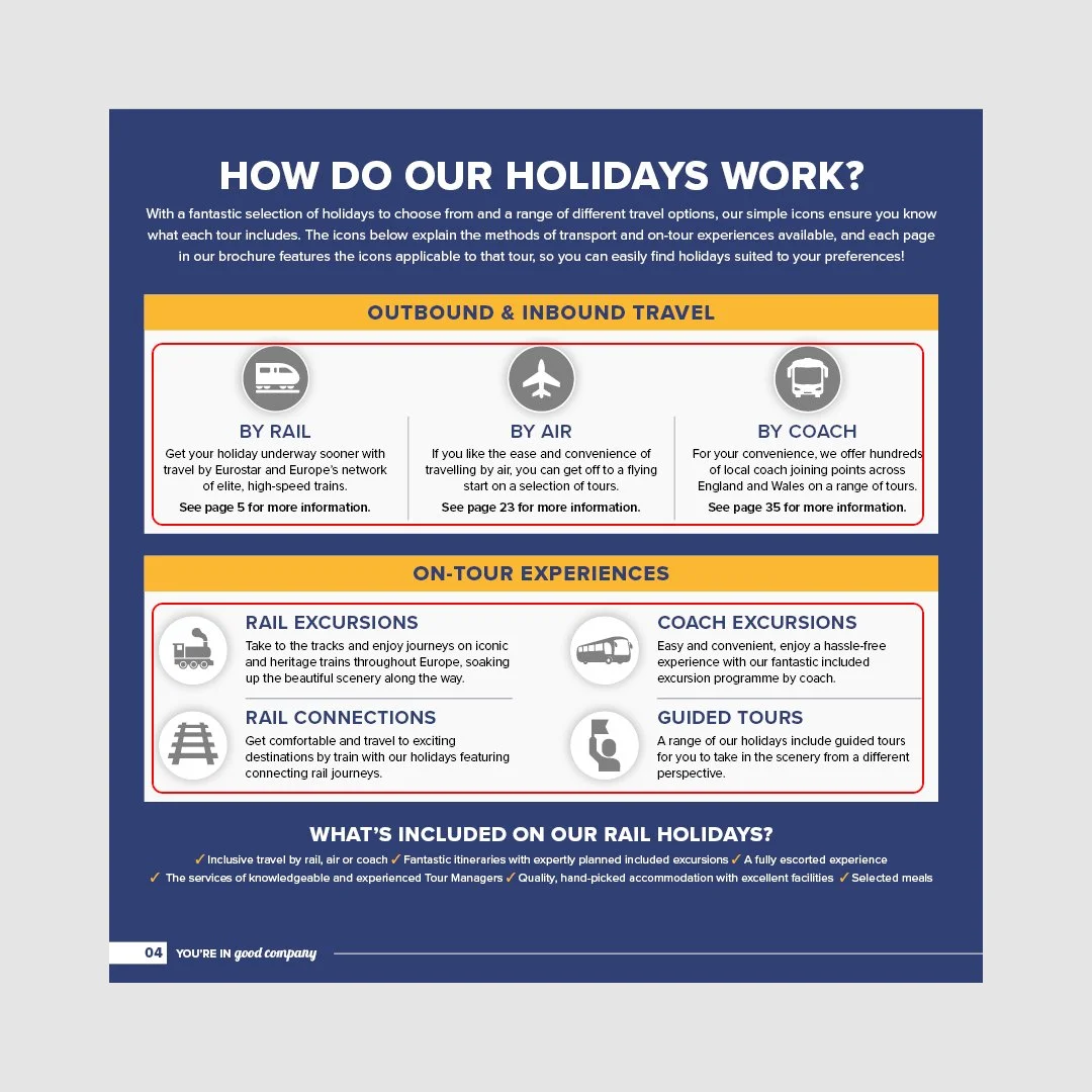
Icon system appearing on the website and in the brochure was inconsistent and often misleading.
Brochure combined rail-to-Europe holidays with famous rail journeys reached by coach/air, creating confusion.
On the holiday page in the brochure “Tour at a Glance” highlights were vague and unhelpful.
On the holiday page in the brochure “Your Tour Includes” section was visually weak and overlooked.
Explanations of why travel by rail and how do holidays work were overwhelming and unclear.
Research
Confusing icon system
Overwhelming information
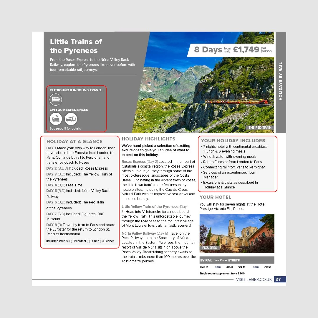
Holiday page lacking clear information
Customer Questionnaire
We then built a questionnaire to gain an understanding of what customers look for and find important when searching for a rail holiday and to identify any pain points or insights in the current offering.
Pain points & insights
Customers value clear, honest information about what is included, travel logistics, and physical requirements to feel confident when booking.
There is frustration when rail holidays are grouped with other travel types, leading to confusion around what makes the rail product distinct.
Customers are willing to pay more when the holiday feels well organised and good value, prioritising ease, reassurance, and inclusions over the lowest price.
Customers choose rail holidays primarily for comfort, ease, and a more relaxed travel experience, not just as an alternative to flying or coach travel.
DEFINE
DEFINE
Identify USP’s and Core Messaging
After discovering that customers were unaware of how much were included in a rail holiday and what specific parts of a rail holiday they valued along with our research outcomes of pain points and insights we decided to get to the heart of what a Leger rail holiday includes and what is important for a user/customer to see in the journey of browsing and purchasing.
Everything is included in the price (excursions, rail tickets, transfers, Eurostar tickets in and out of Europe and more)
Tour manager with you every step of the way
Fully escorted throughout
Hand picked hotels with meals included
Hotels comfortable and good quality
Rail holidays to be only travel by rail and not confused with other types of travel (air and coach)
How Might We Statements
Using the research insights and the identified USP’s we developed some how might we statements to explore potential solutions and to generate ideas to meet the users needs and how to best present the information to a customer.
-
HMW 1: How might we make it effortless for customers to understand at a glance how rail holidays work and what’s included in their journey?
-
HMW 2: How might we ensure that icons and visual elements support comprehension rather than create confusion?
-
HMW 3: How might me make it easy for customers to understand exactly what’s included in the price — from rail tickets and excursions to meals and hotel stays?
-
HMW 4: How might me help users distinguish Rail Holidays from coach or air-based products to avoid confusion and ensure clarity around the travel type?
-
HMW 5: How might we simplify itinerary information so users can understand key details like destinations, transfers, and inclusions?
-
HMW 6: How might we ensure consistency between digital and print materials so users can easily move between touchpoints with confidence?
DESIGN
DESIGN
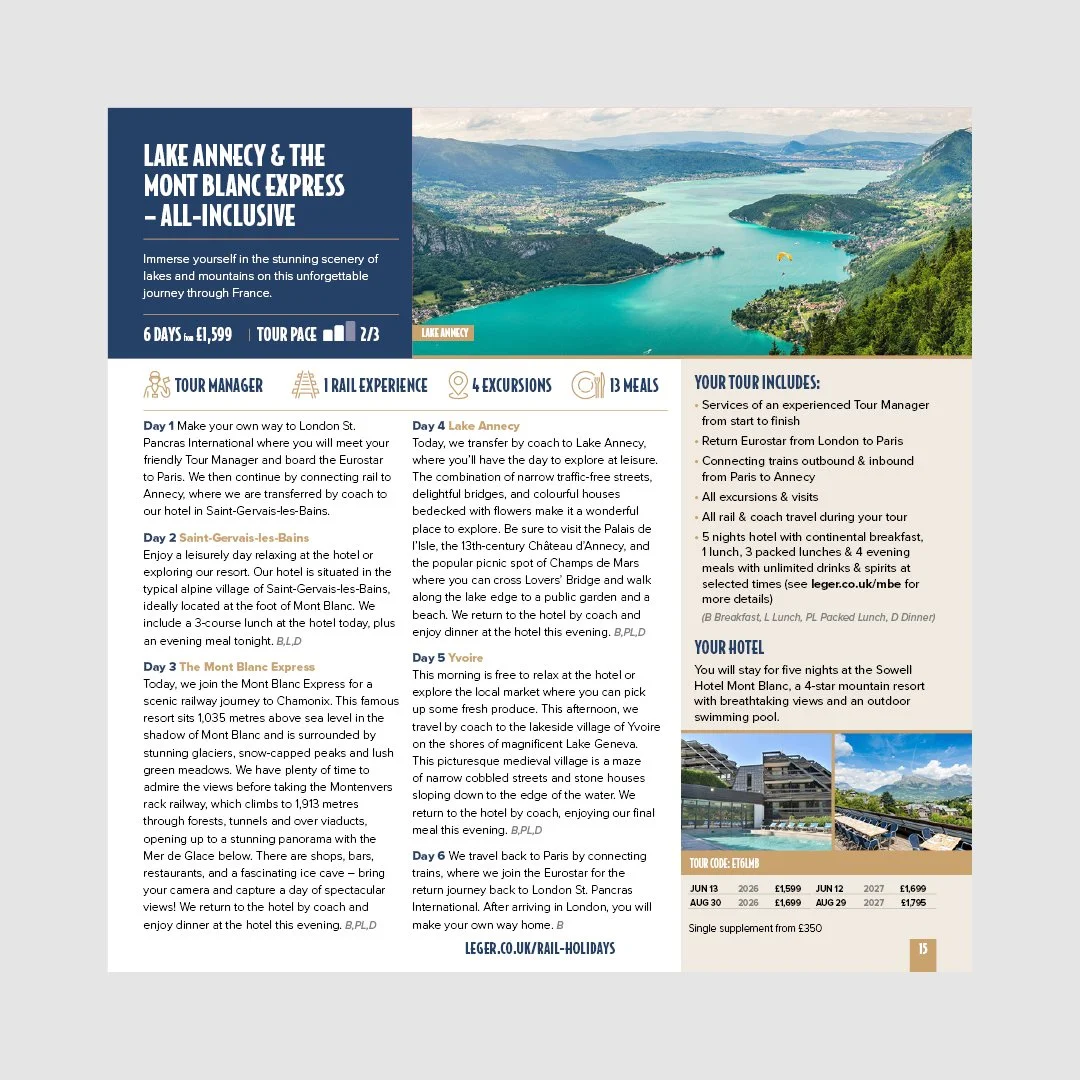
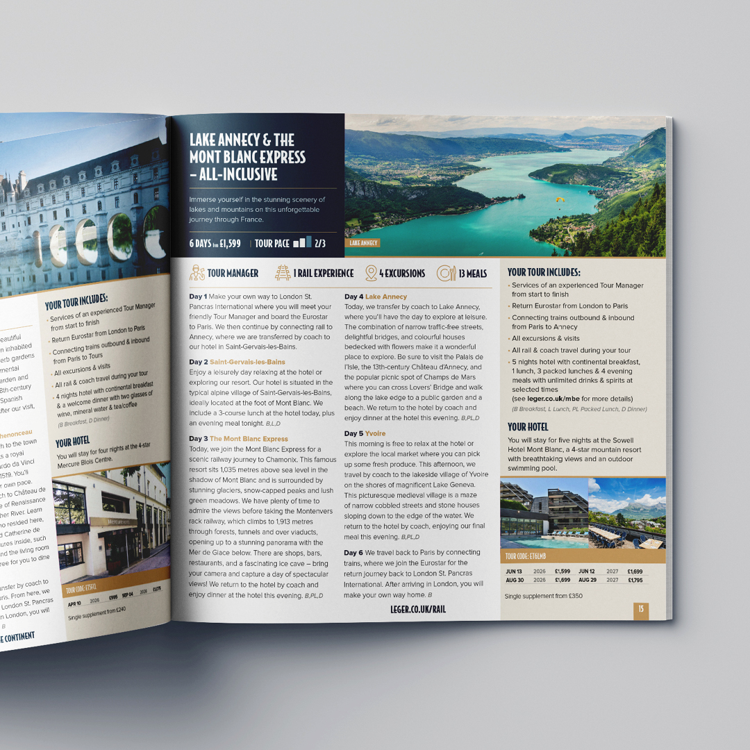
Brochure
tour page
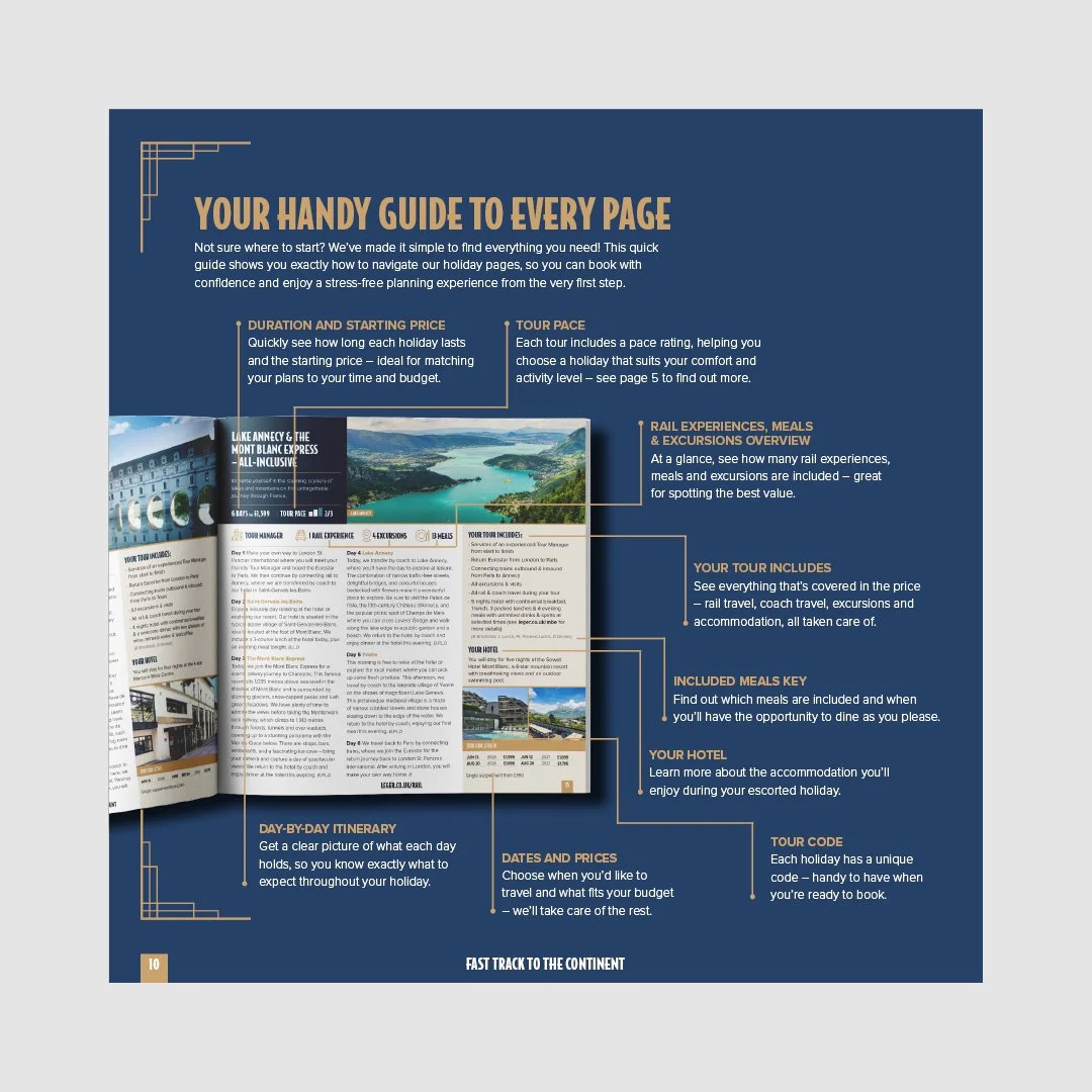
Taking the research and insights along with the how might we statements I wire-framed some potential layouts and solutions for the tour/holiday page.
The outcome included many new additions and adjustments from the current design.
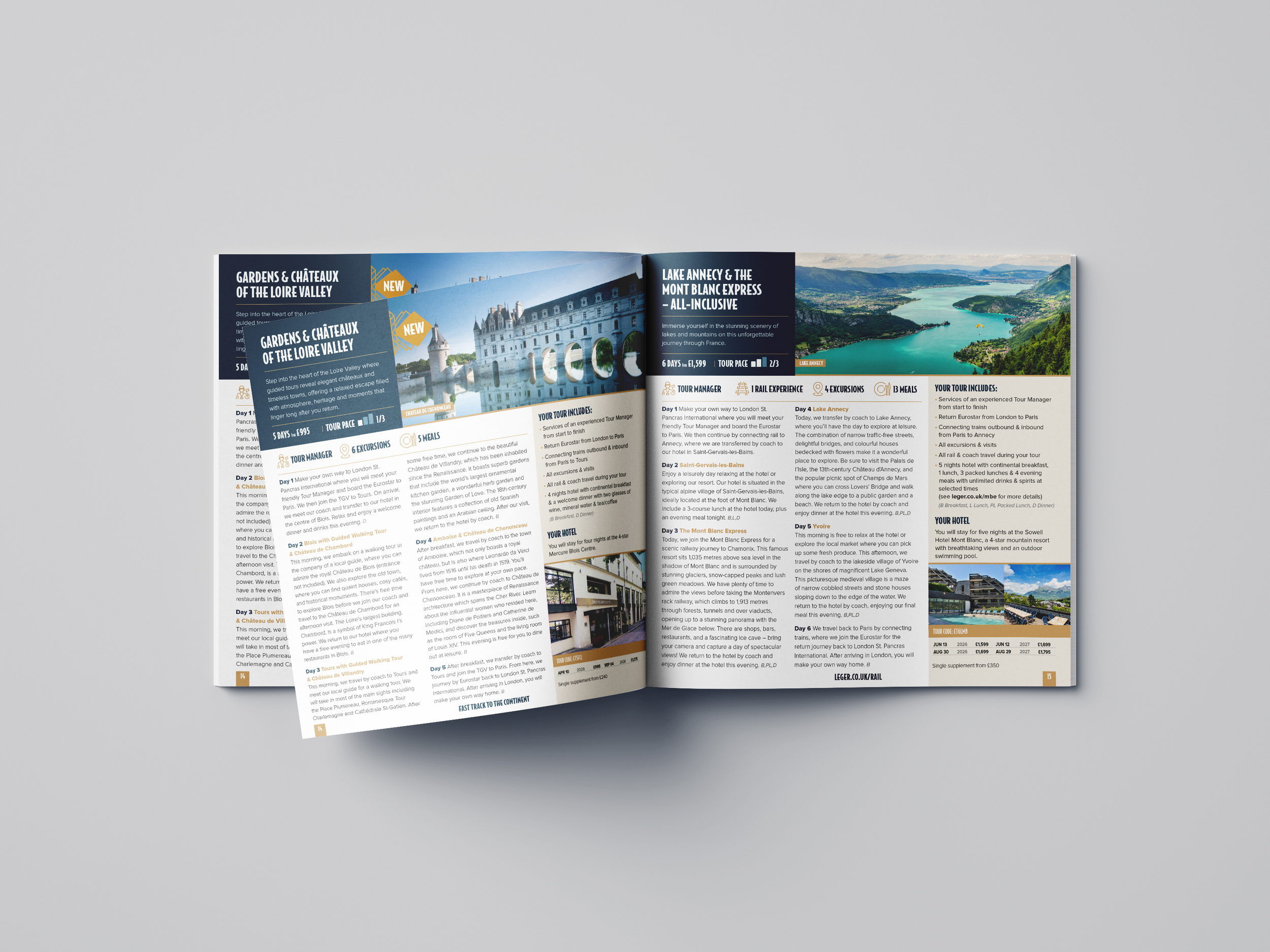
The ‘your tour includes’ area has been adjusted to include more information to make it easier for the customer to see what they get in the holiday. It has also been ordered chronologically to help the user digest the information.
I removed the icons from the previous design to eradicate the confusion.
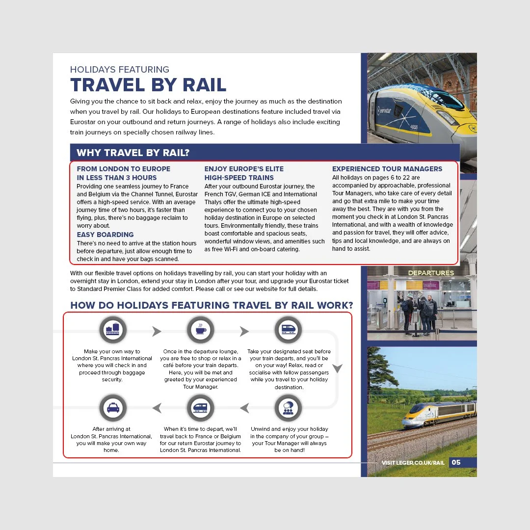
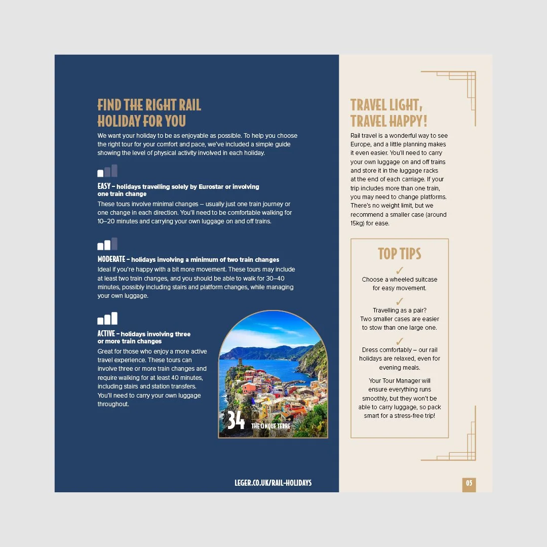
I changed the ‘holiday at a glance’ and ‘holiday highlights’ from the previous design to be a simple well written day-by-day itinerary that clearly states how and when you move between places or go on excursions. This helps replace the intention of the icons and provide more clarity for the user.
A new icon system has been built to help support the customer in understanding what is included in the holiday and to reinforce key messages and information at a glance.
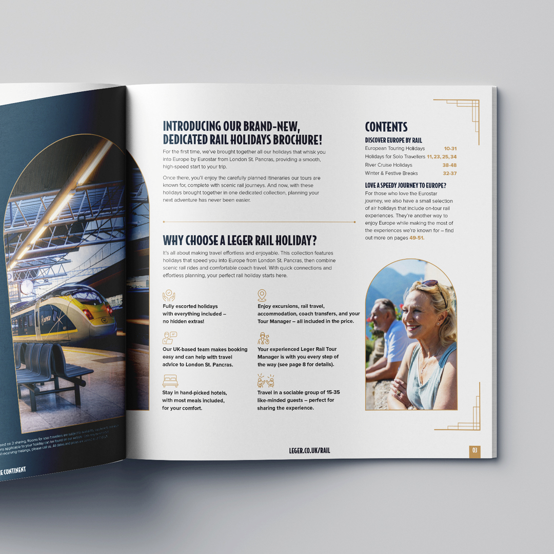
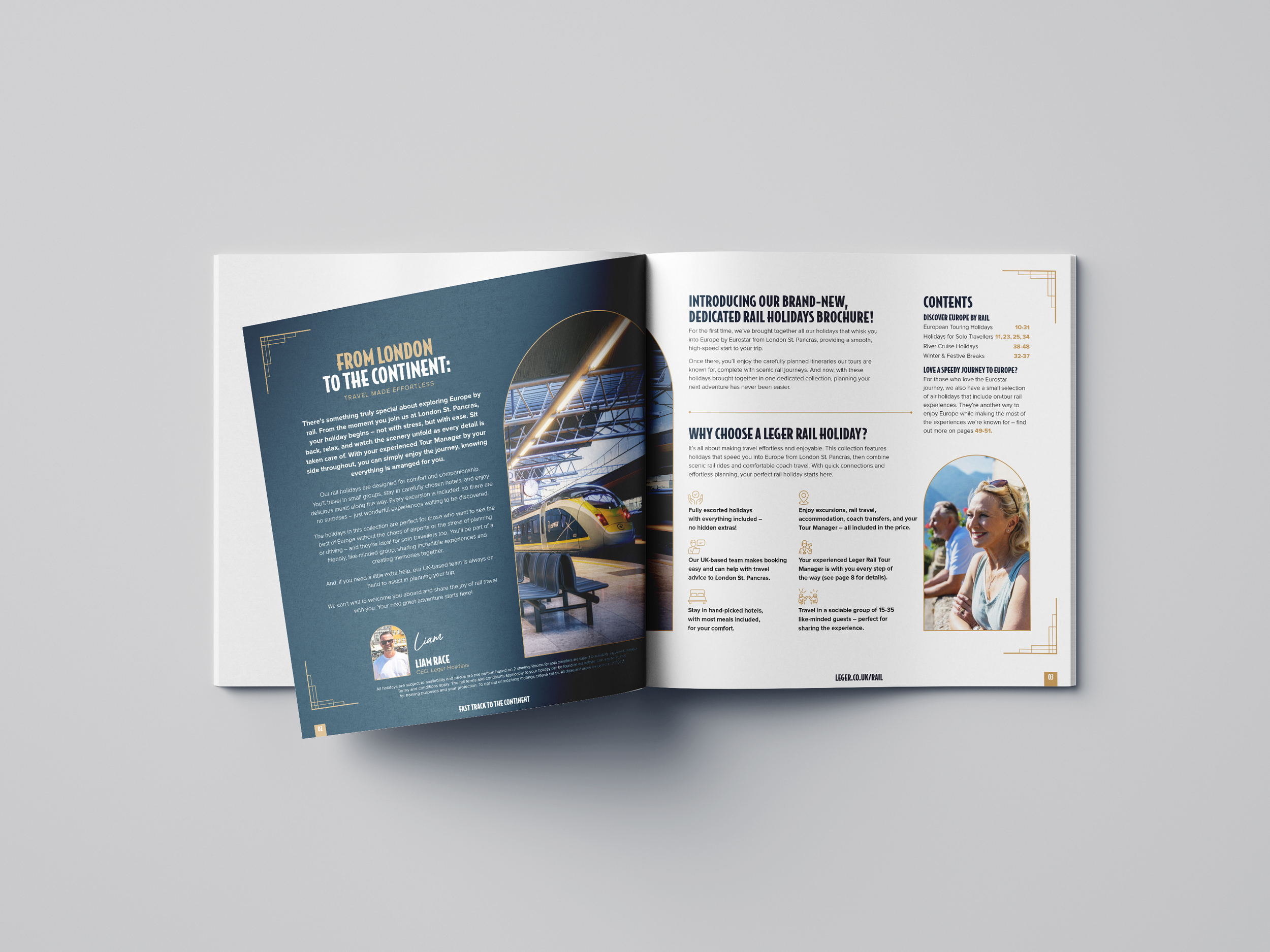
Brochure Introduction pages
I also designed a new intro to the brochure to help make the users journey more effective.
I included a why choose Leger rail panel including the icon style from the tour page for continuity. This helps reinforce the USP’s of the brand and any important information a user/customer needs when first opening the brochure.
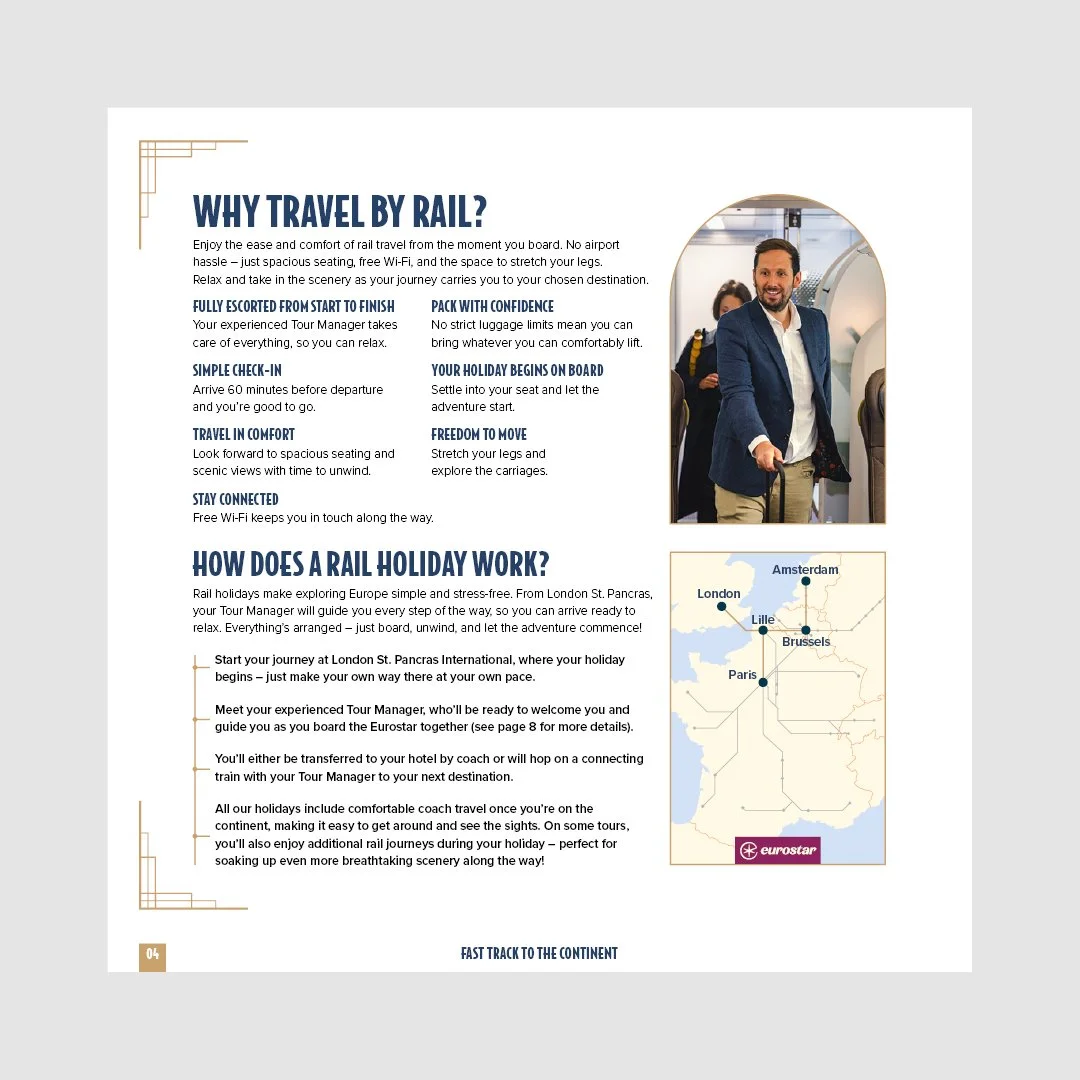
I designed a ‘why travel by rail’ section which helps the user understand the reasons they should consider a rail holiday in general and allows the customer to understand the benefit of choosing to travel by rail and therefore make a decision.
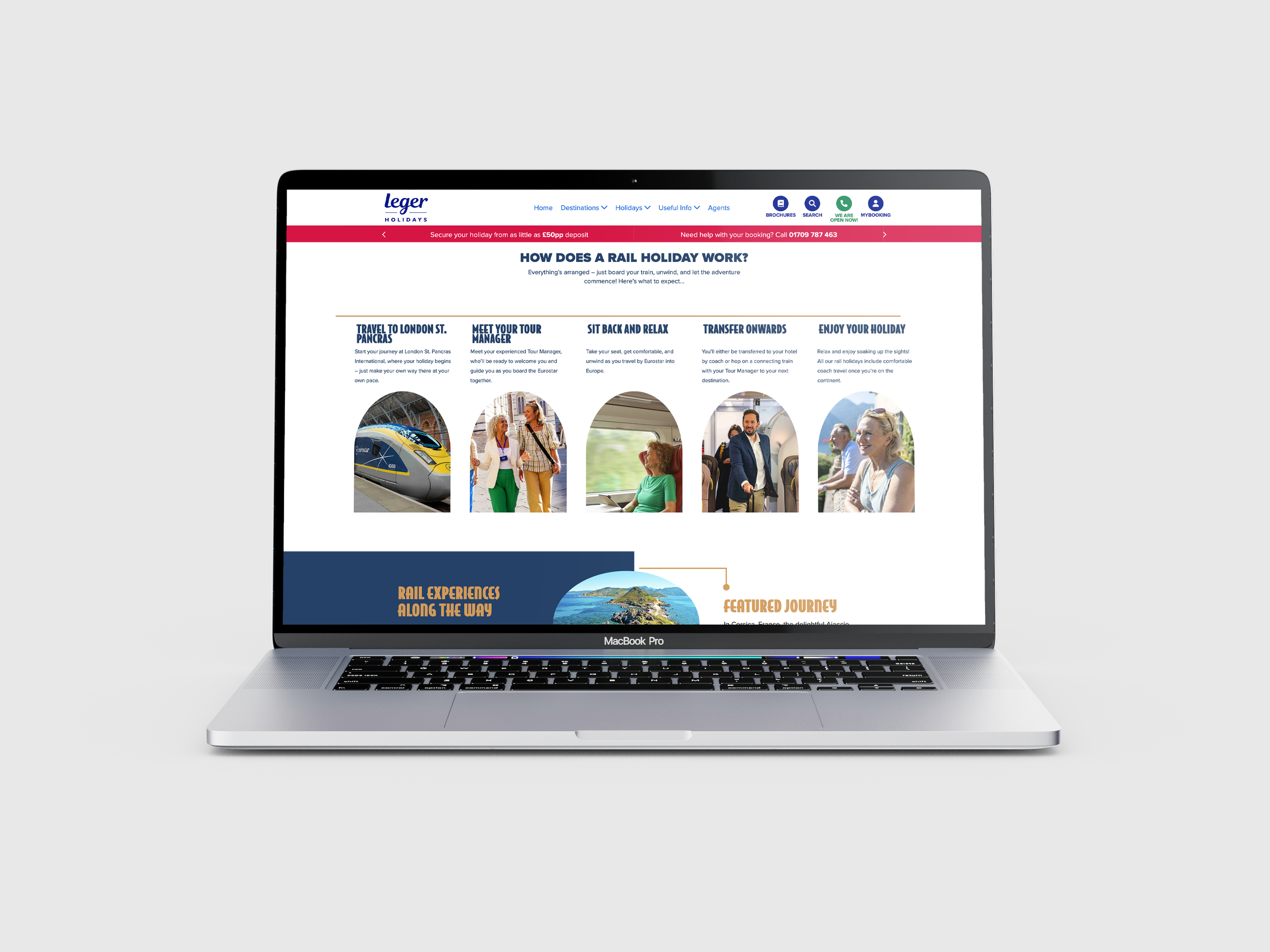
I designed a clearer and refined ‘how does a rail holiday work’ to help the user understand the simplicity of a rail holiday and decide on whether or not they should choose to purchase.
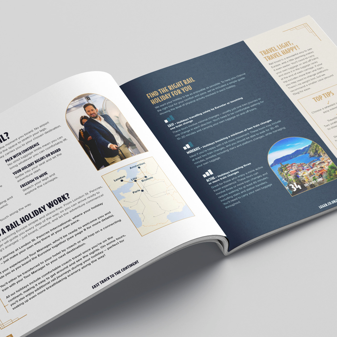
We decided to include a comfort and pace feature to enhance the users experience in picking a holiday so they have more confidence in navigating their decision on which holiday to purchase.
We also added a guide to the tour page to improve the user experience, as this supports them in understand the new layout and what each part of the page is for.
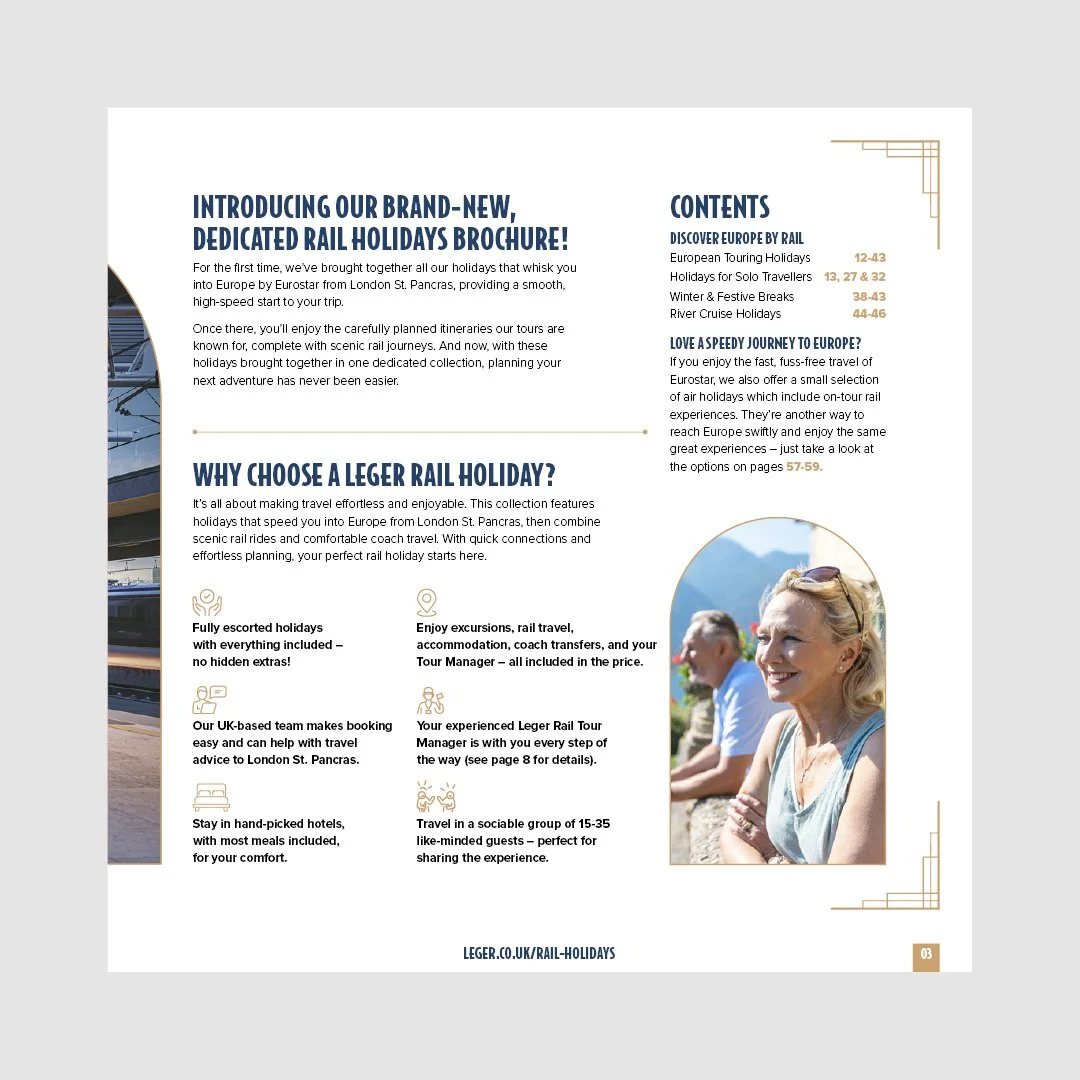
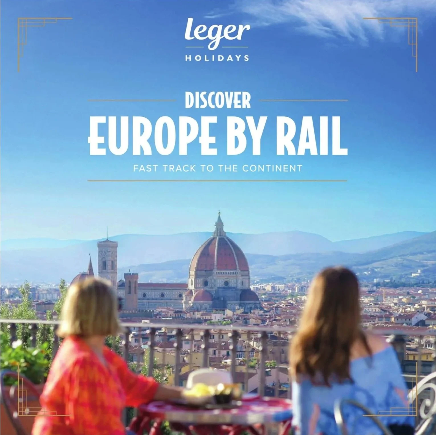
New design and brand messaging
We built a new look for the sub-brand as well as a new set of messaging for the product.
The new design incorporates a new colour scheme. The colour scheme uses a blue and gold to help evoke a slightly higher end feel to support the price point and standard of hotel.
The new messaging includes a clear main message of ‘Discover Europe by rail’ which is a clear message that tells the customer/user these holidays travel by rail so counter the previous confusion. This is supported by a sub message of ‘fast track to the continent’ which helps enforce efficiency, no hassle connection to Europe which captures what the product is about with everything included in a fully escorted holiday guided by a tour manager throughout.
RESULT
RESULT
Performance
and impact
The newly designed 2025 brochure delivered a huge performance improvement:
Inbound calls to book rail holidays increased by 346% (2024-2025)
Cost per response dropped by 75% (2024-2025)
Overall turnover grew by 142%. (2024-2025)