My Petit Choux
My Petit Choux is a boutique bakery specialising in handcrafted pastries, breads, and coffee. The objective of this project was to develop a full visual identity that reflects the brand’s artisanal craftsmanship, premium quality, and warm, personalised customer experience.
The identity needed to work seamlessly across multiple touchpoints—including packaging, storefront signage, social media, and print materials – while creating a distinctive and emotionally engaging presence that would help the bakery stand out in a competitive market.
I led the project from concept through to final delivery, handling research, visual development, logo creation, typography, messaging, and production of brand assets.
Role
Designer
Tools
Adobe Photoshop, Adobe Illustrator, Adobe InDesign, Figma
DISCOVER
DISCOVER
Research/Discovery
To establish a clear direction for the brand identity, I carried out focused research into the market, audience expectations, and how bakery brands typically present themselves.
What I explored:
Audience expectations: What customers look for in small local bakeries versus larger, commercial ones.
Competitor landscape: How larger bakery chains position themselves visually and through messaging.
Brand touchpoints: How the identity would need to function across packaging, signage, social media, and print.
Key Outcomes / Insights:
Customers value a sense of personality and character in smaller, independent bakeries.
Larger chains often use uniform, generic messaging, which can feel impersonal.
There is room for a brand that feels more distinctive and customer-focused than typical mass-market competitors.
Consistency across touchpoints is important for creating a recognisable brand presence.
These insights helped define the overall direction and priorities for the visual identity going forward.
DEFINE
DEFINE
Design opportunities
& goals
Based on the research insights, several key opportunities emerged to guide the direction of the brand identity:
Differentiate from larger bakery chains by leaning into a more personal, character-driven brand expression.
Develop messaging that feels warm and direct, helping the brand form an immediate emotional connection.
Use visual storytelling to create a sense of place and personality, setting the bakery apart from more generic competitors.
Introduce consistent assets and brand elements that can scale as the business grows.
DEVELOP
DEVELOP
Solution
In response to the research insights, I created a visual identity that emphasises artisan quality and a personal connection, helping My Petit Choux stand out from larger, more generic bakery brands.
Core Elements of the Concept
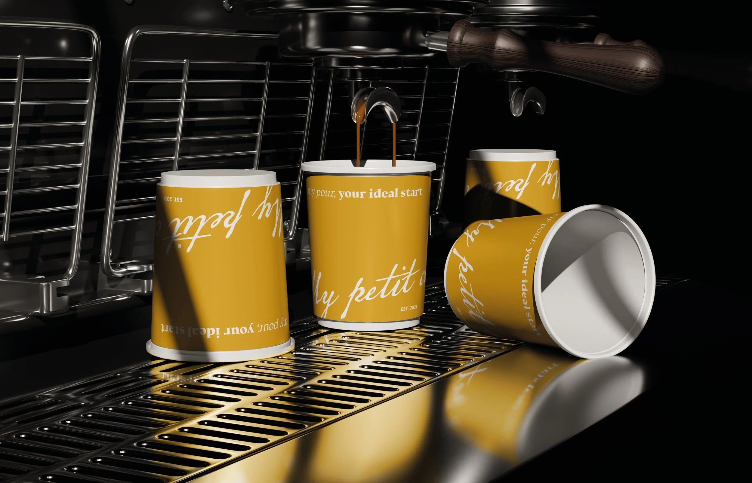
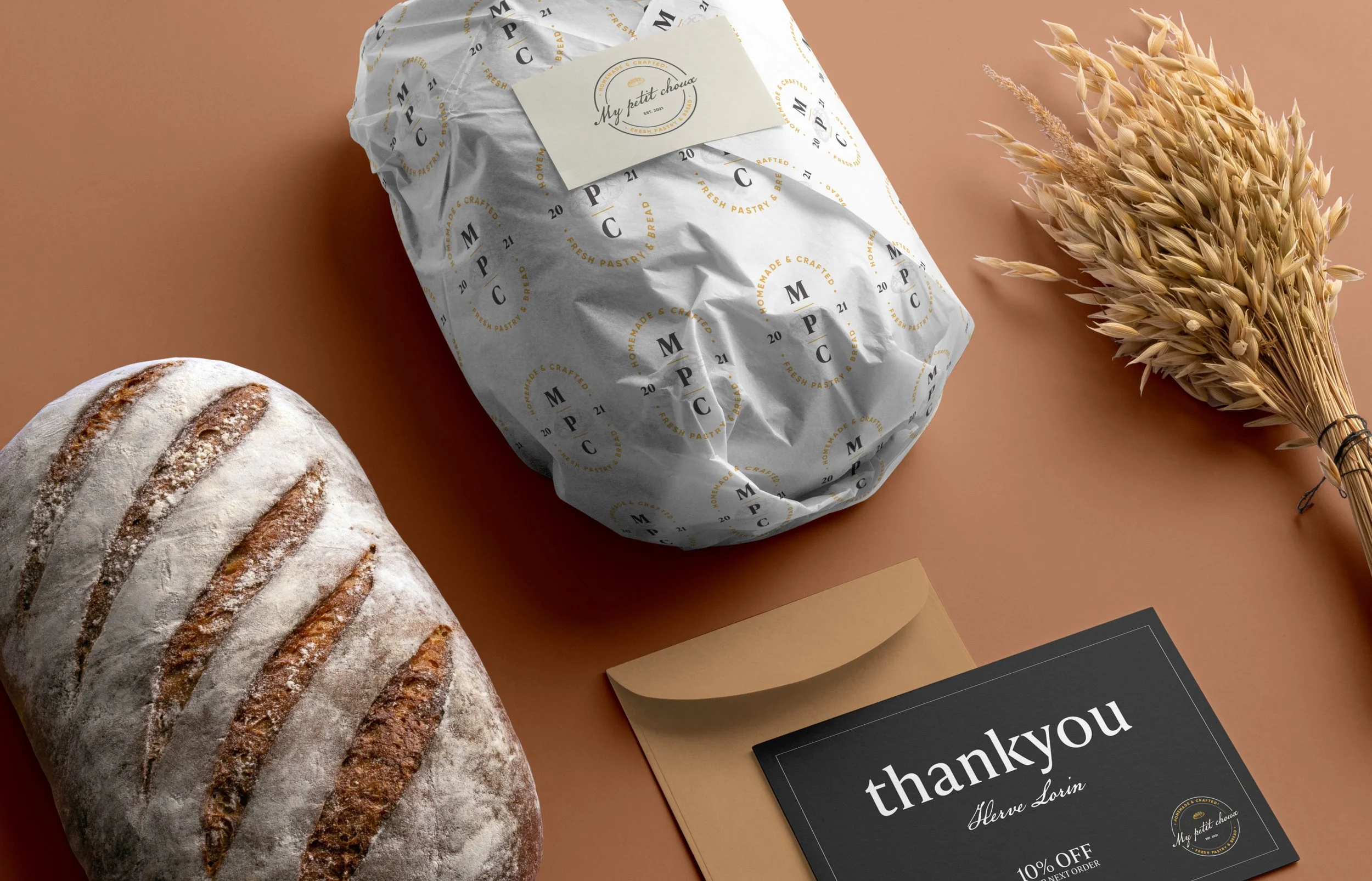
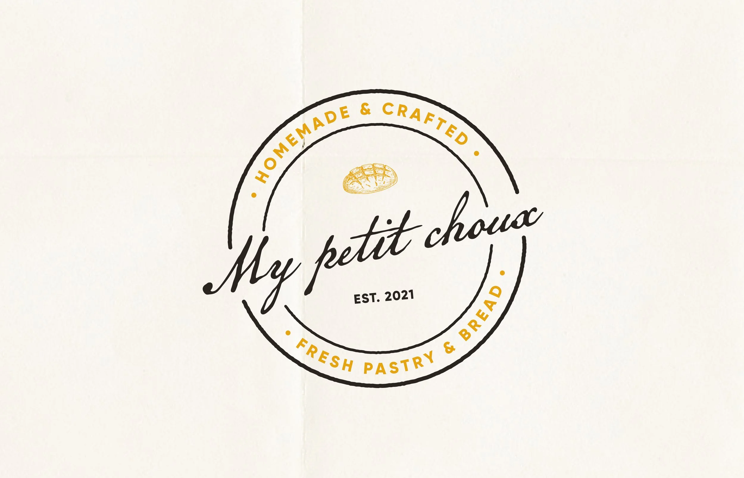
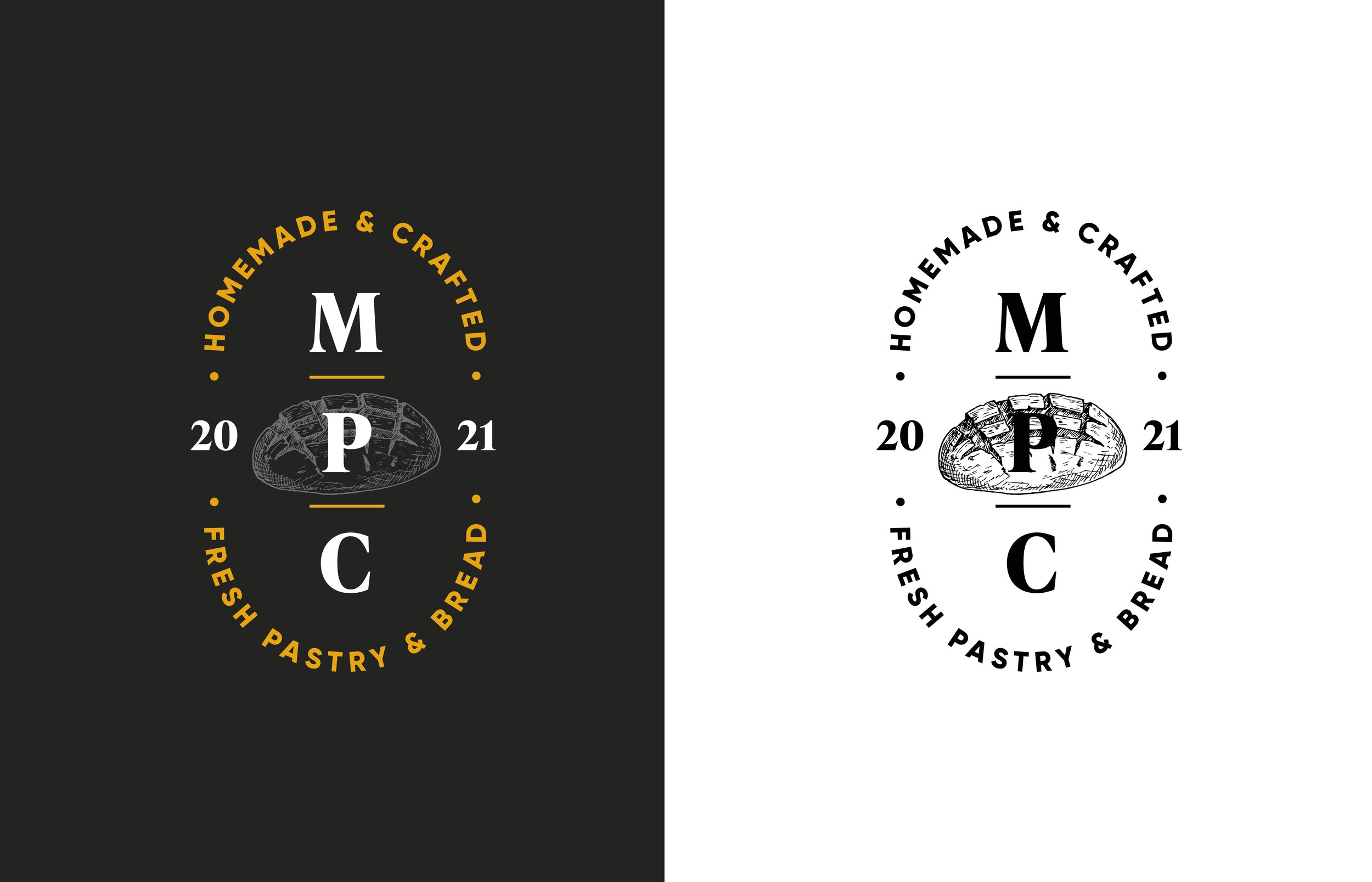
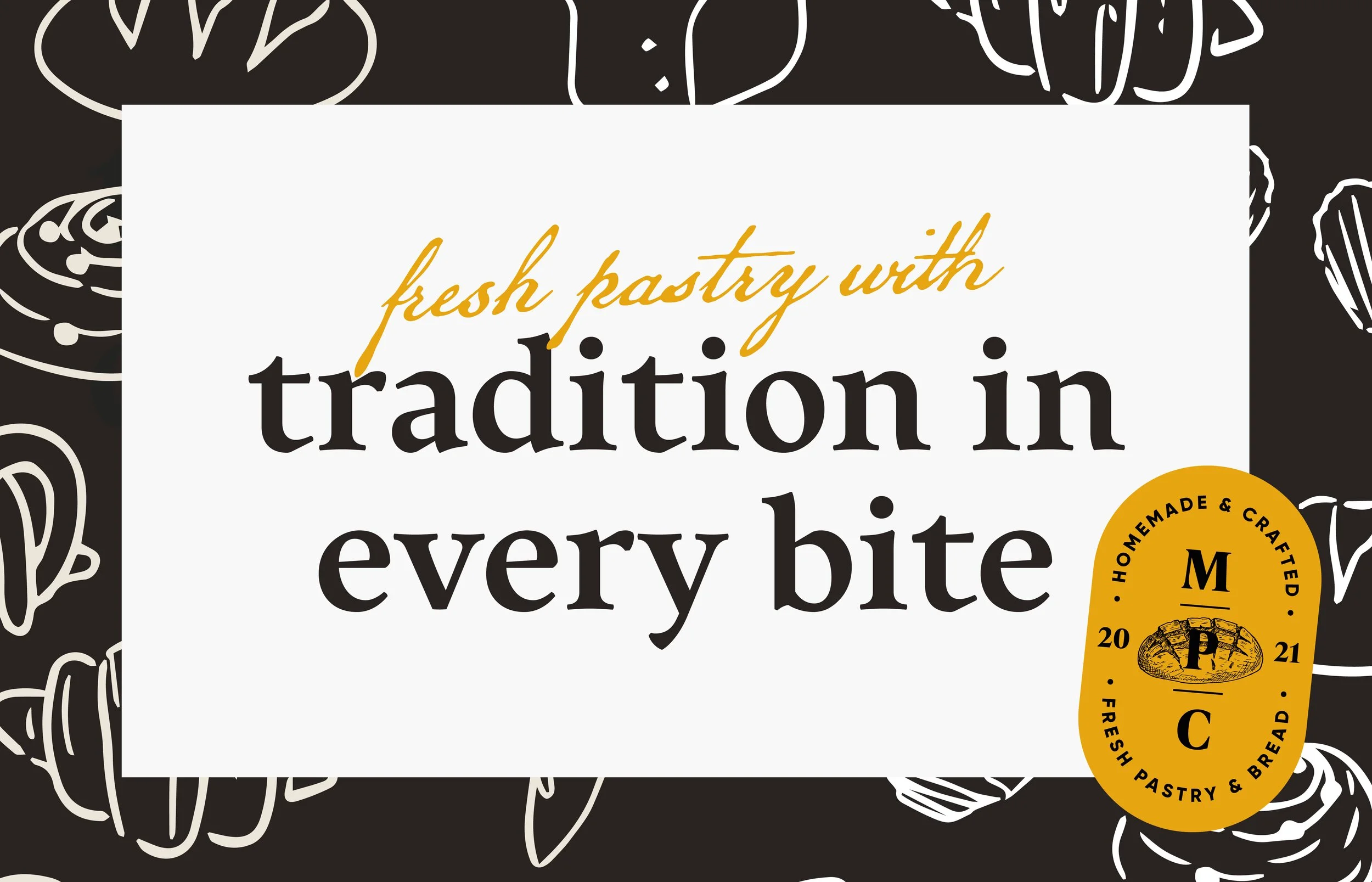
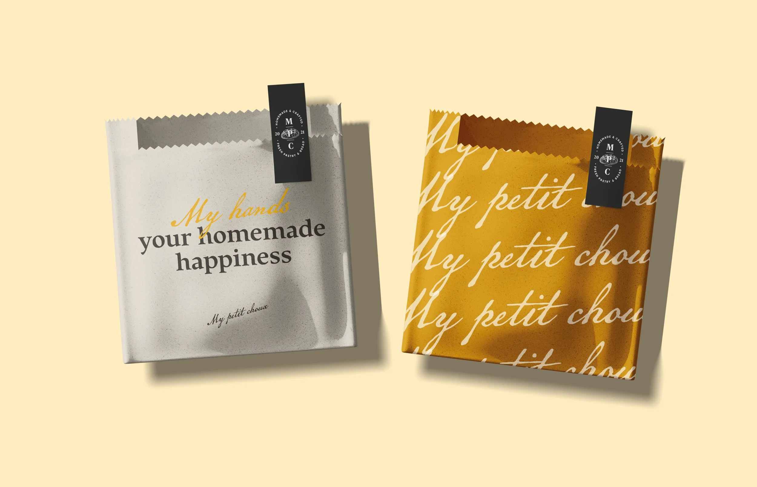
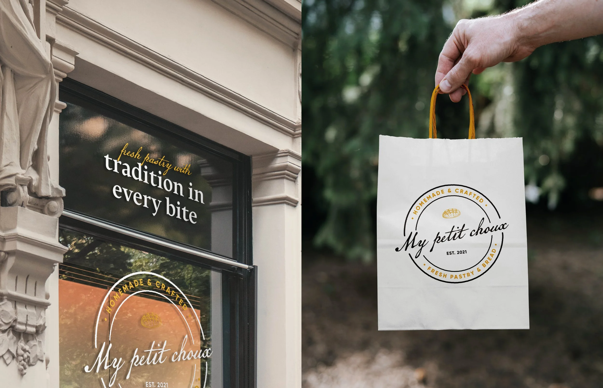
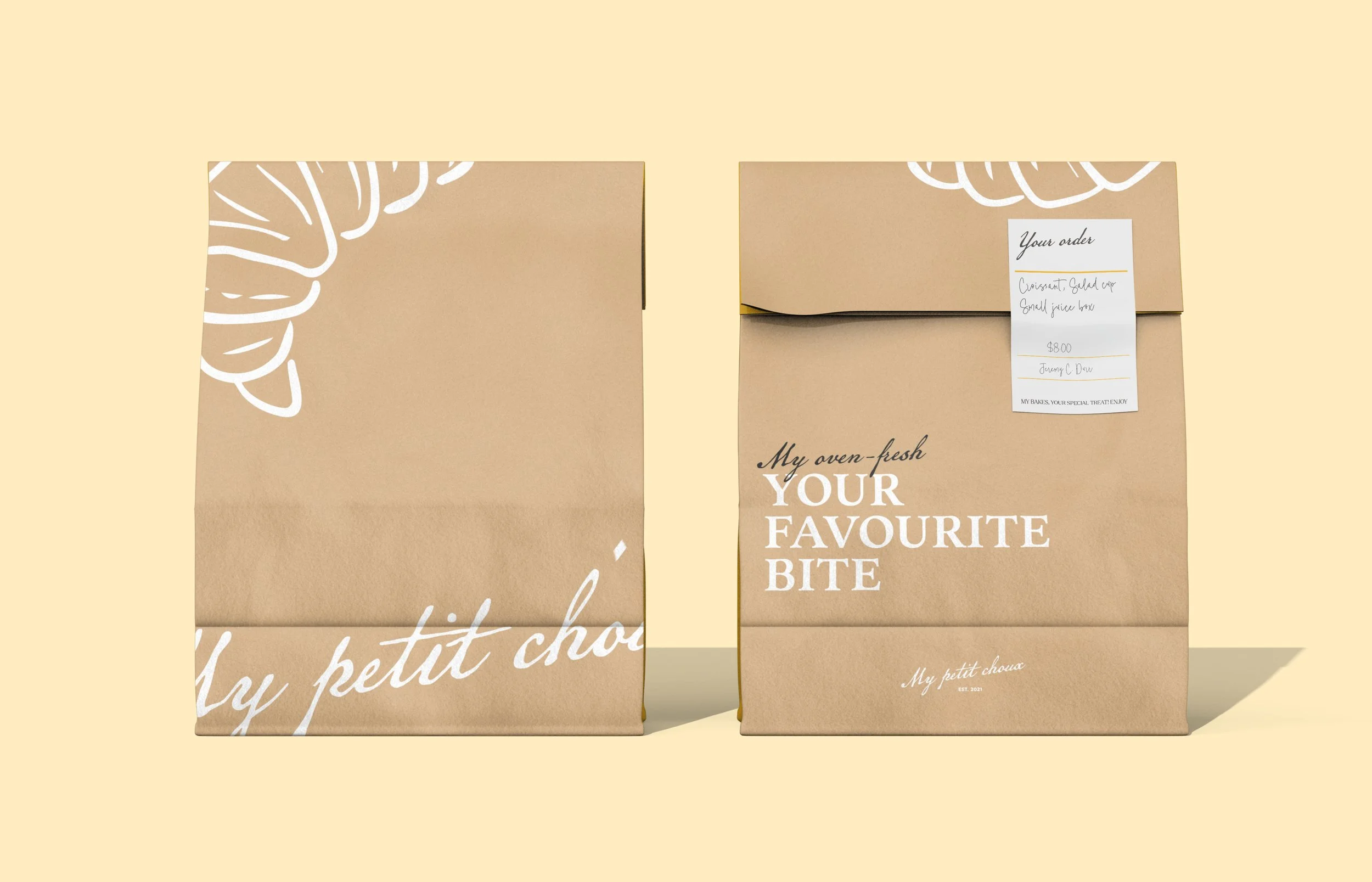
Logo: A handwritten script logo conveys warmth, craft, and authenticity, reinforced by its subtle stamp-like texture. A secondary MPC serif mark adds versatility and communicates tradition and trust.
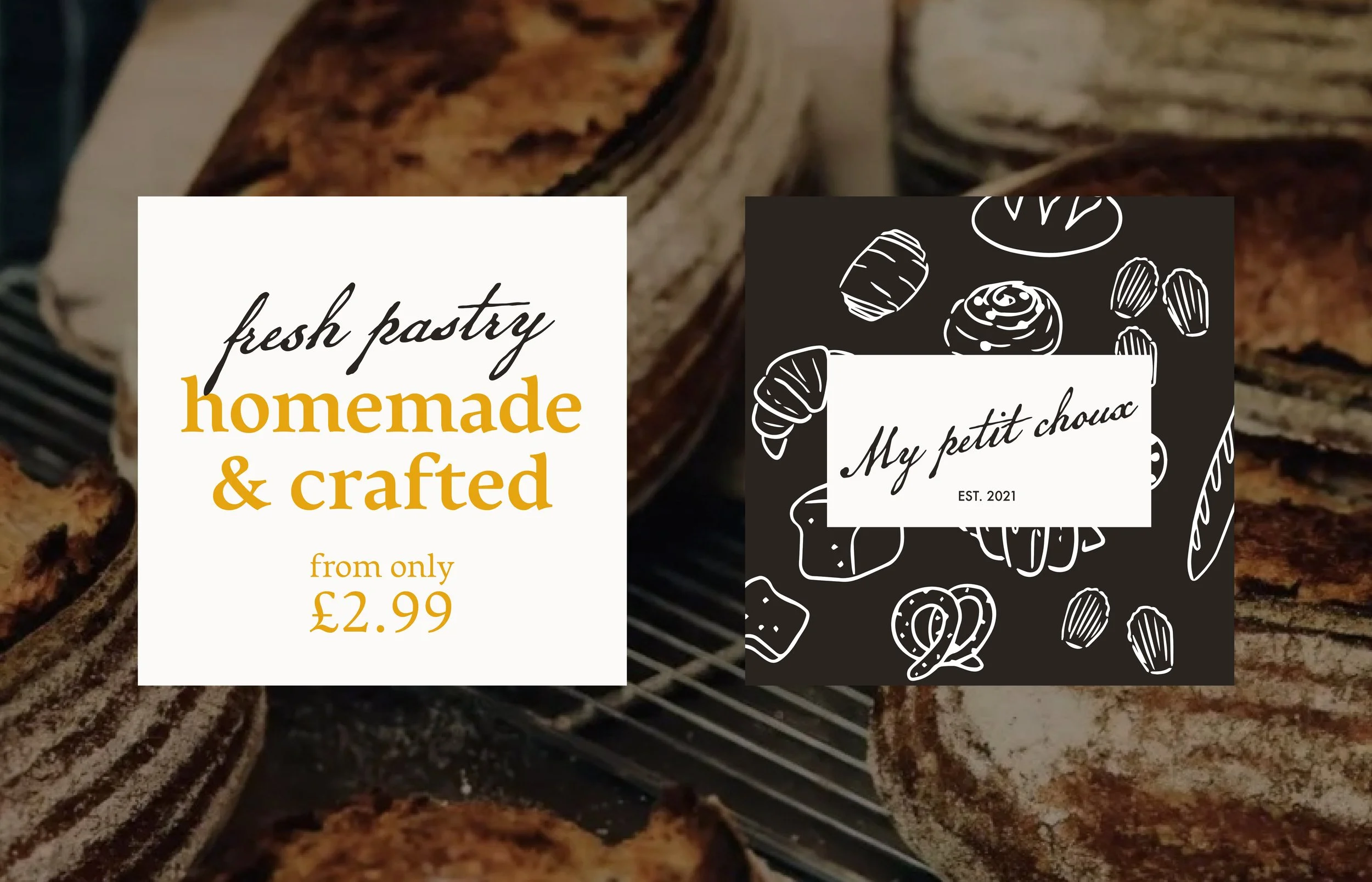
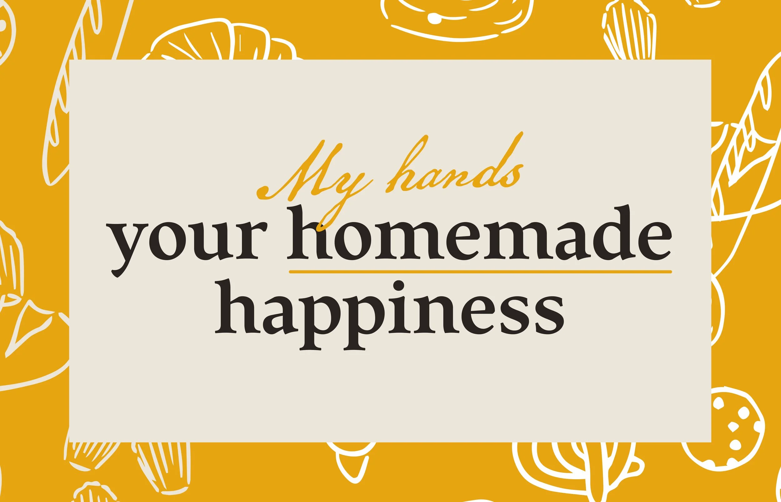
Colour Palette: Soft pastels paired with warm neutrals evoke comfort, freshness, and a premium yet welcoming feel—aligned with how customers expect an artisanal bakery to present itself.
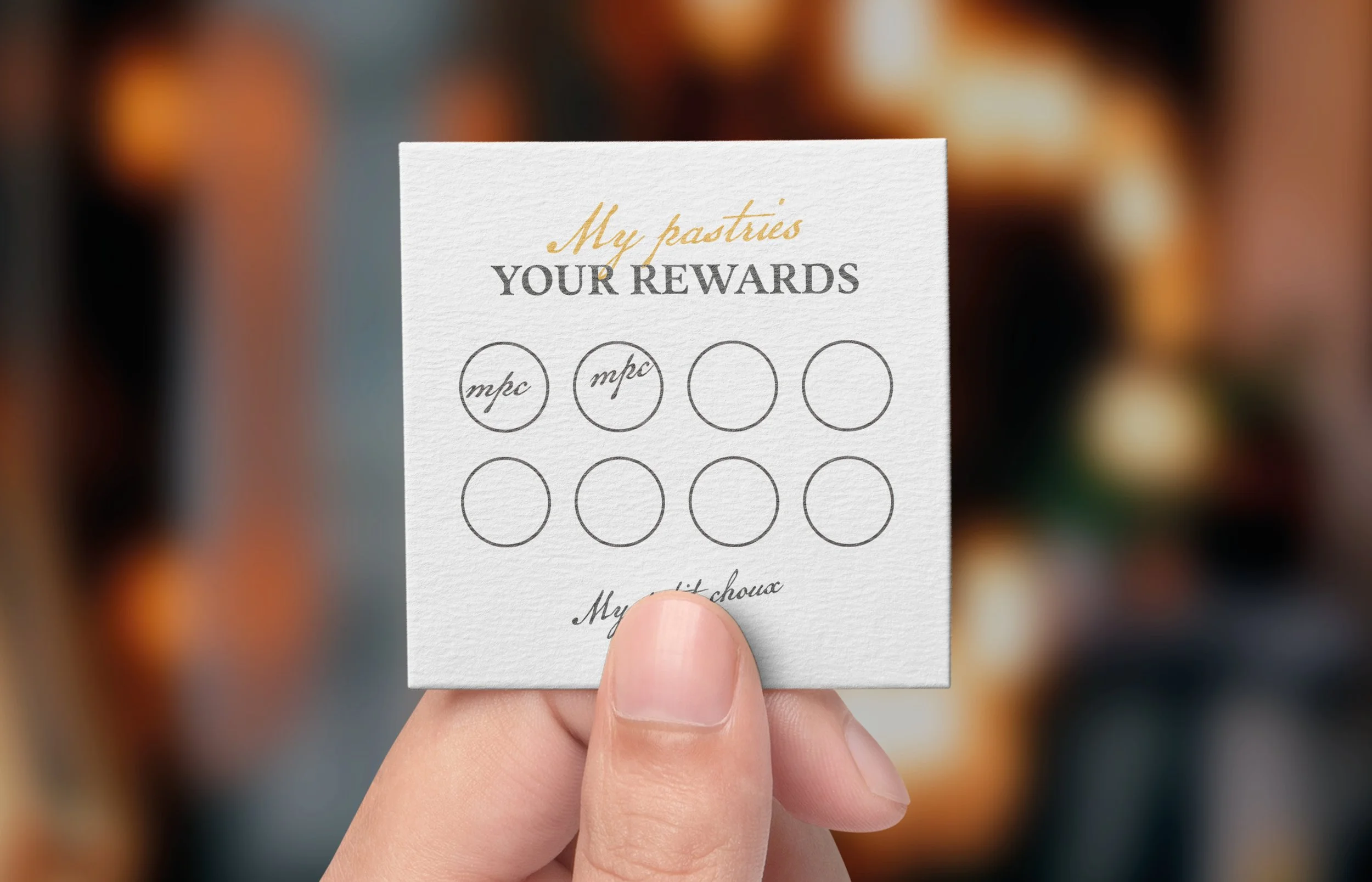
Messaging: To differentiate from competitors' generic communication, I developed a personalised messaging system built around the word “My” (e.g., “My Bakery, Your Local Treasure,” “My Moment, My Petit Choux”). This strengthens emotional connection and reflects the brand’s warm, customer-focused experience.
Illustrations: Hand-drawn icons and patterns add charm and reinforce the handcrafted ethos across packaging, menus, signage and digital materials.
Overall, the visual identity communicates premium quality while creating an inviting, personalised brand presence across all touchpoints.

Outcome
Unfortunately, the concept did not get used in the end as the owner decided to pull the business idea.