Leger National Press Advertising
The original national press ads were generating poor returns, with high cost-per-response and low ROAS. Following a full creative rethink, research, improving the layout, visual hierarchy, and clarity of the message – the new advert delivered substantially stronger results, turning an underperforming channel into a profitable one.
I worked closely with the Marketing Manager to understand what wasn’t resonating, clarify the key customer benefit, and contribute to a refreshed visual and messaging approach that drove improved response and campaign performance.
Role
Designer
Tools
Adobe Photoshop, Adobe Illustrator, Adobe InDesign, Figma
DISCOVER
DISCOVER
Research
We reviewed all national press ads from 2024 to early 2025 to understand why performance was declining. The analysis revealed unclear hierarchy, cluttered layouts, and messaging that lacked a strong, immediate benefit, making the ads easy to overlook and hard to understand quickly.
From this, we identified key opportunities: simplify the design, sharpen the core message, and focus on a single clear benefit supported by a cleaner, more structured layout. These findings shaped the direction for the redesigned concept.
Existing creative insight (visuals below)
Cluttered layout: Multiple competing messages reduced clarity and impact.
Weak hierarchy: Key benefits and offers were not immediately visible.
Diluted messaging: Attempted to communicate too much, making it harder to engage readers.
Visual style inconsistent: Lacked a strong, recognisable identity across campaigns and appeared cheap and lacked class.
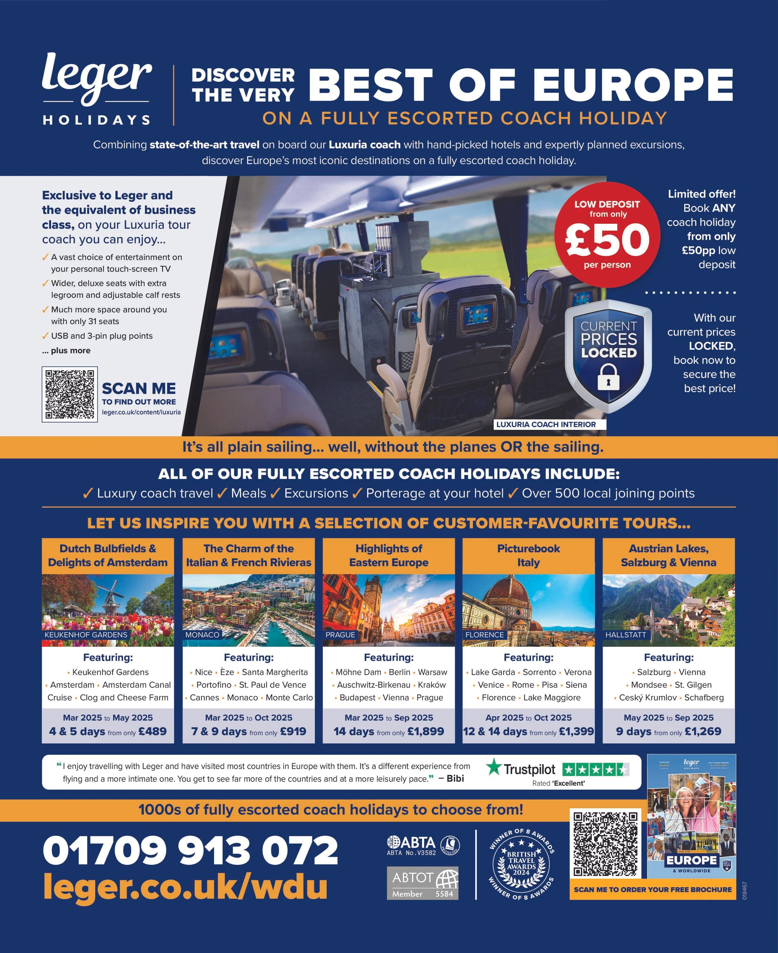
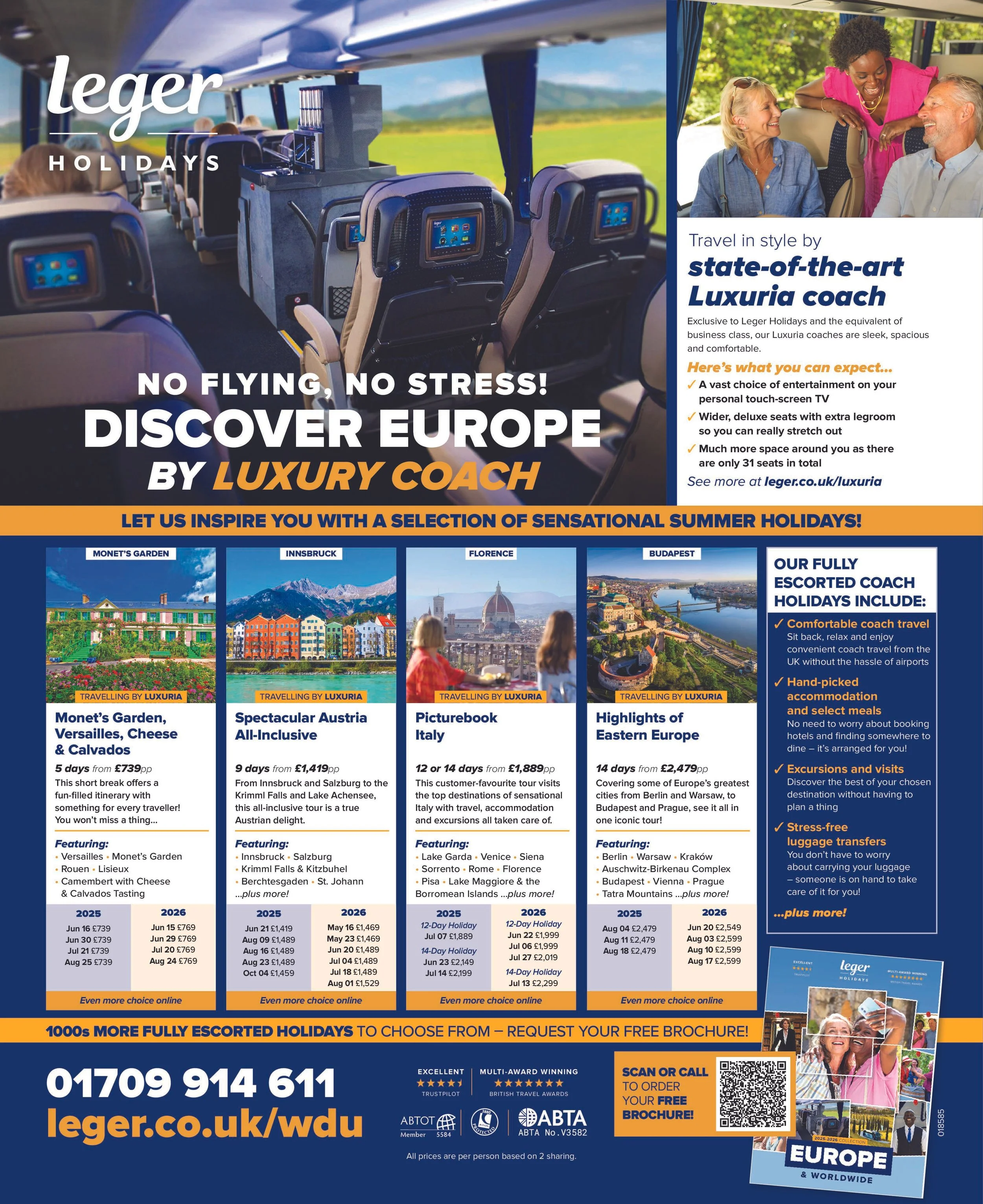
Luxuria coach visuals as a proven driver of response: Analysis of higher-performing ads and related inbound enquiries showed a consistent pattern — adverts featuring the Luxuria coach interior generated more interest and calls. This insight highlighted the interior experience as a key motivator for customers.

DEFINE
DEFINE
Design opportunities
& goals
We identified an opportunity to position the luxury business-class coach experience as the central USP, making it the key benefit communicated to potential customers.
Highlight the key USP: Make the luxury business-class coach experience the main focus to clearly communicate value.
Convey class and luxury: Update the visual style to evoke a premium, aspirational feel.
Simplify messaging: Focus on a single, clear benefit per ad to improve readability and response.
Improve visual hierarchy: Ensure key information and messaging are immediately visible and understood by the customer.
DEVELOP
DEVELOP
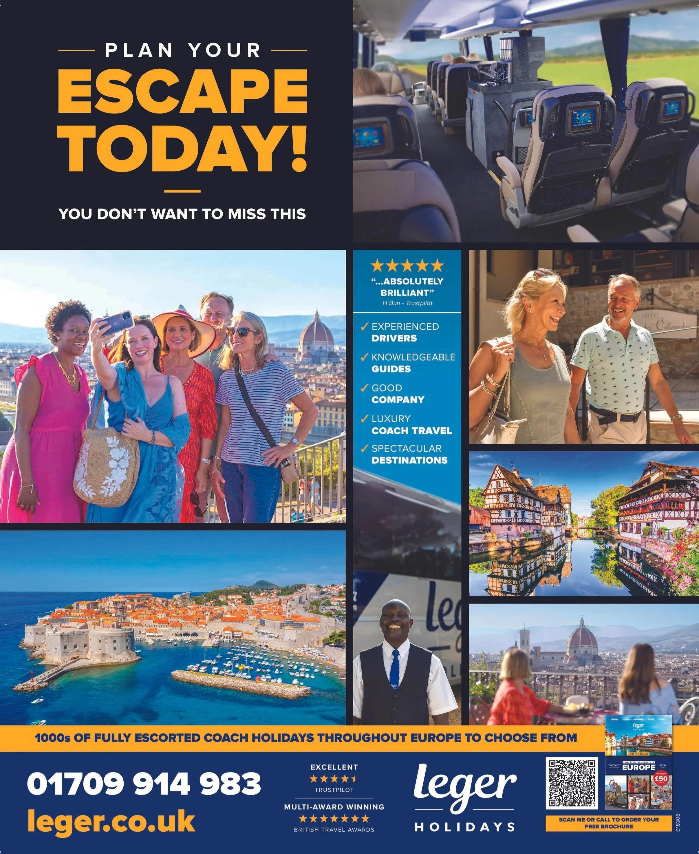
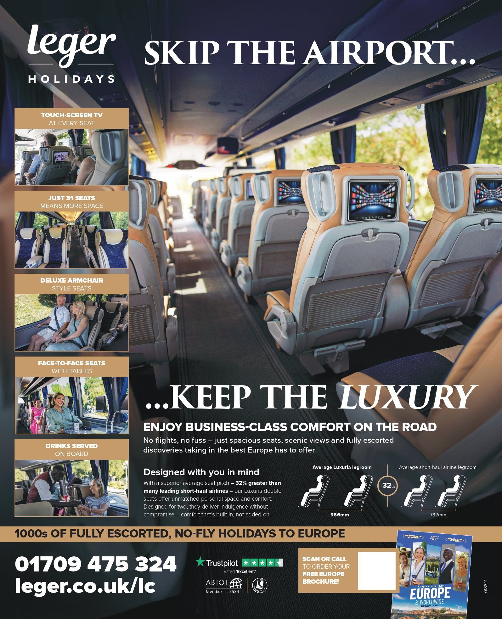
Building on the insight that the previous adverts failed to communicate luxury or clarity, the new creative direction focused on elevating the offer and making the core benefit immediately recognisable. The design shifts centred around stronger messaging, clearer visual hierarchy and a more premium feel.
Core Elements of the Concept
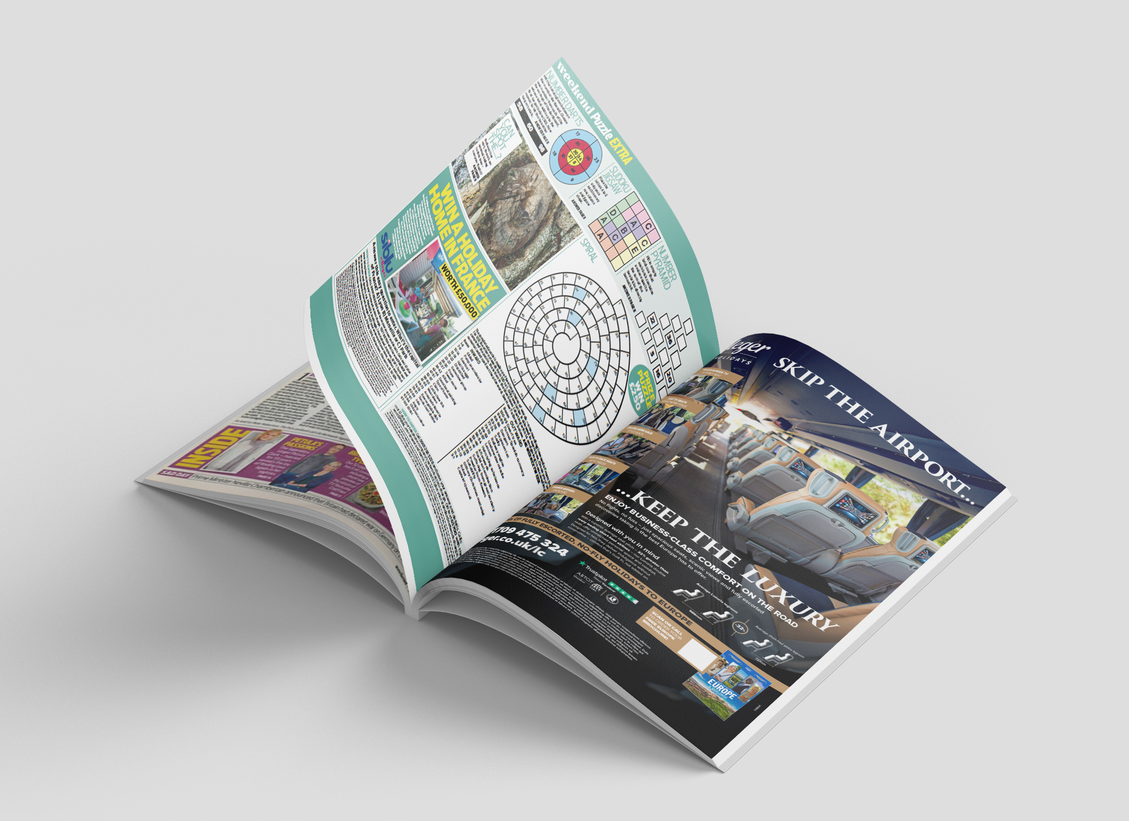
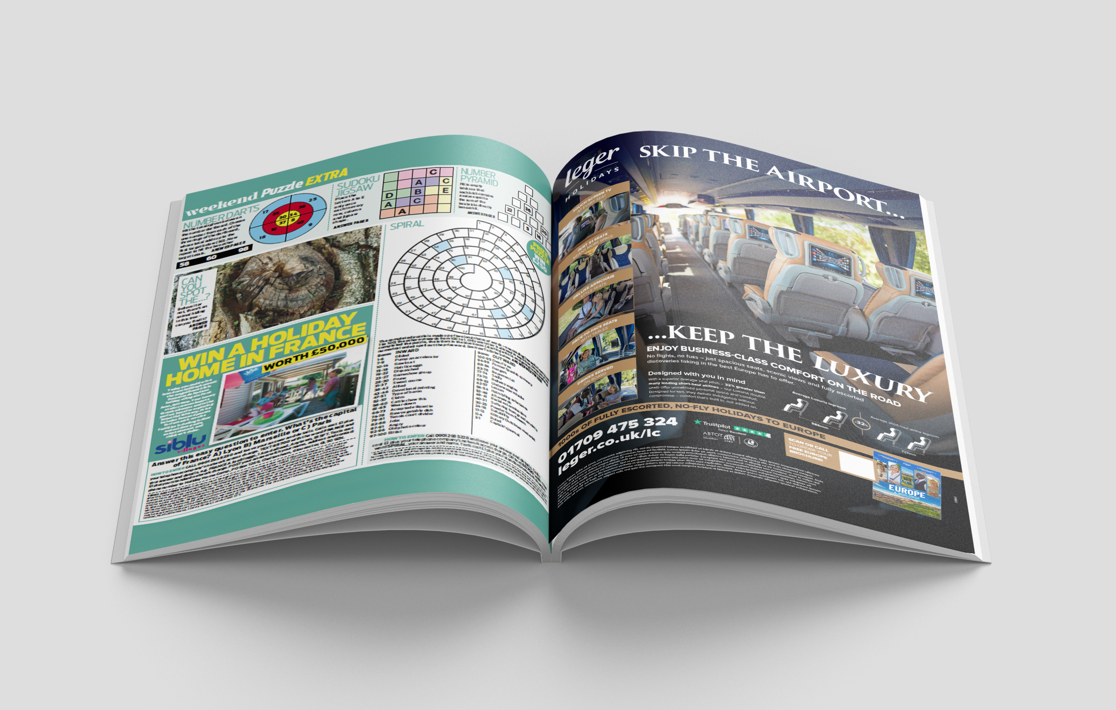
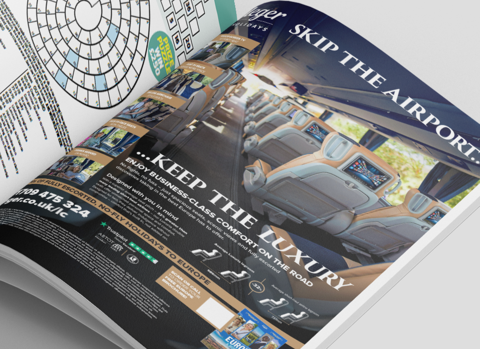
A clear, memorable message: We introduced the line “Skip the airport…. Keep the luxury.” – a simple, immediate benefit statement that positions Leger’s luxury coach as a stress-free, premium alternative to flying.
Premium hero imagery: A full-width hero image was used to showcase the high-quality interiors of the business-class coach, helping the advert instantly communicate comfort and luxury.
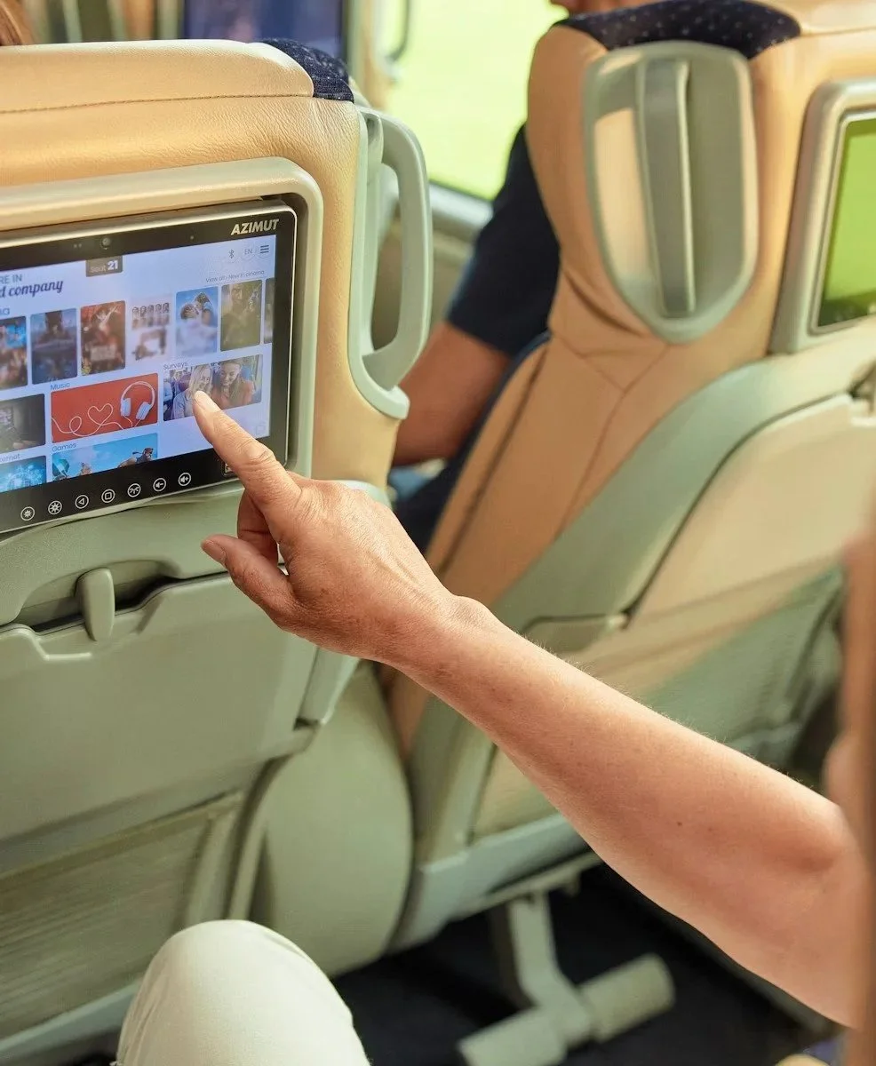
Supporting feature visuals: Smaller supplementary images were added to highlight specific features such as spacious seating, onboard facilities and comfort upgrades. Each was paired with bold, concise captions for instant clarity.
Straightforward supporting copy: Short, benefit-driven copy reinforced the key value proposition: no flights, no fuss, just a relaxed, high-quality travel experience.
Clear legroom visualisation: A clean, premium diagram was introduced to demonstrate the generous legroom – helping customers quickly understand the tangible comfort advantage over air travel.
Solution
Performance
and impact
The redesign turned an underperforming press channel into a high-return asset almost instantly.
Before the Redesign (Early 2025)
Previous ads consistently showed:
High cost per response: £57–£255
Low engagement: 69–179 brochure requests
Limited conversion intent: 47–209 inbound calls
Overall: interest was low, costs were high, and the value proposition wasn’t cutting through.
After the Redesign
The new creative delivered a major uplift:
Cost per response dropped by up to 92% (down to £20–£41)
Brochure requests increased by up to 820% (from 69 to 629)
Inbound calls increased by up to 1,155% (from 47 to 590+)