Shearings Message & Promotion Device
The Shearings Holidays brand required a refreshed approach to how its promotional messaging was communicated across marketing channels. Campaigns promoting key sales messages—such as low deposit offers, holidays from prices, and save promotions—were underperforming and failed to stand out in a crowded travel market.
I was tasked with leading the creative direction to improve the effectiveness of this marketing activity by developing a clearer, more distinctive visual system that strengthened brand recall and aligned with Shearings’ warm, friendly tone of voice.
Role
Designer
Tools
Adobe Photoshop, Adobe Illustrator, Adobe InDesign
DISCOVER
DISCOVER
Research
To understand where the existing promotional activity was falling short, I began by analysing Shearings’ current marketing materials and conducting competitor research. This helped identify patterns in visual presentation, tone, and message hierarchy, highlighting where Shearings’ campaigns were losing impact and where opportunities existed to differentiate the brand more clearly within the travel market.
Existing creative insight
Underperforming sales messaging: Promotions like low deposits, holidays from prices, and save offers were not standing out or driving engagement.
Inconsistent visual hierarchy: Key messages were often lost among other copy and imagery, making it difficult for users to quickly understand the offer.
Generic creative: Competitors’ campaigns were often more vibrant or visually distinctive, leaving Shearings’ messaging feeling safe but uninspiring.
Market insight
Competitor research showed that most travel brands used roundels or circular shapes for callouts, meaning Shearings had an opportunity to differentiate visually.


DEFINE
DEFINE
Design opportunities
& goals
Based on the research insights, I identified the following opportunities for the brand to improve the visibility, clarity, and engagement of its promotional messaging:
Make key sales messaging (low deposits, holidays from prices, save offers) immediately noticeable and easy to understand.
Strengthen brand recall and differentiation in a competitive travel market.
Ensure consistency across channels (paid social, print, email) while maintaining flexibility for different layouts.
Create a friendly, approachable tone that aligns with Shearings’ brand personality.
Develop a modular, reusable system that can work both as a standalone element and alongside other content.
DEVELOP
DEVELOP
Solution
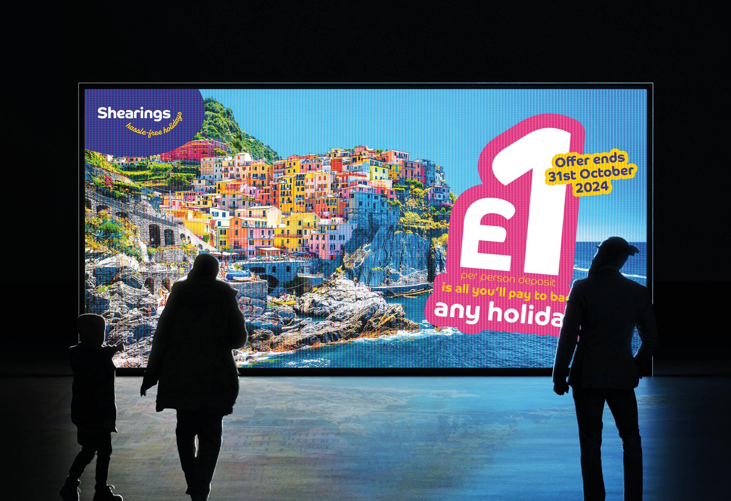
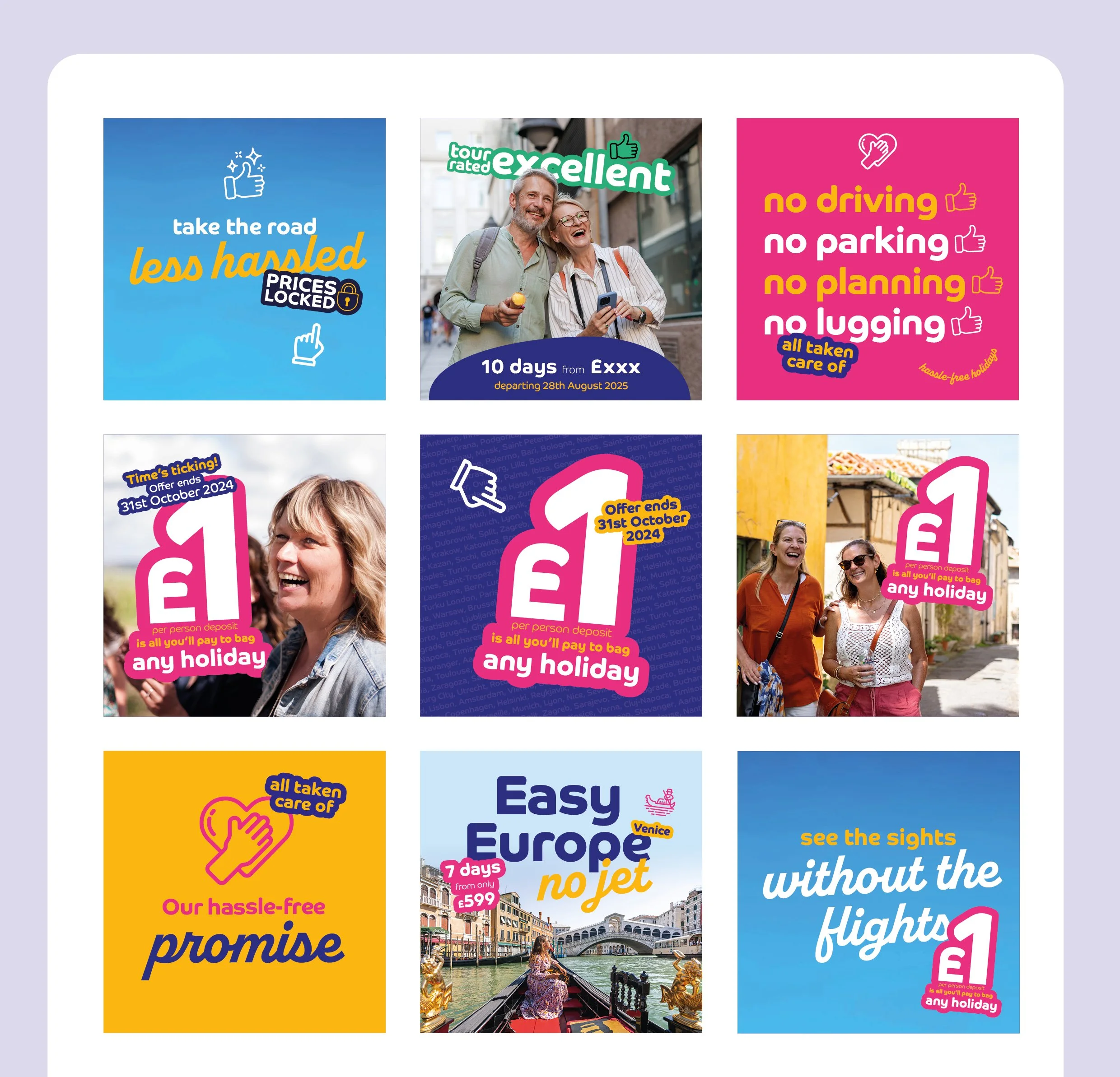
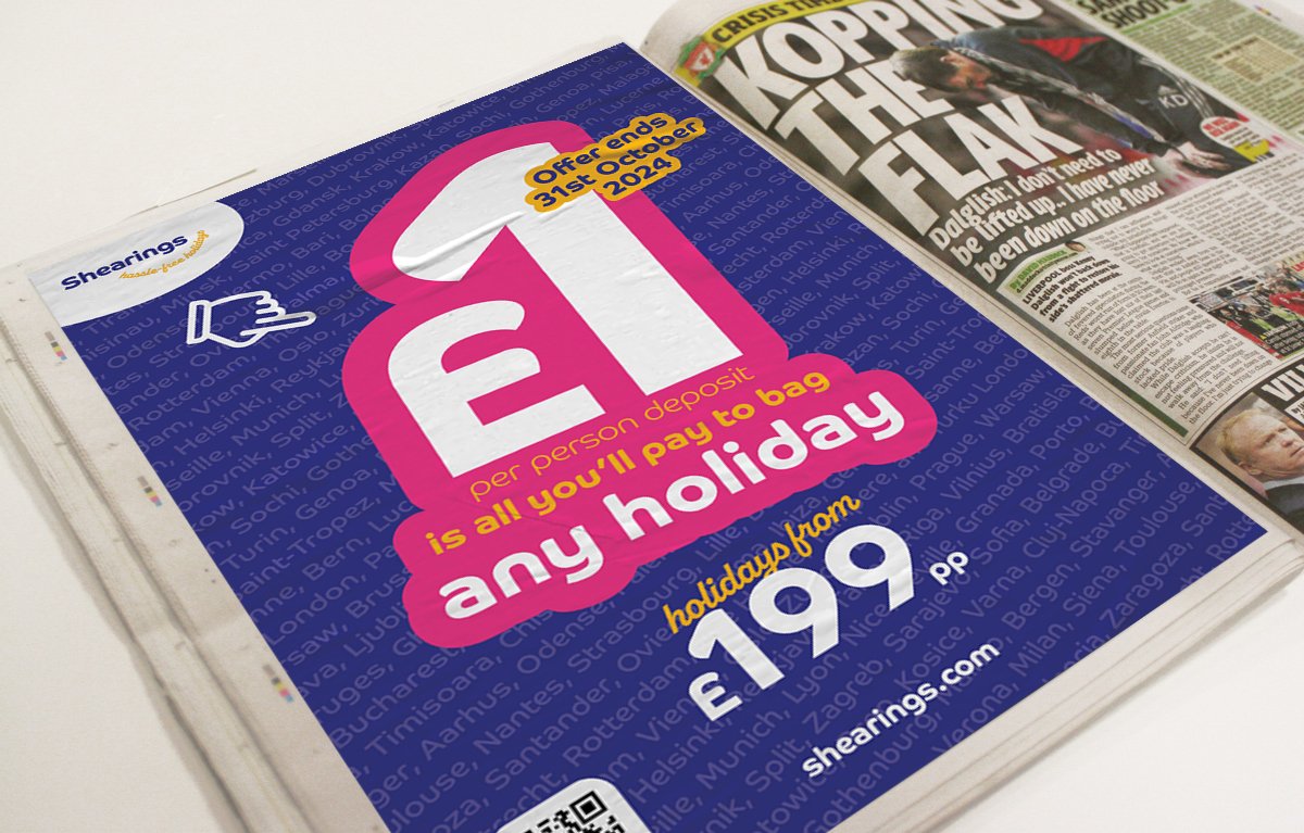
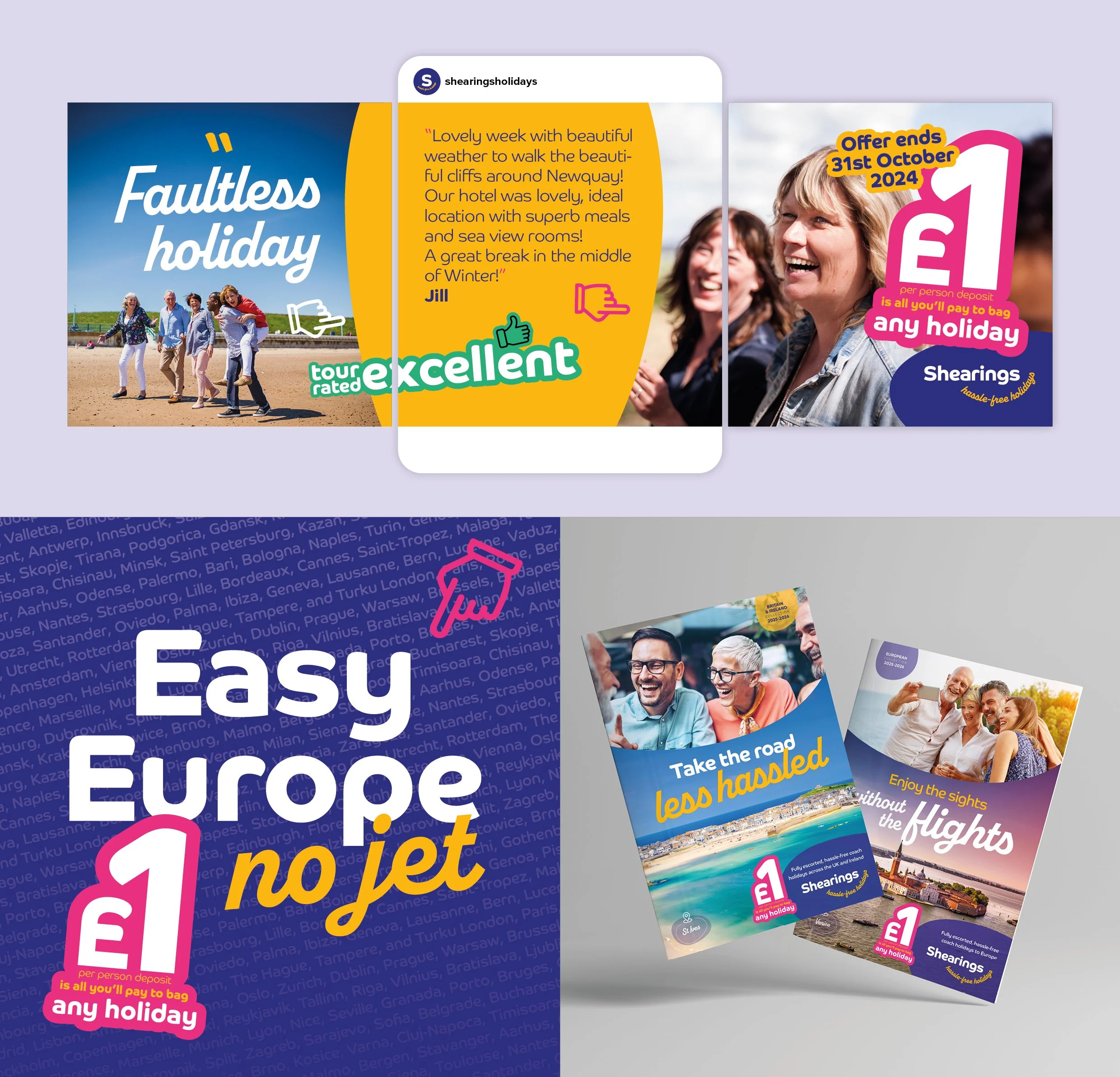
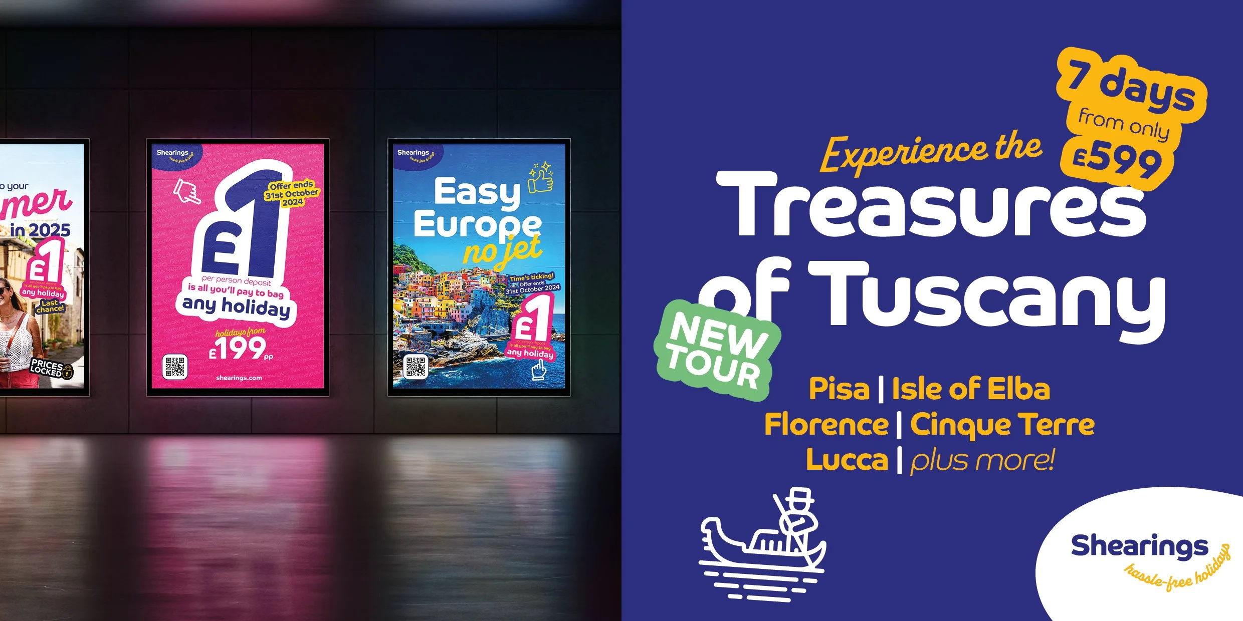
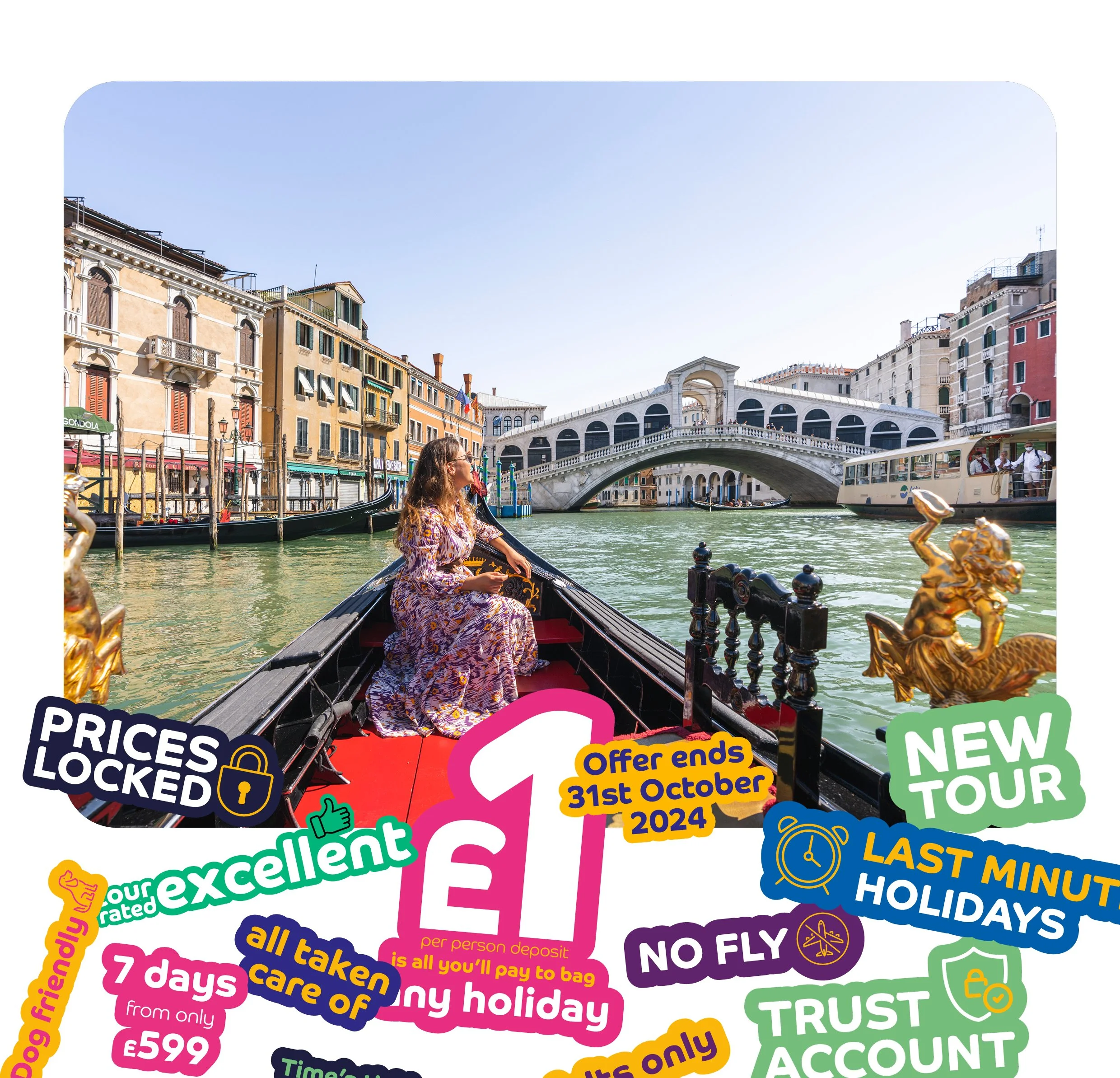
After identifying potential opportunities, I developed a bold, bubble-style “sticker” graphic to highlight key sales messages.
The modular design works both standalone and alongside other content, ensuring clarity and consistency across paid social, print, and email campaigns. The playful bubble shape differentiates Shearings from competitors and reinforces the brand’s friendly, approachable personality.
Core Elements of the Concept
Attention-grabbing graphics: The sticker/bubble draws focus to key messages without cluttering other content
Bold, readable typography and vibrant colors: Ensures messages stand out across all channels
Consistent visual hierarchy: Helps users instantly recognize promotional highlights
Flexible, modular system: Works across formats and placements, standalone or paired with other content


Performance
and impact
Marketing performance and new business for Shearings significantly improved YOY since introducing the device across all activity in January 2025.
Over a five month period (Jun-Oct), the new creative supported a consistent year-on-year uplift in new business, averaging 20% growth versus the previous year.