It took a rethink to get Leger Rail back on track.
Rail Holidays was an established product in the Leger portfolio, but it wasn't performing to its potential. Despite offering a genuinely premium travel experience, confusion around the product and weak communication of its value meant customers weren't converting. This project focused on fixing that.
My Role
Designer
Tools
Figma, Adobe InDesign, Illustrator
The Brand
Leger Holidays
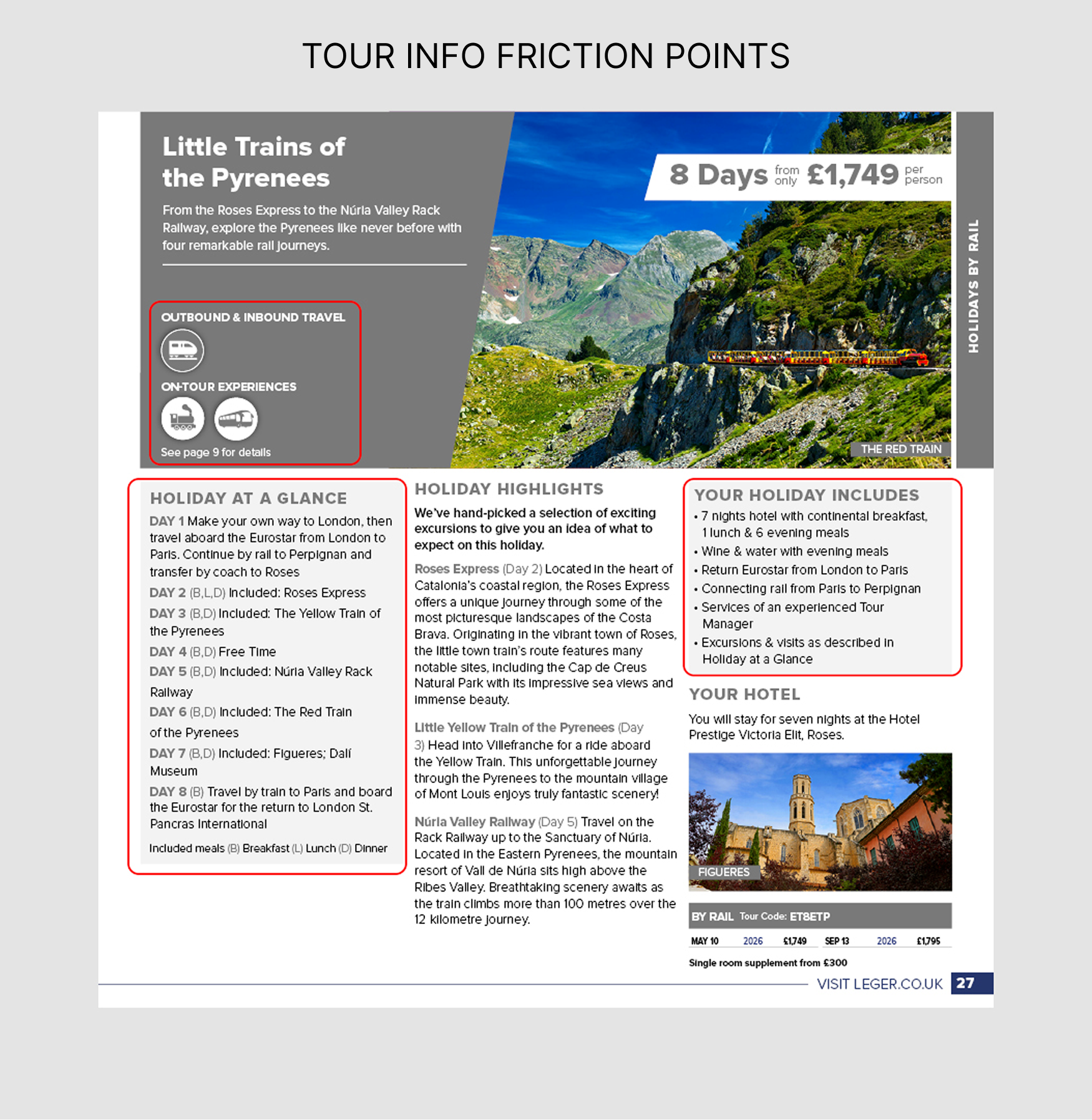
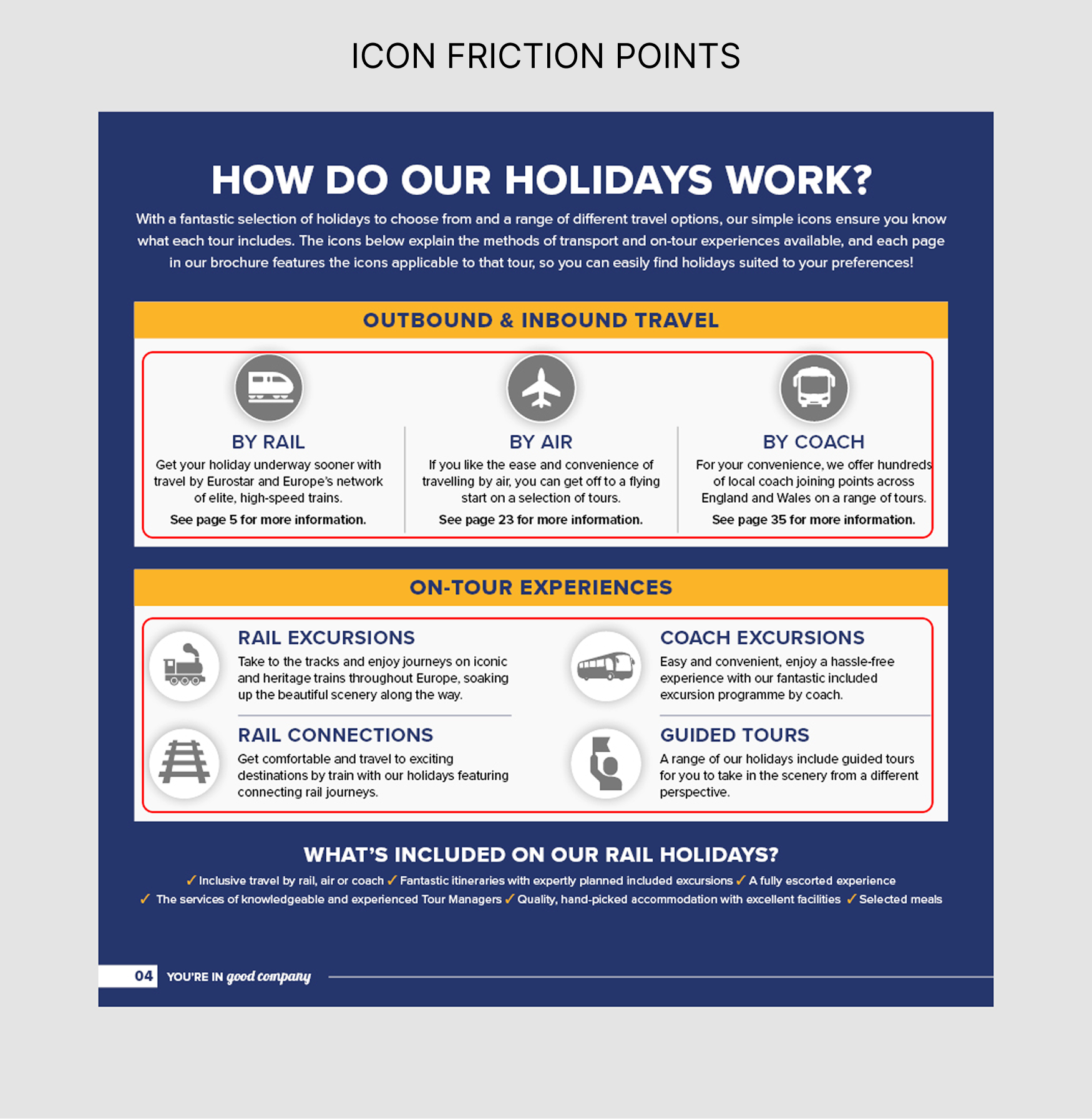
The brochure mixed true rail holidays with holidays that reached the train by coach or air — leaving customers unsure what they were booking. A vague "Tour at a Glance" section, an overlooked "Your Tour Includes" panel, and an inconsistent icon system across web and print added to the confusion. Explanations of the rail experience were overwhelming rather than reassuring. Customers weren't disengaged — they were lost.
The Challenge
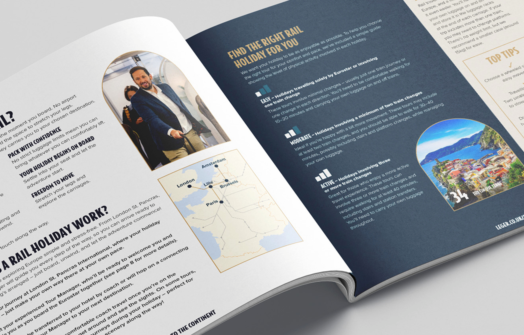
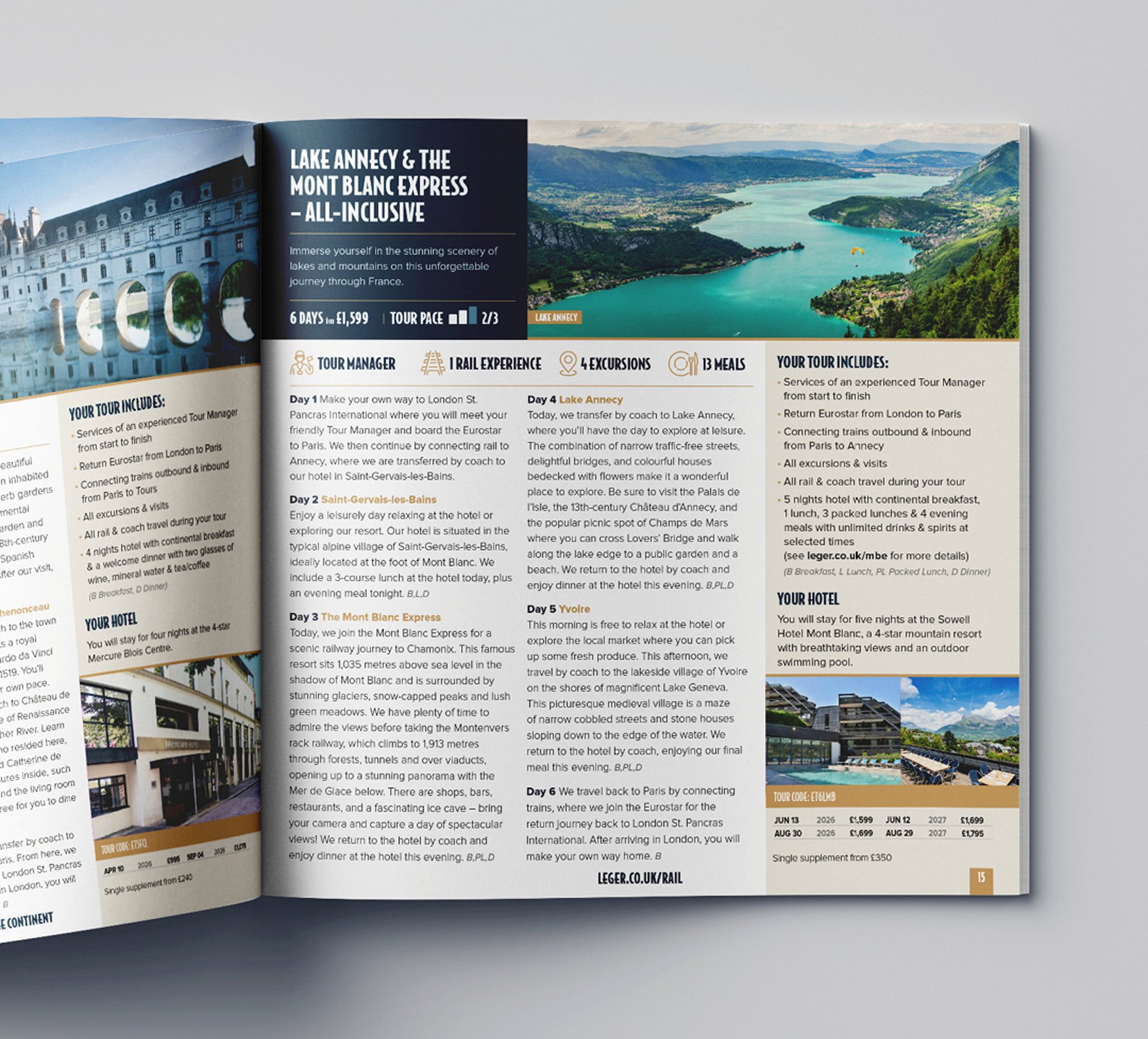
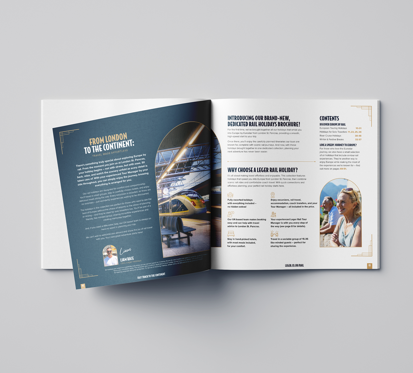
I separated the product range clearly so customers could immediately understand what they were choosing. The icon system was rebuilt for consistency across web and print. Holiday page content was restructured — "Tour at a Glance" was rewritten around genuine experience-led highlights, and "Your Tour Includes" was given the visual prominence it deserved. Explanations of rail travel were simplified and reframed around benefits rather than mechanics, reducing cognitive load at every key decision point.
The Approach
The impact was significant. Inbound bookings increased by 346%, cost per response dropped by 75%, and overall turnover grew by 142% year-on-year. Rail holidays went from an underperforming line to one of the portfolio's strongest — not because the product changed, but because customers could finally understand why it was worth choosing.
The Impact